Your manuscript is done. The file holds together, the table of contents is clean, only the cover is missing. Yet the cover decides what happens next: in an online store your book is first a thumbnail the size of a stamp, sitting next to thirty others. An AI book cover generator gives you artwork in minutes, and that speed is the trap: most of the covers floating around the marketplaces are recognisable at a glance.
Half erased titles, letters that look like letters without spelling anything, a centred composition with no hierarchy, pretty artwork that says nothing about the subject. The fault almost never lies with the image model. It lies with the method. The method that works has three moves: generate a visual with no words inside it, place the title on top as real type, then judge the result at thumbnail size. That is the same chain as our complete guide to building an ebook with AI.
The short answer
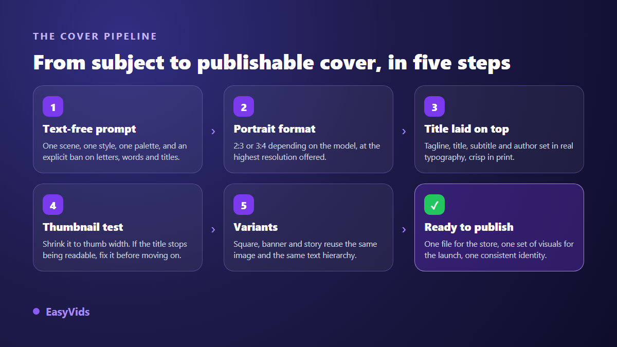
Generate a portrait image with no text at all, showing one readable scene and keeping a calm area for the title. Then compose the title, the subtitle and your name on top in a layout tool. According to the Kindle Direct Publishing help pages, a digital book cover displays best at a height to width ratio of 1.6, meaning 1,600 pixels wide by 2,560 pixels tall, saved as JPEG or TIFF, and never below 1,000 pixels on the longest side. Finish with the test that settles everything: shrink the cover to thumbnail size and check that the title still reads. Ten minutes is enough, eight of them spent checking.
Why a generated cover gives itself away
The first flaw is text. Image models draw shapes that resemble letters without ever understanding words. On a cover the outcome runs from an approximate title to pure typographic noise, and a reader hesitating between two books decides in a second. The behaviour has a technical explanation, covered in our article on unreadable text inside generated images: it is not a setting to find, it is a limit to design around.
The second flaw is composition. Left alone, a model centres its subject and fills the frame edge to edge. Nothing breathes, and any type added afterwards lands on a busy detail. The third flaw is quieter: the artwork looks good but could belong to any book. A sunset over a mountain illustrates every self help title ever written. A cover that sells announces the content instead of decorating the page.
The rule that changes everything: artwork first, type on top
Split the two crafts. The model makes an illustration, your layout tool makes the typography. Inside the EasyVids ebook generator, the cover prompt describes the theme of the book and explicitly bans letters, words, titles and captions; the kicker, the title and the subtitle are then placed as real text in the book layout. One lesson learned the hard way: quoting the title inside the prompt is enough to make the model try to paint it, whatever the instruction says. Describe the theme, never the exact words.
The split brings a second, very practical benefit. Changing a title no longer costs a generation. You test three wordings over the same artwork, compare them, keep the strongest. And the type stays sharp when enlarged or printed, which no generated lettering can promise.
The sizes to know before you generate
A cover does not survive careless cropping. It is portrait, and a wrong ratio is paid for in lost pixels, usually across the title. Here is what to prepare depending on where the file goes.
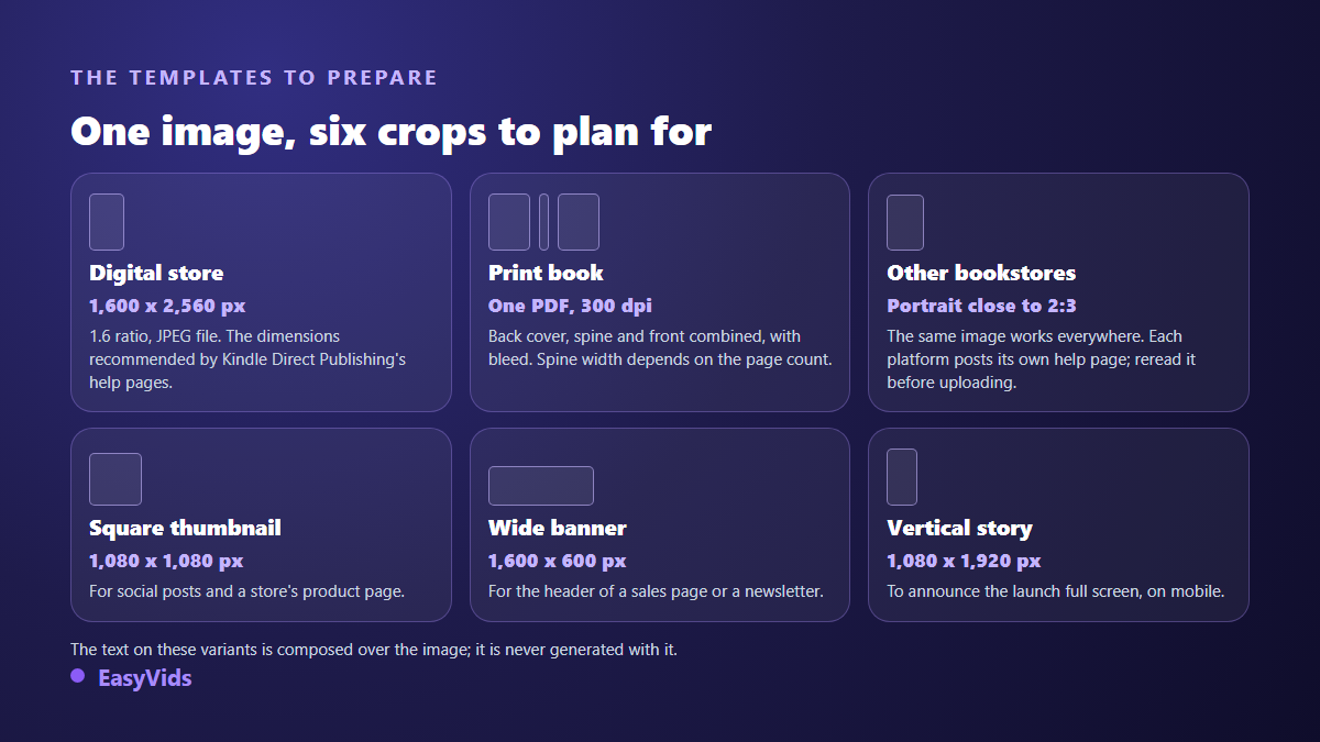
- Digital book: according to the Kindle Direct Publishing help pages, an image 1,600 pixels wide by 2,560 pixels tall, a ratio of 1.6, saved as JPEG or TIFF, with at least 1,000 pixels on the longest side.
- Print book: the same documentation asks for a single PDF holding the back cover, the spine and the front cover together, at 300 dots per inch, with bleed. Spine width depends on page count and paper stock, and an official template calculates it for you.
- Other digital stores: a portrait close to 2:3 travels everywhere. Each platform publishes its own help page, worth rereading before upload since these templates change.
- Direct sales and lead magnets: free choice, but stay portrait. That is the shape readers instantly read as a book.
- Social announcements: plan a square and a vertical version from the start, otherwise every platform will crop your cover wherever it likes.
Resolution deserves the same care. An image produced at the first quality tier fills a store thumbnail, not a cover printed at 300 dots per inch. Generate at the highest tier your model offers, or enlarge afterwards. In the studio, image models accept 2:3 and 3:4 portrait shapes, and several of them reach the 4K tier.
The cover prompt in five blocks
A cover prompt is not an ordinary illustration prompt. It has to produce artwork that can carry type. Five blocks are enough, in this order.
- The scene: one concrete subject that hints at the promise of the book. One thing, not three.
- The style: oil painting, editorial illustration, studio photography, graphic minimalism. One style, held throughout.
- Light and palette: two or three dominant colours and one identifiable light source. This is what reads as professional work.
- Composition: subject pushed toward the lower half, upper third deliberately calm, shallow depth of field to lift the subject off the background.
- The bans: no text, no letters, no typography, no title, no watermark, no collage or split frame.
One prompt you can reuse as it stands: editorial illustration of a coffee cup on a wooden desk, low morning light, ochre and midnight blue palette, subject in the lower half, upper third empty and dark, no letters, no words, no text.
The thumbnail test decides
Your cover will almost never be seen large. Shrink it to a hundred and fifty pixels wide, look at it on a phone, and ask three questions. Is the subject recognisable? Does the title read without squinting? Does the cover stand apart from its neighbours in the same category?
If one answer is no, the problem is not resolution, it is the number of elements. A cover that survives at small size holds two or three things, not ten. A short title, a readable subject, hard contrast between type and background. The rest is creator comfort, not reader benefit.
Composing the title: a hierarchy readable in one second
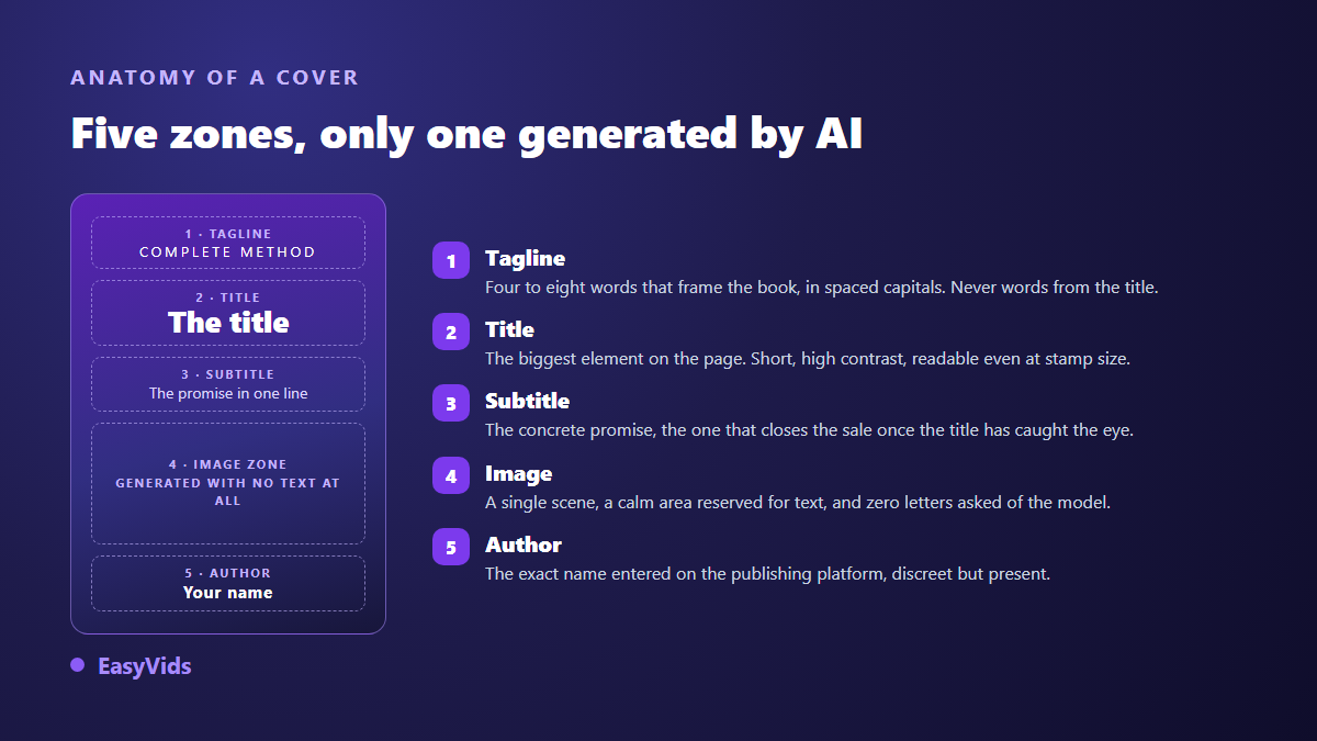
Four levels are enough, and their visual order is not negotiable. The title dominates as the largest element on the page. The subtitle carries the concrete promise, the one that closes the sale once the title has stopped the eye. The kicker, four to eight words in spaced capitals, places the book without repeating the title. The author name closes the composition, discreet but present.
For type, one family in two weights beats three fonts picked by feel. Avoid thin scripts, unreadable at thumbnail size. Always set text over a solid panel, a dark scrim or a plain area: a white title over busy artwork simply vanishes. That is what the ebook layout in the studio does, drawing the kicker, the title and the subtitle as crisp text over the illustration rather than inside it.
What the platforms actually require
Two rules come up everywhere. Consistency first: according to the Kindle Direct Publishing content guidelines, the cover must show the title and the author name exactly as entered in the publishing form, with no added promotional text. A mismatch between artwork and metadata gets the book rejected at review.
Disclosure next. Amazon asks publishers, at the moment of publishing through Kindle Direct Publishing, whether the content was generated with artificial intelligence, images included. Declaring is not being refused, it is expected information, and the subject is unpacked in our guide to AI books on Amazon KDP. Finally, check the commercial usage terms of whichever tool produced the artwork, and stay away from the face of a real person or the claimed style of a living illustrator.
Mistakes that cost sales
- Asking the image model for the title, then spending an hour repairing broken letters.
- Generating square because it is the default, then cropping to portrait and losing half the scene.
- Pairing dark artwork with grey type: nothing survives at thumbnail size.
- Stacking five symbols to say everything about the book, and saying nothing at all.
- Ignoring category codes: a thriller and a cookbook do not look alike, and readers rely on those signals.
- Forgetting the spine and back cover for a print edition, then discovering the template the night before launch.
Frequently asked questions
Can I sell a book with an AI generated cover?
Yes on the main self publishing platforms, under two conditions: respect the commercial usage terms of the tool that produced the artwork, and complete the generated content disclosure requested at publication, on Kindle Direct Publishing in particular. A cover built from original artwork with crisp type raises no specific issue.
Which size should an AI book cover use?
Portrait, always. Generate at 2:3 or 3:4 depending on what the model accepts, then resize to what the platform expects. For a digital book, the Kindle Direct Publishing help pages recommend 1,600 pixels wide by 2,560 pixels tall. For print, the full wrap goes out as a PDF with a spine calculated from the page count.
Why does AI lettering come out distorted?
Because these models produce images, not text: they imitate letter shapes learned from millions of examples with no notion of spelling. Recent models do better on a single word, none guarantees an exact sentence. The fix is structural: generate without text, compose the text afterwards.
Do I need a designer for a cover that sells?
Not for a practical guide, a white paper or a lead magnet: the method above is enough. A designer still earns their fee on illustrated fiction, on a series that has to hold across several volumes, or in a tightly coded market where the smallest slip shows.
A cover is not decoration, it is the first sentence of the book. Generate the artwork without text, compose the title on top, judge the whole thing small: three moves that lift a book out of the pile of anonymous covers. To try it, creating an account opens the image models and the ebook generator, cover and sales visuals included, and the EasyVids studio takes over once the book exists and needs an audience.