You are looking for YouTube thumbnail ideas because yours is not pulling. The topic is solid, the edit holds up, and the image still sits flat among the others. The problem is rarely graphic talent. It is the blank page: with no composition to start from, you stack a face, part of a title and three colours, and the eye scrolls straight past.
Channels that earn clicks do not reinvent anything for every upload. They pick from a small library of proven compositions, then swap the subject. That is exactly what follows: six composition families, then 51 concrete ideas sorted by niche. Sizes, file limits and the zones the interface covers are handled in our complete guide to YouTube thumbnails. This page is about the idea only: what to show, and how to frame it.
The short answer
A good thumbnail idea fits in one sentence: one subject, one emotion, three words at most. The 51 examples below are variations on six base compositions: the reaction face, the before and after, the versus, the isolated object, the giant number and the pointed detail. Pick the composition that serves your topic, replace the model's subject with yours, keep your usual colours. You do not need to be a designer, you need a starting frame.
The six compositions almost every thumbnail comes from
Grammar first, ideas second. Look at fifty thumbnails in any category and one of these six structures will come back again and again. Knowing them saves a lot of time, because you stop hunting for an image and start choosing a frame to fill.
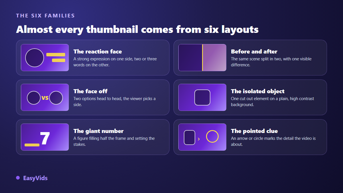
- The reaction face: a strong expression fills half the frame, two or three words fill the other half.
- The before and after: one scene cut in two, with a single visible difference between the halves.
- The versus: two options facing each other across a hard line, so the viewer picks a side.
- The isolated object: one cut out element on a plain, high contrast background.
- The giant number: a figure taking half the frame and carrying the stake on its own.
- The pointed detail: an arrow, a circle or a highlighted zone marking what the video is about.
Two compositions in one image produce mush. One composition held all the way produces a thumbnail that reads at stamp size. That rule runs through every niche below, and it is the one never worth bending.
Gaming: 7 thumbnail ideas
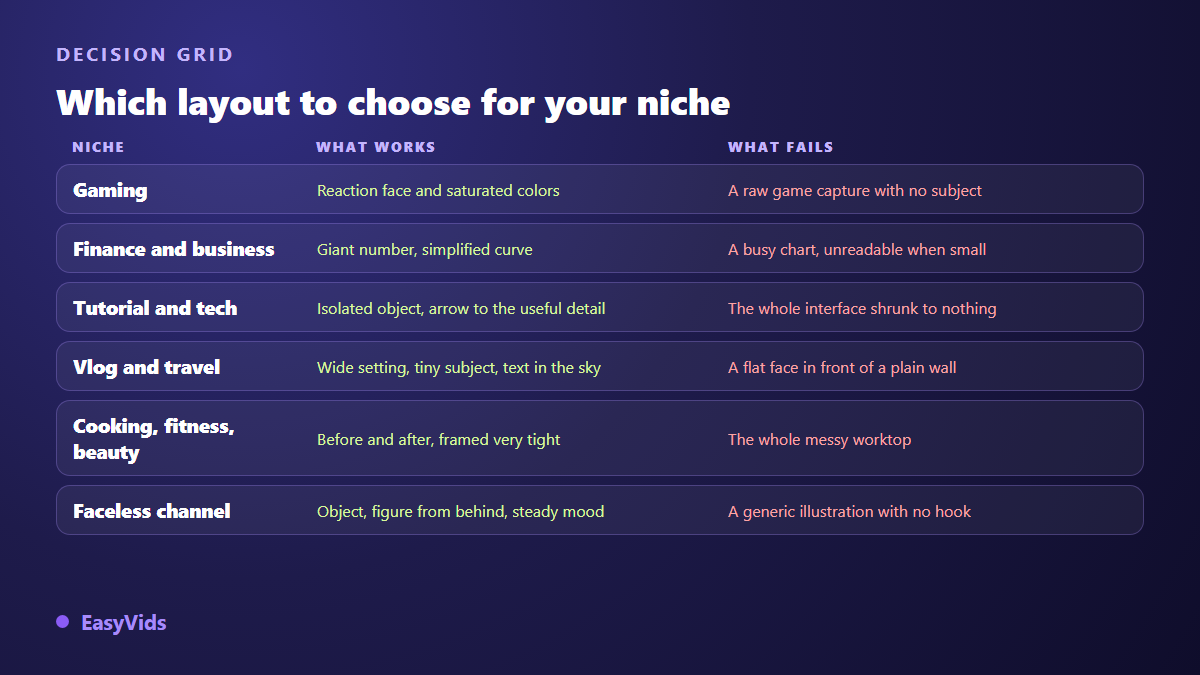
Gaming is the most colour saturated niche, which makes visual order stand out instantly. What works: one subject, very large, with the gameplay capture demoted to a backdrop.
- 1. A stunned face in close up on one side, the game scene on the other, split by a hard diagonal.
- 2. The character cut out on a flat colour glow, with one single game item beside them.
- 3. The ranking: three characters in a row, a giant number on the middle one.
- 4. A nearly empty health bar in extreme close up, two words laid over it.
- 5. Raw material on the left, an arrow, the crafted item on the right, nothing else.
- 6. The game map with one bright circle on a single spot, and the word naming it.
- 7. An improbable score in giant digits, the face shrunk to a small inset in one corner.
Finance, business and money: 6 ideas
Viewers come for proof or a shortcut. The thumbnail has to announce a result or a method, never an abstract concept. One caution: a promise the video does not keep gets paid back in early exits, and the recommendation system reads that signal faster than you do.
- 8. A three point simplified curve in the background, the subject cut out in front, one percentage stated.
- 9. Two columns in opposing colours: what everyone does on one side, what you do on the other.
- 10. The tool of the trade isolated on a plain background: a laptop, a notebook, a key.
- 11. A dashboard reduced to one sharp line, everything else deliberately blurred.
- 12. A serious face, arms crossed, dark background, one warning word in the accent colour.
- 13. The roadmap as three numbered dots, and not one word more.
Tutorials, tech and software: 6 ideas
The most common mistake is pasting a full screenshot. Shrunk to thumbnail size, an interface turns into grey texture nobody decodes. Show one element of that interface, or the physical object you are talking about.
- 14. One single interface button, enlarged, with an arrow pointing at it.
- 15. Two tools facing each other across a vertical line, with no logo or trademark.
- 16. A hand holding the object, framed very tight, on a plain background.
- 17. The same render left and right, with exactly one setting changed between them.
- 18. The minimal diagram: three blocks, two arrows, no scenery.
- 19. The error message turned into a giant pictogram, with the two words that sum it up.
Vlog, travel and lifestyle: 6 ideas
A vlog sells an atmosphere and a person. The whole difficulty is carrying both in one image without landing on a forgettable holiday snapshot. The contrast between the scale of the scene and the scale of the subject does most of the work.
- 20. A very wide landscape with the person tiny inside it, and the text set into the sky.
- 21. The face right against the lens, the recognisable location behind it, slightly out of focus.
- 22. The logbook: first day on the left, last day on the right, the same pose on both sides.
- 23. An open suitcase seen from above, objects lined up, plain background.
- 24. A high contrast night shot with a single light source in frame.
- 25. The route drawn out: two points, a dotted line, one transport pictogram.
Food, fitness and beauty: 7 ideas
These three niches share one mechanic: people come for a transformation. The before and after composition rules here, on one condition. Keep the same light, the same distance and the same framing on both sides, otherwise the comparison looks staged and viewers stop trusting it.
- 26. The dish shot from above on a plain background, one plate, no props around it.
- 27. The spoon lifting, in close up, with the texture perfectly sharp.
- 28. Left half raw, right half cooked, cut hard down the middle.
- 29. The same profile silhouette left and right, same light, same distance.
- 30. Three numbered silhouettes for three exercises, and not one word more.
- 31. The face half done, half bare, with the split running down the middle.
- 32. Products lined up in a row, one of them circled in a bright colour.
Faceless channels: 7 ideas
With no face to show, you need another anchor: an object, a silhouette, a light. Storytelling, documentary and motivation channels live comfortably on these compositions, as long as the atmosphere stays identical from one video to the next. Our guide to running a YouTube channel without showing your face covers how to build an identity without ever appearing.
- 33. A silhouette from behind facing a vast scene, never the face.
- 34. One object on a table, grazing light, black background.
- 35. An old map with one area circled by hand, nothing else.
- 36. A door ajar with light behind it, no character in sight.
- 37. A closed file on a desk, one readable label, no photo of a real person.
- 38. A two line quote over a worked sky, always in the same typeface.
- 39. The timeline: three dates, three pictograms, a single accent colour.
Education, kids and music: 6 ideas
These audiences watch in series. Recognition matters more than surprise: your thumbnail has to be spotted in a list of suggestions, not win a poster contest. One fixed element repeated across episodes is enough to build that reflex.
- 40. The same illustrated character every episode, placed in a different situation each time.
- 41. The lesson number as a badge in one corner, the topic of the day in the centre.
- 42. The question asked in three words, with a question mark twice their size.
- 43. Simple shapes and flat colours for very young viewers, no text at all.
- 44. The mood cover: one scene, not a word, the same palette across the whole series.
- 45. The instrument alone, framed tight, on a complementary colour background.
Vertical Shorts: 6 cover ideas
A vertical cover follows different constraints, because the interface owns a large share of the screen: the title at the bottom, the button column on the right, the navigation bar underneath. It matters most on your channel tab and in search results, where it is seen as a still image. If you publish these formats in series, our method for making Shorts with AI explains how to keep a rhythm without losing your weeks to it.
- 46. The subject placed in the central third, nothing at the bottom or under the right column.
- 47. Text at the top of the frame, two lines maximum, never at the bottom.
- 48. A hand gesture in the foreground, very large, the background reduced to one colour.
- 49. A single figure at huge scale, for countdown formats.
- 50. The episode number top left, identical from Short to Short, to establish the series.
- 51. The cover reuses the strongest image of the first two seconds, never a closing frame.
Adapt an idea instead of copying it
An idea reused as it stands produces a thumbnail that looks like your neighbour's, and drowns in the same results page. Adapting takes four moves, always the same ones, and less time than the inspiration hunt that came before.
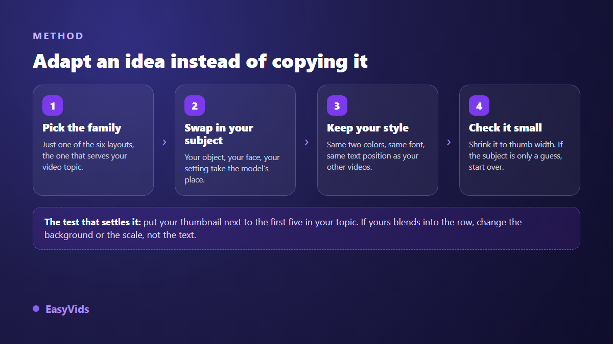
The final check deserves a word. Put your image next to the first five thumbnails your topic returns: if yours melts into the row, change the background or the scale, not the text. What the eye settles in a fraction of a second follows fairly stable mechanics, which we unpack in our piece on the psychology behind a thumbnail that earns clicks. To settle a choice between two ideas, there is better than intuition. According to YouTube Studio help, the thumbnail test and compare tool shows several versions of the same video to the same audience and keeps the one delivering the most watch time. When that feature is available on your channel, it is the only genuinely clean comparison.
Producing these thumbnails with AI
An idea is only worth what you can produce on the day you need it. The EasyVids thumbnail generator sits in the One-Shot workspace, under the Thumbnail tab. You describe the subject in one sentence, add the overlay text if you want one, then pick a style among eight, from viral to documentary through gaming, tutorial, vlog, horror, luxury and spirituality, and an emotion among five: surprise, shock, joy, fear or serious. The ratio switches between 16:9 for a standard video and 9:16 for a Short. Those settings write the prompt for you, on the same principles covered in our guide to AI image generators.
Two practical points are worth knowing. You can attach a face photo as a reference so you appear on the thumbnail yourself, which settles the likeness question across episodes. And each request produces one image: to compare several directions, relaunch with a variant description rather than hoping to nail it first time. Across our own generations, descriptions that state a composition (« close up, subject on the left, right half empty, plain dark background ») give far more usable results than descriptions that tell a story. One honest limit: image models still write long words badly, so keep to two or three, or add the text yourself afterwards. Plans and how credits work are laid out on the pricing page.
Mistakes that cancel out a good idea
A sound idea can be ruined in execution, almost always for one of these reasons. Each takes minutes to fix, and the thumbnail changes category.
- Two compositions in one image: choose, then delete the other.
- A full sentence instead of three words: the text becomes grey texture.
- The title copied inside the image: half the frame is spent for nothing.
- An original photo background kept as it is, with all its clutter.
- A neutral expression on the face: it says nothing and asks for nothing.
- An idea borrowed from another niche without adapting it to yours.
- A promise the video does not keep: click won, audience lost.
Frequently asked questions
How many words should go on a thumbnail?
Three, four at most, and sometimes none. The text is not a second title: it adds the missing word, the one creating tension or sharpening the angle. Entire channels work without a single word, especially in food, travel and music, because the image already says what it is.
Should the composition change with every video?
No. Hold one or two compositions across a whole series: that is how your audience recognises you in a feed before reading your name. Vary the subject, the accent colour and the word on top, not the structure. Switch composition family when you switch format, for instance between a long video and a Short.
Can a thumbnail without a face work well?
Yes, provided you replace the face with another strong anchor: an isolated object, a silhouette from behind, a hard light. What holds attention is not the face itself, it is the presence of a single readable subject. A generic illustration with no anchor fails, with or without a character in it.
How do I know whether my thumbnail idea is good before publishing?
Scale the image down to about 300 pixels wide, then step back a metre. If you cannot identify the subject and read the text within a second, the execution is off. Faster variant: squint until the image blurs. What survives is mass and contrast, which is exactly what a scrolling eye perceives.
Can I reuse another channel's thumbnail idea?
A composition belongs to nobody: the reaction face and the before and after are common property. What is protected is the execution, so someone else's images, photographs and graphic assets. Reuse the structure, never the visuals, and be wary of imitating a well known channel too closely, which makes you look like a copy rather than a reference.
Take a video whose topic deserves better numbers, pick one of the six compositions, apply the idea closest to your niche, and publish the new thumbnail. Measure over several days before concluding anything. To produce the image, set your text and hold one identity across episodes, creating an account opens the full studio, no bank card required.