You have probably tried it once: a shocked face, a saturated background, a red arrow across the frame. It looks vaguely like the MrBeast thumbnail style, and the click through rate does not move. The editing software is almost never the problem. The surface was copied without the mechanism holding it up.
These thumbnails do not win because they shout louder. They win because they show a stake in a quarter of a second, with one single idea in the frame and an outcome left hanging. That mechanism transfers to finance, cooking or software tutorials, as long as you know what you are transferring. If the technical basics are still missing, our complete guide to YouTube thumbnails covers them; this article takes on the formula itself.
The short answer
The formula fits in one sentence: one idea in the frame, one readable emotion, one identifiable stake, and an outcome you can only learn by clicking. Saturated colours, rim light and an oversized face are not the formula. They are the means of making that sentence readable at stamp size, on a phone, wedged between a dozen competing thumbnails. So you can borrow the mechanism without borrowing the look, and that is the only way to avoid looking like a knock off.
Why literal copying almost always fails
First reason: the thumbnail promises a stake the video never delivers. Those videos rest on extreme challenges and situations that can genuinely go wrong. The thumbnail only shows the stake. If your video is a calm software walkthrough, a screaming face creates no expectation. It creates disappointment, and disappointment is paid for in watch time.
Second reason: the penalty is written down. YouTube's spam, deceptive practices and scams policy, published in the platform's help centre, treats thumbnails that promise content absent from the video as misleading metadata. A visual that dramatises is one thing. A visual that lies is another, and only the second puts a channel at risk.
Third reason, quieter but real: your audience expects a tone. A financial analysis channel that suddenly adopts entertainment codes loses in credibility what it gains in clicks. Always show the stake, but dose the intensity.
The six rules of the formula
Look at a wall of these thumbnails and six constants stand out. None of them depends on a production budget. They are framing, colour and text decisions you can apply with any tool.
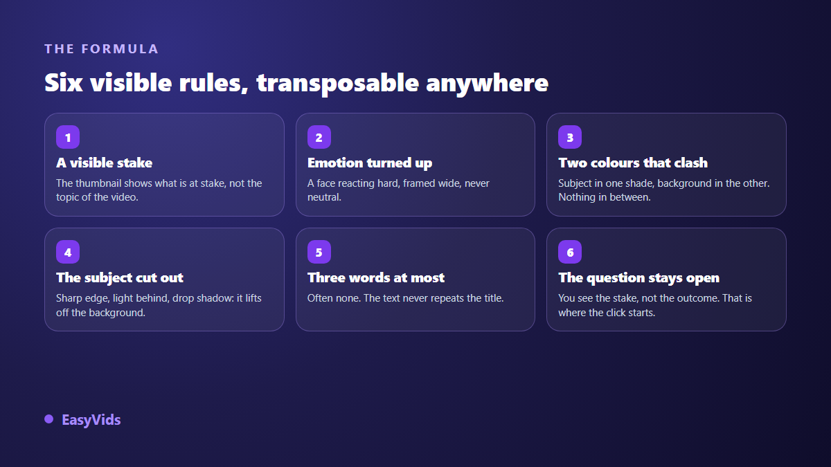
- A visible stake. The thumbnail shows what is on the line, not the topic of the video: a closed door, a stack of objects, a countdown.
- A pushed emotion. The face reacts hard, framed wide, never neutral. The reaction tells the viewer something important is happening.
- Two colours in opposition. One hue for the subject, the opposite hue for the background, with as few in between tones as possible.
- A cut out subject. Clean edge, light from behind, drop shadow: the subject lifts off the background instead of melting into it.
- Three words at most, often none. When text appears, it adds something the title does not already say.
- A question left open. You understand the stake, you do not know the outcome. That gap is where the click comes from.
Show the stake, not the topic
This is the most misread rule. Most creators illustrate their topic: a video about saving money shows a piggy bank, a video about search shows a magnifying glass. Nobody clicks on a topic. People click on a situation whose ending they want to know.
The useful move is to answer two questions before opening any editor. What is at stake in this video? What does the exact second where everything tips look like? The thumbnail shows that second. The saving video becomes an empty wallet facing a full trolley. The search video becomes a collapsing curve and a face taking the news.
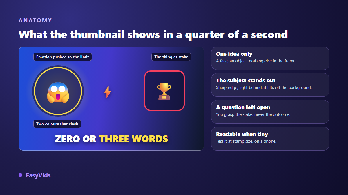
Notice what is missing: no logo, no explanatory subtitle, no second character. Every added element divides attention by the number of elements present. At the size the thumbnail is actually seen, two ideas equal zero ideas.
The face is optional, the emotion is not
Many creators dismiss the formula because they never film themselves. That is a false obstacle. What a face contributes is a reaction signal: somebody is affected by what is happening. That signal can come from a staged object, a hand, a gesture, a silhouette seen from behind. Channels that publish content without ever showing a face get the same effect by lighting a symbolic object the way you would light a person.
When a face is available, two details matter more than the expression itself. The gaze must leave the frame, towards the viewer or towards the object of the stake: eyes lost in the void kill the effect. And the face must fill a serious share of the image height, otherwise the expression vanishes at small size.
Colour: two camps, never a palette
The classic mistake is stacking bright colours to imitate the energy of the original. The result is a mush where nothing stands out. The real logic runs the other way: two chromatic camps, one for the subject, one for the background, with as few in between tones as possible.
One simple check replaces every theory. Shrink your image to phone thumbnail width, then turn it black and white. If the subject stays separate from the background in greys, your contrast holds. If it dissolves, no amount of saturation will rescue it.
Text: three words that do not repeat the title
Text is not there to summarise the video, the title handles that. It is there to add the missing piece. If the title announces the experiment, the thumbnail can announce the constraint. If the title asks a question, the thumbnail can show the number of attempts. The pair works when the two elements say different things that complete each other. Three words maximum, a very heavy weight, and an outline or shadow that lifts the letters off the background.
Adapting the formula to your niche
Adaptation comes down to one operation: replace the spectacular stake with the real stake of your audience. What matters to a personal finance viewer is not what matters to a gamer, but in both cases there is a second where everything tips.
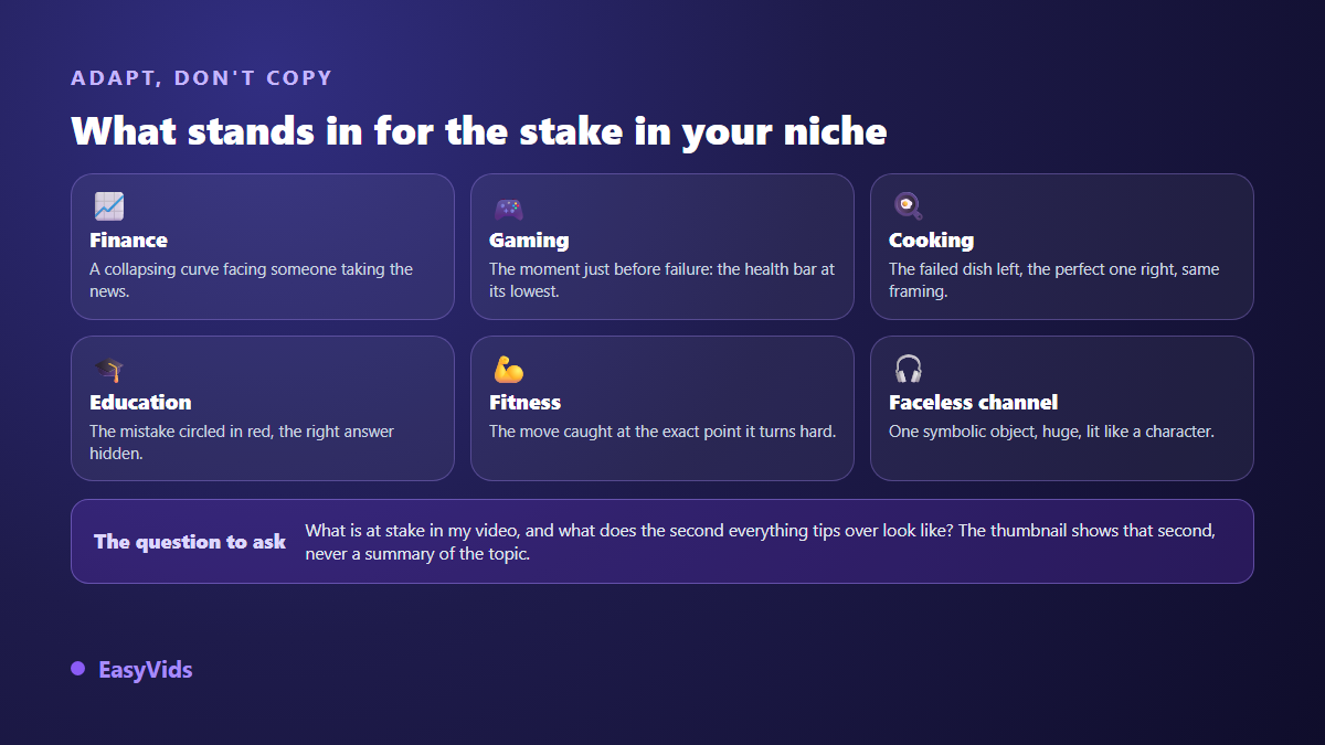
- Finance and business. A collapsing curve, a crossed out table, a face taking the result. The stake is the avoidable loss.
- Gaming. The instant before failure: health bar at the minimum, opponent off frame. The stake is survival.
- Cooking. The failure on the left, the success on the right, same framing and same light. The stake is the gap between them.
- Education and tutorials. The mistake circled, the correction hidden. The stake is what the viewer gets wrong without knowing it.
- Fitness and health. The movement at the exact moment it becomes hard. The stake is the effort, not the final result.
- Faceless channels. One symbolic object in extreme close up, lit like a character, on an opposing colour.
When that symbolic object is a product you sell, the vocabulary of material and light does half the work, and our prompt formulas by product type supply the wording that makes an object read in extreme close up. Once the stake is identified, the series matters as much as the single image. Keep the same subject position, the same colour family and the same text weight from one video to the next. That regularity is what makes a channel recognisable in a results page, long before anyone reads its name.
What you must never copy
The line is clear. The formula is a composition method and belongs to everyone. A real person's face, their name and their channel identity do not belong to you. YouTube's impersonation policy, published in the platform's help centre, forbids leading viewers to believe a video comes from another person or another channel, and personality rights protect the commercial use of somebody else's face in most countries. In practice that rules out three things: generating or cutting out a known creator's face on your thumbnail, reusing their logo and proprietary type, and implying your video belongs to their channel.
Building your version with AI
A thumbnail like this used to require a photo session, a cut out and retouching. An image generator now covers most of the road, provided you feed it the right elements. In the EasyVids studio, the Thumbnail tab of the one click generator asks for four things: the subject of the scene, a visual style including a viral preset built on these codes, an emotion to display, and the optional text to burn in. The ratio is set to 16:9 for a standard video or 9:16 for a short. If image generation is new to you, our guide to AI image generators explains how to write a description that returns something usable.
Reference photos are the detail that changes everything. One picture of your face is enough for you, rather than a generated stranger, to appear on the thumbnail with the requested expression. It is also what keeps the same face from one thumbnail to the next, which turns a pile of images into a channel identity. A rough drawing works the same way: going from a scribbled sketch to a finished visual lets you settle the layout of the thumbnail, where the subject sits and where the words go, before generating anything. One honest limitation: text burned in by an image model stays unreliable on long sentences and accented letters. Keep the wording very short, or generate the image without text and add the words in the editor. Available models and generation volume depend on your plan, listed on the pricing page.
Test instead of believing
No analysis replaces a measurement. According to the YouTube help centre, the Test and compare tool in YouTube Studio puts up to three thumbnails against each other on the same video, and picks the winner on watch time share rather than click through rate alone. That nuance decides a lot: a thumbnail that wins the click and loses the watch time simply attracted the wrong people. Test one variable at a time, and let it run long enough that chance is not making the call for you.
Frequently asked questions
Can I use MrBeast's face on my own thumbnail?
No. YouTube's impersonation policy forbids leading viewers to believe a video comes from another person or channel, and personality rights protect the commercial use of someone else's face in most countries. The composition style itself is free to reuse.
Do I have to show my face to use this formula?
No. The face works as a reaction signal, and that signal can come from an object, a hand or a silhouette. Plenty of faceless channels get the same contrast by lighting a symbolic object like a character against an opposing background.
What size and format should the thumbnail be?
According to the YouTube help centre, a custom thumbnail should be 16:9, ideally 1280 by 720 pixels, at least 640 pixels wide, and under the 2 MB file limit. Keep the lower right corner clear: the video duration sits on top of it.
Do highly saturated colours work in every niche?
No, and that is good news. On serious subjects, a dark palette with a single bright accent creates the same contrast without damaging credibility. What counts is the gap between subject and background, not the amount of colour.
How many thumbnails should I generate before choosing?
Three to five versions of the same idea are usually enough, as long as you judge them shrunk and side by side at phone thumbnail size. Beyond that you stop comparing ideas and start comparing variations, and the choice turns into a matter of taste.
Keep the hierarchy in mind: stake first, emotion second, execution last. A restrained thumbnail showing a real stake beats a loud one showing none. To apply the method without opening a retouching suite, creating an account opens the thumbnail generator, and the EasyVids studio keeps video, voice over and channel visuals in one place.