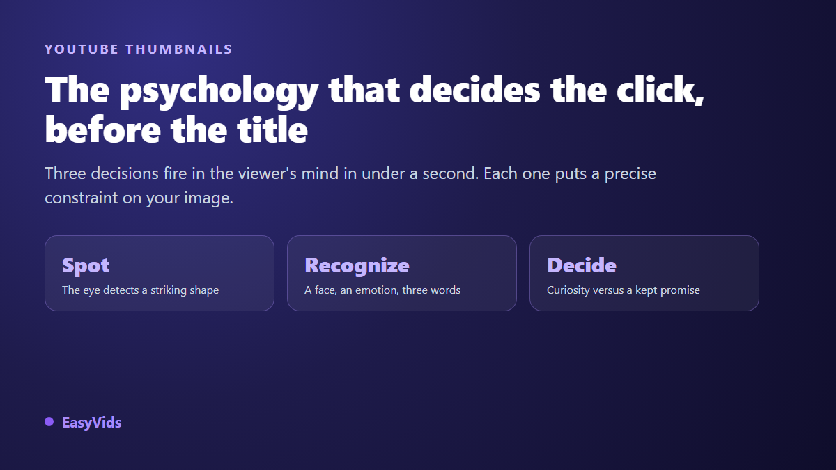
Your video is good and nobody clicks it. The edit holds up, the topic matters, the audio is clean. It stalls anyway, while rougher videos sit above it in the same list of results. YouTube thumbnail psychology explains most of that gap. A thumbnail does not win because it looks nice. It wins because it clears three mental filters, in order, in under a second.
What follows is not a list of effects to copy. It is the machinery underneath: why the eye stops on one image rather than another, why an open question outweighs a complete promise, and why a rising click through rate sometimes signals trouble. The production rules, sizes and templates included, already live in our complete guide to YouTube thumbnails. This piece looks at the viewer's head instead.
The short answer
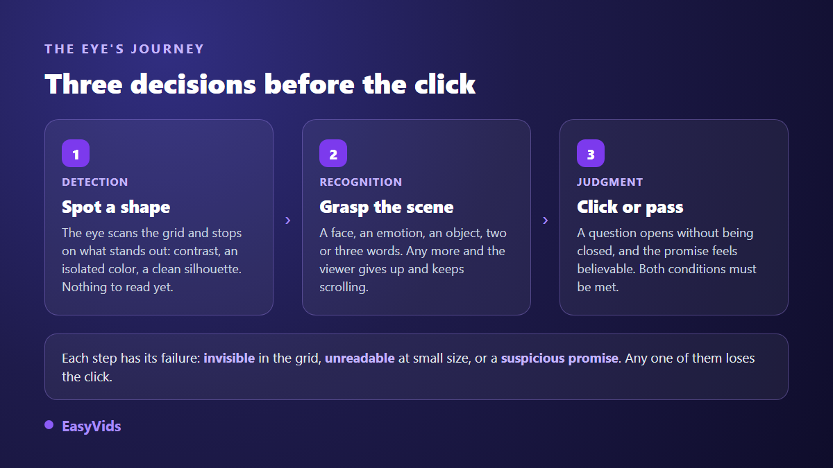
A thumbnail earns the click when it does three separate jobs. Get spotted in a crowded grid, which is a matter of contrast and silhouette. Get understood with no effort, which forces one subject, one readable emotion and three words at most. Open a question without closing it, what psychologists call the curiosity gap. Fail the first job and the video is invisible. Fail the third and it is visible but uninteresting.
The brain decides before you do
A Massachusetts Institute of Technology study published in 2014 in Attention, Perception, & Psychophysics found that participants could correctly identify the content of an image shown for as little as 13 milliseconds. Visual recognition is close to instant, and it runs far ahead of reading. On a results page your thumbnail is processed before your title, and its first job is not to inform. It is to be filed into a familiar category in a fraction of a second.
That speed dictates how you build the image. Anything that needs a second look arrives too late. A rich picture with three characters, a detailed set and a full sentence is objectively more work than a simple one. It still loses, because it offers nothing to grab in the time the viewer gives it. Simplicity is not a style here, it is a speed constraint.
Your thumbnail is never judged on its own
Viewers do not see your image, they see a grid. The isolation effect described by Hedwig von Restorff in 1933 says something simple: inside a uniform set, the item that stands apart takes the attention and is remembered better. Your competition is not the absolute quality of the other thumbnails, it is how much they look like each other.
The useful move takes two minutes. Search your keyword on YouTube, shrink the window, and look at the dominant tone. If ten tiles out of twelve are dark with yellow text, your play is a bright image, an empty frame or one flat colour. You are not looking for the most beautiful thumbnail, you are looking for the one that does not match its neighbours.
Faces are what the eye finds first
Paul Ekman's work on facial expression established that a small set of emotions is recognised immediately across cultures: surprise, fear, joy, anger, disgust, sadness. An expressive face is therefore the fastest decoded element of a thumbnail, which is why it dominates high traffic channels. The emotion has to be identifiable rather than maximal: an open mouth with no visible cause says nothing, while a gaze aimed at an object sends attention to that object.
Two settings do the work. Frame wide on the eyes and mouth, since those are the areas recognition uses, and push the face to one side rather than dead centre. If you never film yourself, a face is still possible without showing yours, as our guide to faceless channels explains: a recurring character, a silhouette, hands in action, or an object staged as a living subject. A synthetic presenter plays that same part of a constant face, and the comparison between Synthesia and HeyGen shows which kind of production each avatar maker is built for.
The curiosity gap: open a question, do not answer it
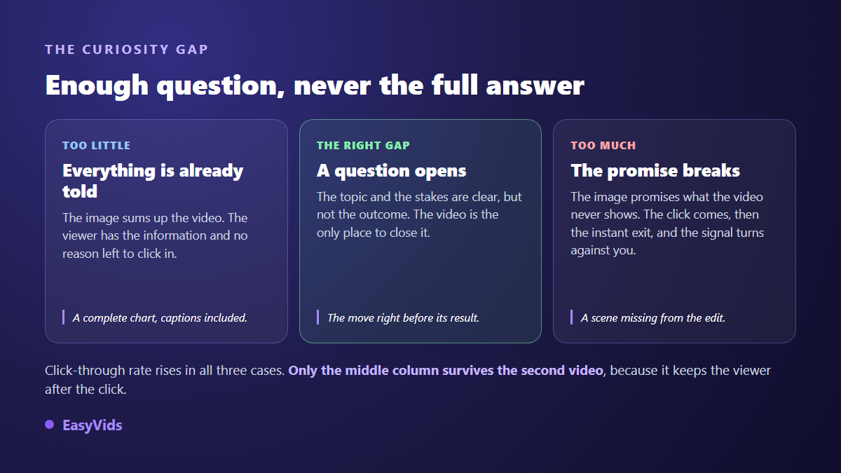
George Loewenstein set out the information gap theory of curiosity in 1994 in Psychological Bulletin: curiosity appears when someone perceives a gap between what they know and what they want to know, and that gap becomes uncomfortable as soon as it is made visible. A working thumbnail manufactures exactly that. It shows enough for the stakes to be clear, and not enough to close the question.
The most common mistake is not lying, it is generosity. A thumbnail that shows the final result, the full chart or the answer in plain words hands the viewer what they came for, and they leave satisfied without clicking. The opposite failure, promising a scene that is not in the edit, collects the click and then the instant exit. The sweet spot sits just before: the gesture before its result, the door before what is behind it.
Three words, and never a copy of the title
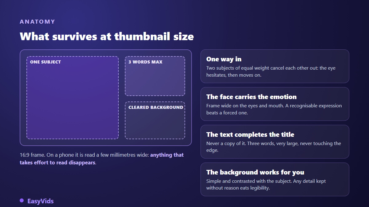
Thumbnail text is not a subtitle. It works with the title, and the title is already written right next to it. Repeating the same words wastes half of your attention surface. The split that works: the title announces the subject, the thumbnail adds the stake, the contradiction or the objection.
On length the rule fits in one line: three words maximum, very large, never touching the edge. One word is often enough. The text has to stay readable when the image drops to thumb width, which rules out thin fonts, stacked outlines and full sentences. If the image still reads without the text, keep the text anyway: it confirms, it does not explain. Those three frozen words have nothing in common with the text living inside the video, where words can be cut to the voice: our guide to kinetic typography covers that case, which follows different legibility rules.
The thumbnail test, forced by mobile
YouTube states on its press page that more than 70 % of watch time comes from mobile devices. Your image will not be judged on a large screen but on a few centimetres, often in motion, sometimes in daylight. Every composition decision follows from that constraint, not from what you see in your image editor.
Checking takes ten seconds. Shrink your image to about a tenth of its size, or step two metres back from the screen, then ask three questions: can I see the subject, can I read the text, can I tell this tile apart from its neighbours. One no means a composition problem, never a resolution problem.
Why a rising click through rate can be bad news
Click through rate is never read alone. The YouTube Help Centre explains that the figure measures the share of impressions that turn into views, and that it has to be read next to watch time: a high rate followed by instant exits points to a promise the video did not keep.
YouTube's own testing tool confirms it. According to YouTube Help, the test and compare feature rotates up to three thumbnails and picks the winner on watch time share, not on click through rate. The platform rewards the thumbnail that brings the right audience, not the one that catches the most thumbs. YouTube's thumbnail policy points the same way by banning images that do not represent the content of the video, with removal of the thumbnail as a possible outcome.
The mistakes that come back most often are perception mistakes, never resolution mistakes.
- Two subjects of equal weight: the eye hesitates, then moves to the next tile.
- Title words copied into the image: half the surface says nothing new.
- A busy background kept out of convenience: every useless detail eats the subject.
- A forced expression with no visible cause: an emotion needs an object in the frame.
- The same palette as the competition: similarity cancels the isolation effect.
- Text parked in the bottom right corner, where the video duration is overlaid.
Building the thumbnail with AI without landing on generic
An image generator knows nothing about the grid you are about to land in, so you have to feed it what perception demands: one subject, a named emotion, a simple background. In the EasyVids studio the Thumbnails tab is built on exactly those inputs. You describe the subject, pick a channel style among eight (viral, gaming, vlog, documentary, tutorial, horror, luxury, spiritual), name the emotion (surprise, shock, joy, fear, serious), type the overlay text, then generate in 16:9 for a standard video or 9:16 for a short.
Two details change the outcome. Attaching a face photo as a reference puts the right person on the image instead of an invented face, which fixes consistency from video to video. And generating several variants takes minutes, which finally allows sorting: keep the one that survives at thumb size, not the one you like at full width. Prompt writing follows the same principles as any generated image, covered in our guide to AI image generators, and the credit system is set out on the pricing page.
What click through rate to aim for
The YouTube Help Centre states that half of all channels and videos sit between 2 % and 10 % impressions click through rate. Treat that as a landmark, not a target. A video pushed to a wide cold audience mechanically shows a lower rate than one served to loyal subscribers. Compare your own videos on similar topics rather than against a general average.
On timing, patience is the only honest method. The first hours mostly reflect your existing audience, the people who click out of habit. Wait until impressions come from the home feed and suggestions before drawing conclusions, and change one variable at a time, thumbnail or title, never both on the same day.
Frequently asked questions
Does a high click through rate guarantee more views?
No. Click through rate triggers the first wave, retention decides the rest. A thumbnail that promises more than the video delivers looks strong for a few hours, then distribution slows because viewers leave early. The winning pair is an earned click followed by an opening that keeps the promise of the image.
Do I need a face if I never film myself?
A face helps, but nothing forces you to show yours. A recurring character, a silhouette, hands in action or an object staged as a living subject create the same pull. What matters is one entry point and one identifiable emotion, not an identity.
Why does my thumbnail work on desktop and not on mobile?
Because you approve it large and it is consumed small. Thin fonts, distant faces and busy backgrounds vanish at real size. Run the shrink test before every upload: it is the only check that reproduces how your audience actually sees the image.
Should I test two thumbnails or trust my instinct?
Test, as soon as the video gets enough impressions for the difference to be readable. YouTube Studio offers a test and compare feature that handles rotation and names the winner. On a low traffic video, instinct guided by the shrink test beats a test that will never reach enough data.
Can I reuse the same thumbnail for a short?
No, the framing breaks. An image designed in 16:9 and cropped to vertical cuts the subject or the text. Generate a dedicated version in the right ratio, with the subject placed higher, because the short format interface covers the bottom of the screen.
Keep the order in mind, it matters more than any trick: stand apart from the grid, be understood in one glance, then open a question only the video can close. A thumbnail tested at thumb size beats a thumbnail admired at full screen. To generate your variants, compare them and keep the one that holds up small, create a free account and open the Thumbnails tab in the EasyVids studio.