You need to explain your offer in one minute, and you have no designer, no camera and no production budget. The quotes you received talked about weeks of work, and the software you tried asked for months of practice before producing ten clean seconds. That is exactly where motion graphics live: video that is entirely drawn and animated, with nothing filmed, where every word, shape and figure appears at the moment you decided.
The idea was never the blocker. The tool was, along with one stubborn belief: that you must master a professional animation package before you are allowed to produce anything at all. This guide takes the opposite route. First what the technique is genuinely for, then the principles that make movement watchable instead of tiring, then the practical ways to produce when you are not a designer.
The short answer
Motion graphics animate graphic elements, meaning type, shapes, icons or a logo, in order to show what a camera cannot film: an idea, a flow, a mechanism, a comparison. The five common deliverables are the explainer video, kinetic typography, the logo sting, on screen branding and the series intro. Three settings separate good animation from tiring animation: a rhythm that varies, movement that starts firmly then slows on arrival, and a reading hierarchy that makes it obvious where to look. The rest is a question of tooling, and the tool no longer has to be a professional package. If assisted video production is new to you, our guide to AI video generators lays out the full chain.
Motion graphics, character animation and AI video are three different things
The three terms travel together and describe distinct crafts. Motion graphics animate graphic material: typography, shapes, curves, a logo. They do not try to imitate reality, they diagram it. Character animation tells a story through a body and a face, which is another discipline entirely. Generated video builds realistic or illustrative imagery from a description, with the unpredictability that comes with it.
That distinction has a very practical consequence. A video model can produce a believable scene, but it writes on screen text badly and will not respect your brand colours to the pixel. Motion graphics do the reverse: type stays perfectly crisp, colours are exactly yours, and nothing appears by accident. For a product explanation, a figure to highlight or a set of instructions, this is the technique that wins. For mood, scenery or a face, generated imagery takes over. The strongest videos often combine both, each on the ground where it is stronger.
Five deliverables, and one that starts working immediately
The term covers a family of outputs that differ widely in length, effort and expected effect. Telling them apart stops you from commissioning branding when what you needed was an explanation.
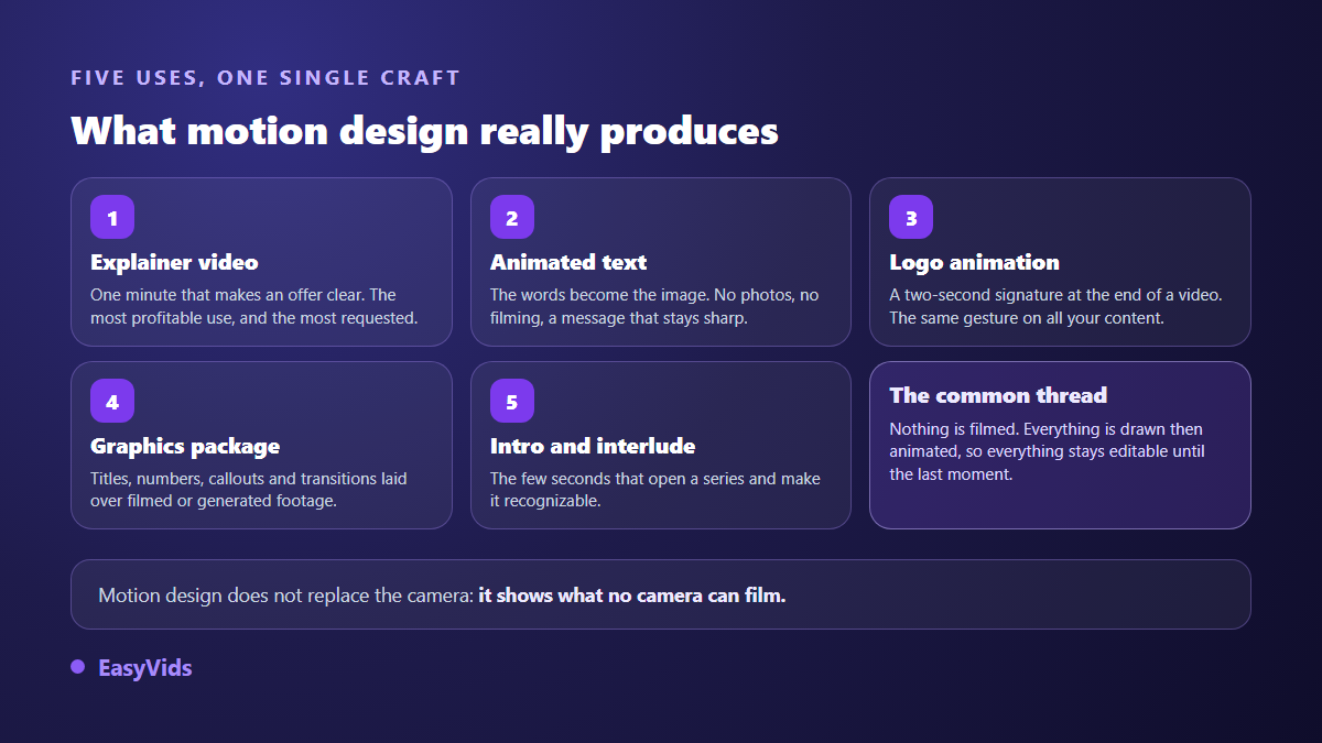
If you can only pick one, pick the explainer video. It is the only format that works while you are away: placed at the top of a sales page, inside a welcome message or as the answer to the question every customer asks, it replaces a paragraph nobody reads. Logo animation and on screen branding come later, once the brand needs a signature that carries from one video to the next.
What makes movement pleasant to watch
Failed animation is rarely a technical failure. It fails because everything moves the same way, at the same time, at the same speed. Four levers fix almost every case, and none of them requires redrawing anything.
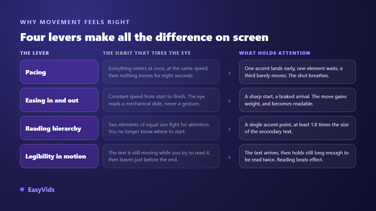
Rhythm comes first. A shot has an accent: one thing enters early and catches the eye, a second arrives after a pause, a third barely moves. Three elements starting at even intervals read like a list unrolling, which is the opposite of an intention.
Easing, the acceleration and deceleration of a move, comes next. An object travelling at constant speed feels mechanical, because nothing in the physical world behaves that way. A move that leaves firmly and brakes on arrival gains weight, and the eye reads it as a gesture rather than a displacement. It is the highest return setting in the whole craft: it changes nothing in your composition and everything in the perception.
Reading hierarchy closes the list. At any given moment one element dominates and everything else is visibly subordinate to it. On our own shots we work with a measurable rule: a size ratio of at least 1.8 between the dominant text and the secondary text. Below that, both read as one level and the viewer no longer knows where to start. Then comes the lever everyone forgets, reading time: text must hold still long enough to be read twice before it leaves. The same hierarchy rules a still image, where the choice is tighter still: our YouTube thumbnail examples sorted by niche show what one dominant element does in a frame read in a fraction of a second.
The one minute explainer, structured
An explainer video is not a summary of your offer. It is a demonstration of understanding: you show the viewer that you know their problem as well as they do, and only then does your solution become credible. The structure that works has five beats, and their order matters more than the exact length of each.
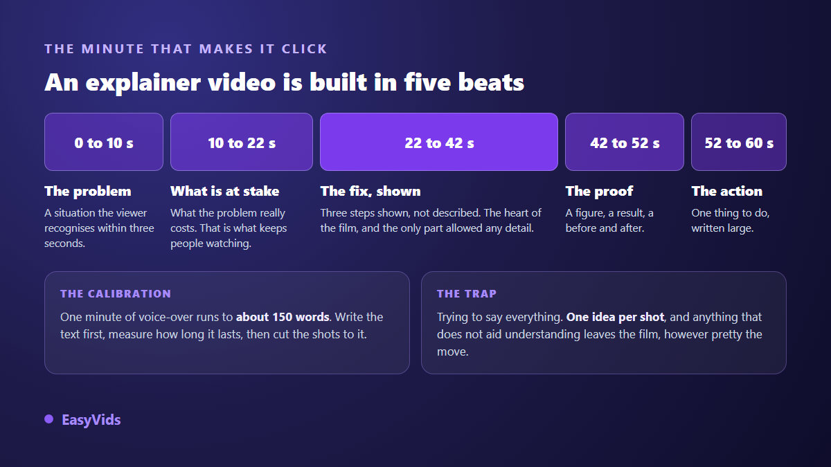
Two calibration habits keep the film from rambling. Write the script before drawing anything, then measure its real duration: one minute of voice over is roughly 150 words. Then allow yourself one idea per shot, because a shot carrying two ideas conveys none. Our own engine applies a close rule on duration: past roughly eight seconds, a shot whose animation has already settled is no longer motion graphics, it is a slide. The text is split into two shots instead.
Kinetic typography, when the words are the image
Animated text is the most accessible entry point into the craft, because it needs no illustration at all. The principle is to stop treating words as a caption laid over a picture, and start treating them as the graphic material itself: strongly contrasted sizes, different weights, deliberate line breaks, isolated words, very large figures. What is said gets shown, rather than merely subtitled.
One rule about size decides most outcomes, and beginners miss it most often. Video is watched on a large screen or on a phone, never at reading distance like a web page. On a 1920 pixel wide frame, a dominant word sits between 90 and 220 pixels tall, a heading between 64 and 140, secondary text between 32 and 56. Below 28 pixels nothing survives platform compression. Those are the thresholds we enforce on our own shots, and they transfer as they are to any tool.
Two guardrails complete the picture. Keep anything meant to be read at least 5 % away from every edge, otherwise the app interface will cover it. And never show more than three readable blocks of text at the same moment. Captions remain essential on top of all this, since a large share of the audience watches with the sound off. The same size and contrast reflexes apply outside the film itself, starting with the image that earns the click, covered in our guide to the YouTube thumbnail.
Mistakes that make animation tiring
They come back whatever the tool, and they are all fixed without redrawing a single shape.
- Fading every element in from the bottom: it is the default gesture, and it shows the moment it is the only one in the video.
- Letting a shot sit frozen while the voice over keeps talking. Split it instead of stretching it.
- Moving text while the viewer is trying to read it.
- Centring everything out of habit. The centre is a compositional choice, never a default.
- Piling up colours: three are enough, and only one of them belongs to the accent.
- Confusing a transition with an effect. A transition links two ideas and goes unnoticed; an effect that gets noticed steals attention from the message.
- Picking the aspect ratio at export instead of before composing, which always cuts off something that mattered.
Producing without professional software
Three routes exist today, and they do not serve the same need. Comparing them honestly saves you from paying for a subscription that does not cover your use. If your toolkit is not settled yet, our comparison of AI tools for content creators reviews each family and what it genuinely does.
- Template libraries. You swap the text inside a ready made animation. Fast and reassuring, but your video will look like every other customer of that same template, and your brand never quite fits inside it.
- The online editor. You compose your own shots with animated headings, shapes and transitions. Freer, slightly slower, and more than enough for branding, intros and kinetic typography.
- Code driven generation. The film is not assembled from existing clips: every shot is written for that specific film, then computed frame by frame. Type stays perfectly crisp, colours are exactly your own, and nothing is inherited from a template.
That third route is the one we are building at EasyVids, and its principle fits in a sentence: the video is produced by code, with no prefabricated template. An art direction is written for the project, a shared set of rules gives the film its unity, and animation timing is expressed as a fraction of the shot duration. The practical consequence is that changing the voice over or fixing a sentence does not require rewriting the animations, since they realign themselves on the new duration. Each shot is then captured and reviewed to confirm that no text is hidden, cut off or too faint to read.
One point of honesty: that piece is still under construction and is not open on every account today. The studio itself is available as soon as you sign up for the rest of the chain, from scripting to visuals, natural sounding voice over, music and editing. Our pricing page lists what each plan includes.
Aspect ratio and voice over, the two decisions to make first
Aspect ratio is decided at the start, not at export. A video composed in landscape and later cropped to vertical always loses something that mattered, because the composition was built on the width. The three useful frames are landscape, full screen vertical and square, and the best move is to produce directly in the one your platform uses. The voice over then drives the edit: in a well built chain its measured duration sets the length of every shot, never the other way round. For the full chain applied to a real case, our step by step YouTube video walkthrough covers each stage in context.
Frequently asked questions
Do I need to be able to draw?
No. Motion graphics work with simple shapes, typography and colour, not with illustration. What matters is a sense of composition and rhythm, and both are built by watching a lot of video and then holding yourself to the legibility rules above.
How long should an explainer video be?
Between 45 and 90 seconds in most cases. Shorter, and the problem has no time to land. Longer, and you need a real narrative reason. On a sales page, length matters far less than the first ten seconds: if viewers do not recognise themselves immediately, the rest goes unwatched.
Do motion graphics work in vertical format?
Yes, and it is one of their advantages over filmed video. Since everything is composed, nothing forces you to crop: the same message is redrawn for a vertical frame, with larger type and fewer elements on screen at once. The only rule is to choose the frame before composing.
Can I make an animated video without a voice over?
Yes. Kinetic typography carried by music works well in a social feed, where people read without sound. The constraint moves to reading time: each block must stay on screen long enough to be read twice, and the word count drops sharply.
How is this different from AI generated video?
A video model produces imagery that looks like reality, with some unpredictability and on screen text that is often mangled. Motion graphics are computed: type is crisp, the brand is respected, and rerunning the same project gives the same result. The two complement each other, one for mood, the other for explanation.
Motion graphics are no longer reserved for people who spent months inside an animation package. What stays rare is the discipline: one idea per shot, one accent per frame, movement that brakes on arrival, text large enough to read on a phone. Start with a single one minute video answering the question your customers ask most, and measure what it changes on your page. Creating an account opens the studio to write, illustrate, score and edit that first video.