You sell something, and you photographed it on the kitchen table with your phone. The picture looks exactly like what it is: a shot taken on a kitchen table. Cluttered background, yellow light, shadow falling the wrong way, a window reflection across the packaging. That is the gap an AI product photo generator closes: you keep your own picture as the starting point, and you get a catalogue image back, with a chosen set, studio lighting, and a product that is still yours.
The promise holds. The method is what people get wrong, and almost always for the same two reasons: the source picture was unusable, or the model was given permission to redraw the product. This guide walks the whole path, from the five minute shoot to the check you run before publishing, including the public rules that decide what you are actually allowed to put online. If you want the underlying mechanics first, our guide to AI image generators covers them.
The short answer
Shoot your item sharp and complete against a plain background, drop that picture in as a reference image, then describe the set, the light and the angle you want, never the product itself. The model places your object into a believable scene instead of inventing it. Generate three moods from the same photo, keep the best one, check the label and the colours, publish. Once the shoot is done, each visual takes minutes.
What the model does with your picture, and what it must never do
Two very different jobs share one name. The first is creating an image from nothing: you describe a serum bottle on marble, and the model invents the bottle. Fine for a mockup, useless for selling, because the item that ships will not match the picture. The second is starting from your photo and changing only what surrounds it. That is the one you want, and model catalogues have a precise name for it: editing from a reference image.
The distinction is not cosmetic. In the first case, accuracy is luck. In the second, your picture is the anchor: the model keeps the shape, the proportions, the colour and the label, then reworks the background, the light and the staging. Not every model can do this. The ones that can accept one or more input images, and that is more or less the only criterion that matters when you choose.
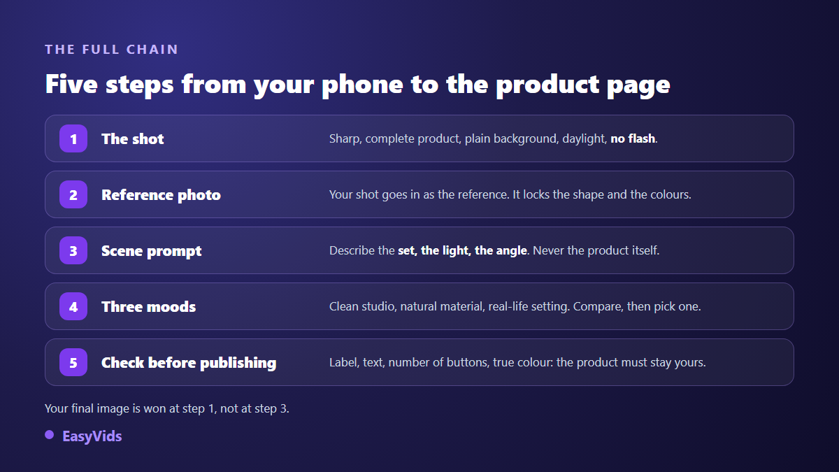
One point of method before the detail. A blurry, underexposed or cropped source will give you a beautiful scene wrapped around an approximate product, and the flaw shows more, not less, as the set gets cleaner. The better the render, the less it forgives a rushed photo.
A five minute shoot that saves you two hours
You need no studio, no light box and no dedicated camera. A recent phone, a window and a sheet of paper will do. What matters is giving the model sharp, complete information about the object.
- Work next to a window, never in direct sun, and turn the flash off: it flattens volume and drops a hard reflection on glossy surfaces.
- Slide a white sheet or plain card behind and under the product, so the model does not invent a material along its edges.
- Frame the whole product with a little air around it. A cropped object forces the model to rebuild what is missing, and it rebuilds it badly.
- Focus on the label, then zoom in to check the text is readable. What you cannot read, the model will not read either.
- Take three angles: front, three quarter and top down. They feed different shots and cost you thirty extra seconds.
- Wipe the product before shooting. Fingerprints, dust and lint survive generation and stand out against a clean background.
- Shoot the whole range in one session, under the same conditions. That is what makes a store look consistent from item to item.
The prompt formula: set, light, angle, material, format
The instinct is to describe the product. It is the most common mistake, and an understandable one: you want to be sure you are understood. But the product is already described, with a precision no sentence will match, by the picture you just uploaded. Describing it a second time hands the model two competing sources, and it settles the argument by redrawing.
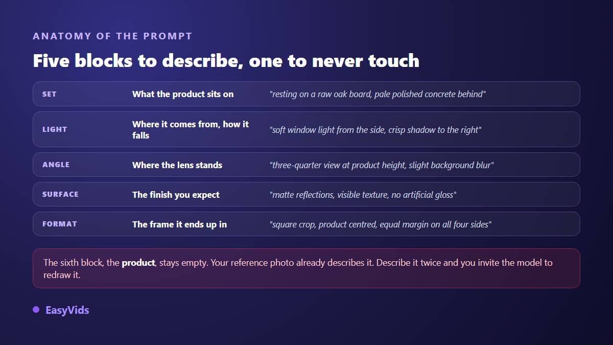
So describe everything else, in this order. The set: what the object rests on and what you sense behind it. The light: where it comes from, soft or hard, where the shadow falls. The angle: lens height and orientation. The material you expect on the surface, to keep away the plastic sheen models like to add. And the format, because a visual built for a square listing does not survive a crop into a banner.
- Cosmetics, clean look: resting on a pale stone plinth, plain pearl grey background, soft side window light, crisp cast shadow to the right, lens at product height, square crop, even margins.
- Food, warm look: on a raw oak board, a few fresh ingredients blurred behind, low morning light, three quarter view slightly from above, vertical crop.
- Accessory, in context: on a light wood desk with a notebook and a mug out of focus, diffuse daylight, top down view, horizontal crop, end of day mood.
One setting earns its place every single time: ask explicitly for a cast shadow, and state its direction. Without it the product looks pasted onto the background, which is the fastest giveaway there is. A shadow that contradicts the light you described does the same damage, only worse.
The six shots a product listing needs
A listing that converts never rests on one image. It tells a progression: recognise the item, grasp its size, picture the use, feel reassured about the finish. These six shots cover that path, and all of them come from the three angles you took at the shoot. If your use shot features a person, holding that same face across the whole range is a job of its own, and the consistent character method explains how it is done.
- The cut out shot: product alone on white, discreet shadow. This is the main image, the one that appears in search results.
- The mood shot: the same product in a set that speaks to your buyer. This is the one that creates desire.
- The scale shot: the product beside a familiar object, or held in a hand. Misjudged size remains a leading cause of returns.
- The material close up: texture, stitching, finish, grain. It answers doubts about quality.
- The use shot: the product mid task, in the gesture a real customer makes.
- The contents shot: what is in the box, laid flat, readable at a glance.
Formats and sizes: generate for the listing, not for your screen
Pick the format before you generate, never after. A serious generator offers square, vertical, horizontal and several ratios in between, and producing straight to the right frame avoids the crop that always removes something. For a marketplace listing, square remains the safe bet, because most storefronts display it untouched.
Two public reference points are worth remembering on size. Shopify's help centre recommends square product images of around 2048 pixels per side, which leaves room for zoom without weighing the page down. And Amazon's Seller Central image requirements ask for at least 1000 pixels on the longest side before the zoom function activates, with 1600 pixels as the recommended value. Generating at 2K, where the model allows it, covers both without further thought.
What marketplaces actually allow
This is the part almost nobody reads, and the one that gets listings pulled. The rules change with the slot the image sits in, they are published openly, and they bear on what the image claims, not on how it was made.
According to Amazon's Seller Central image requirements, the main image of a listing must be a photograph of the product actually sold, on a pure white background, with no added text, logo, border or watermark, and the product must fill at least 85 % of the frame. Drawings, mockups and placeholder images are excluded. In plain terms: cleaning a background to reach that white is compliant, placing your item on an oak board is not, in the main slot.
Google Merchant Center image requirements point the same way for listings fed into Google Shopping: no watermark, no promotional overlay, no added border, no generic stand in image. Between those two documents you can settle nearly every case.
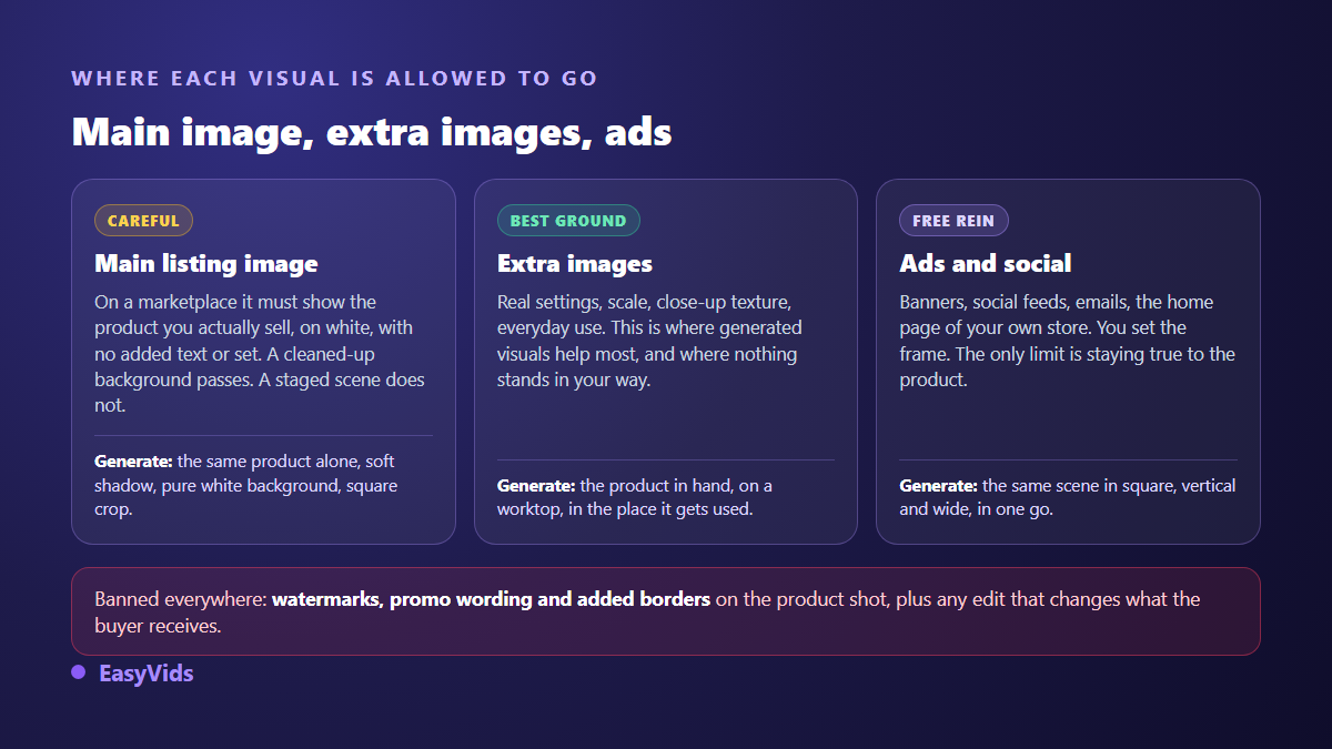
That split shapes how you work. Secondary images welcome staging, scale, material detail and use without reservation. This is where generated visuals add the most, and also where most sellers have nothing at all, for lack of production means. The same logic extends to presentation videos, which can now be produced without a studio or a shoot.
Accuracy is not optional
One rule covers the whole subject: the visual has to stay a promise you can keep. What the customer receives must match what they saw. European Directive 2005/29/EC on unfair commercial practices treats as misleading any presentation that deceives the consumer about a product's main characteristics, and consumer protection authorities elsewhere reason the same way.
In practice the line is sharp. Changing the set, the light, the angle or the background is allowed, that is photography. Changing the real shade of a fabric, erasing a seam, stretching a bottle, adding an accessory that is not in the box is not, and it is also the surest way to push your return rate up. Run this check before every upload.
- Colour: does it match the object in front of you, seen under neutral light?
- Label text: is it identical, letter for letter? This is where models give themselves away most often.
- Element count: buttons, pockets, included parts, visible accessories, all exact?
- Proportions: does a handle look longer, a cap wider? It slips past on screen, never on arrival.
- The set implies nothing that is not sold: not the plinth, not the plant, not the mug beside it.
- Plausibility: a shadow running two ways or an impossible reflection destroys trust in one second.
How it works inside EasyVids
Everything happens on the generation screen in image mode. You drop your photo into the reference area, up to five depending on the model, write the scene prompt, set the format, and launch. Models able to read a reference are flagged as such in the list: the others would simply ignore your picture and hand you an invented product.
Three behaviours are worth knowing. The studio shows the credit cost before you launch, so you can explore on an economical model and switch to a premium one for the final version. A prompt assistant writes a rich description from a simple theme when the blank page blocks you. And several generations run in parallel, which makes exploring three moods as fast as exploring one. Plan details live on the pricing page.
One last thing: as soon as you attach a reference image, generation returns one image at a time, whereas a generation without a reference can produce several at once. Editing a given image has no free variants. It pushes you to write a precise prompt rather than roll the dice, which is the right habit anyway.
Reusing the visual once it works
A good product visual never serves once. The same file feeds the listing, the banner, the social feed and the ad campaign. The moment it becomes a thumbnail, it follows the same readability constraints as a video thumbnail: large subject, strong contrast, nothing important in the corners, because the corners get cut.
The next step is giving it motion. A still animated for a few seconds holds attention far better than a carousel, and the ways to animate a photo start from exactly the file you just produced. From there the natural route leads to a full product video, cut from the same visuals and the same art direction.
Frequently asked questions
Do I need to cut out the photo before uploading it?
Not strictly, but it helps a great deal when the original background is busy. A plain backdrop, even improvised with a sheet of paper, does the same job as a cut out and stops the model inventing material along the edges. If the shot was taken on a cluttered table, retake it with paper behind: that is faster than fixing it afterwards.
Can these images be used as a marketplace main image?
Only if the result respects the main image rule: the product actually sold, on white, with nothing added around it. A background clean up qualifies. A staged shot on wood or marble belongs in the secondary slots. On your own store, where you set the rules, staging is free as long as it misleads nobody.
Will the AI change my product's colour?
It can, especially if your source lighting leans yellow or if you name a colour in the prompt. Two habits solve it: shoot in daylight, and never name the product's colour in the description. Then compare the final visual with the real object before publishing, not with your memory of it.
How many photos does a whole store need?
One good reference photo per item is enough to produce its six visuals. The workload is measured in items, not images: an hour of shooting covers around thirty products, and generation follows at your own pace, reusing the same set prompt across the range.
Do I have to disclose that a visual was generated?
It depends on the platform and on what the image shows. Several social networks now require realistic AI generated or edited content to be declared, and their terms move quickly, so read the ones that apply to you. On a product listing, compliance comes first: if the visual represents the item accurately, you are within the rules.
The lever is not the model you pick, it is the discipline: a sharp photo on a plain background, a prompt that only talks about the scene, an honest check before publishing. Three items handled that way already make a store look more credible than most of the ones running on snapshots. To try it on your own catalogue, create your account and drop your first photo into the image generator inside the EasyVids studio.