Your voice over is clean, your script holds up, and the video still feels flat. Words scroll along the bottom of the frame and nobody reads them. Kinetic typography solves exactly that problem: instead of captioning the voice, it puts the words in the middle of the frame, brings them in the moment they are spoken, holds them still long enough to be read, then clears them before the next ones land. No shooting, no stock footage, no cast.
The craft has a reputation for being specialist work, because nearly every tutorial out there opens a compositing app and stacks layers for three hours. That is a tooling problem, not a method problem. The real work is two decisions per group of words: at what second it appears, and what gesture it makes on arrival. Our motion design guide covers the wider discipline; this piece goes deep on animated text and its timing.
The short answer
Kinetic typography means letting the text itself carry the meaning, locked to the voice. Five steps: write for the ear, produce the voice over before any visual, pull the real timings from that audio, cut the text into groups of two to four words, then give each group an entrance, a still hold and an exit. An online editor with keyframes is enough. Nothing gets eyeballed at edit time: the timing pass does the heavy lifting.
Kinetic typography, animated text and captions are not the same thing
Three practices get mixed up constantly, and blending them produces something that reads as amateur. Captions transcribe everything that is said, at the bottom of the frame, often in short bursts for rhythm: their job is accessibility and retention. Animated text drops an effect on a title that never changes. Kinetic typography does something else: it selects a few words, sets them very large, makes them the subject of the shot, and needs no illustration at all.
That distinction has a practical consequence. You never run a whole script through kinetic typography. Across our own shots we rarely keep more than one word in three on screen, the ones carrying the idea, and leave the rest to the voice. If your goal is instead to display the entire script for viewers watching with the sound off, word by word animated captions serve that better, and the two happily coexist in one video.
The word must land on the syllable, not after it
This is where everything is won or lost. A word appearing a fraction of a second after it was spoken reads as software lagging behind, and viewers feel it without being able to name it. Our renders run at 30 frames per second: at that rate, a delay of three or four frames, roughly a tenth of a second, starts to show. Half a second ruins the shot.
The fix is counter intuitive: the entrance starts before the word, so the text sits at full size at the exact moment the stressed syllable lands. You are not syncing the start of the animation to the voice, you are syncing its end. The same logic applies on the way out: the word leaves during the silence that follows, never underneath the next word.
The production chain, in five steps
Order matters as much as craft. Animating before the voice exists means recalibrating everything the moment a sentence changes, and that mistake costs an entire evening.
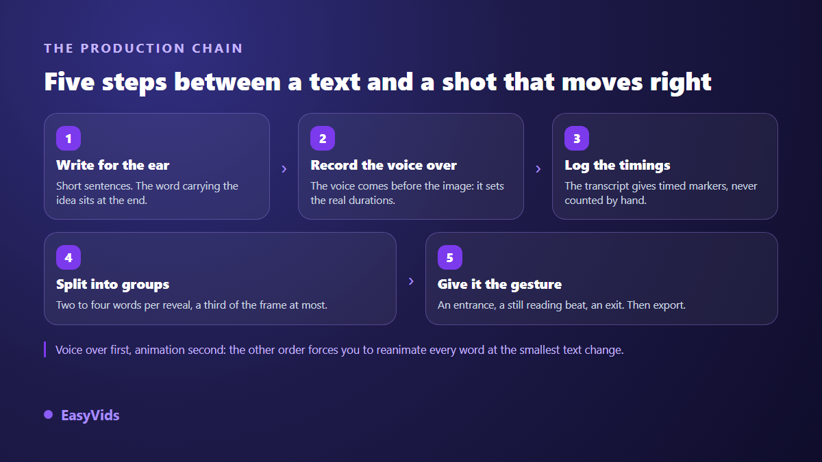
- Write for the ear. Short sentences, one idea each, with the key word at the end where it can stay on screen.
- Produce the voice over. Synthetic or your own, it makes no difference, but it must exist before the first word is animated.
- Pull the timings. Transcription returns timed markers. Never count seconds by hand on a waveform.
- Cut into groups. Two to four words per appearance, never a full sentence in one block.
- Give the gesture. An entrance, a still hold, an exit, then export at the aspect ratio of the target platform.
One useful yardstick before the audio even exists: across our productions, roughly 110 characters of voice over run about six seconds. A 220 character sentence therefore fills around twelve seconds, which is five to seven text appearances.
Getting the timings without counting seconds
This is the step everyone dreads, and the one that automates best. Transcription returns the audio as dated segments, each with text, a start and an end. In the EasyVids editor that transcription runs inside the browser, then the segments are re-cut into short groups, three words by default, with a floor of 0.8 second per group so no appearance is too brief to read.
You end up with a text track that is already in sync, and all that remains is styling and animating it. One technical trap is worth knowing, because it only shows up at the end of a long video: rounding each shot separately makes the errors add up until the text drifts away from the voice. Our engine computes cumulative boundaries in whole frames for that reason. In an editor, the equivalent safeguard is to anchor every group to an absolute marker from the transcription, never to the end of the previous group.
The three beats of a shot
Every text appearance splits into three beats, and only one allows movement. The entrance runs six to ten frames, about a quarter of a second. The still hold takes the rest, with a floor near eight tenths of a second and a ceiling around one second for three short words. The exit is faster than the entrance, four to eight frames.
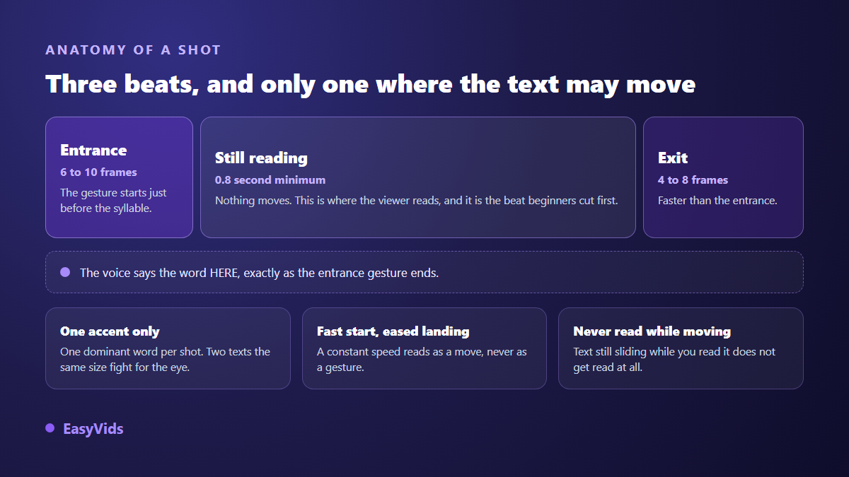
One rule follows from that split: nobody reads text that is still moving. An animation running for the whole display time gives an unreadable shot, however pretty it looks in slow motion. Add acceleration on departure and braking on arrival rather than constant speed, which reads as mechanical displacement instead of a gesture.
What the voice does decides what the word does
The gesture is not decoration, it translates the intent of the sentence. That is what separates a finished piece from a random catalogue of effects. Six situations cover most of an ordinary narration.
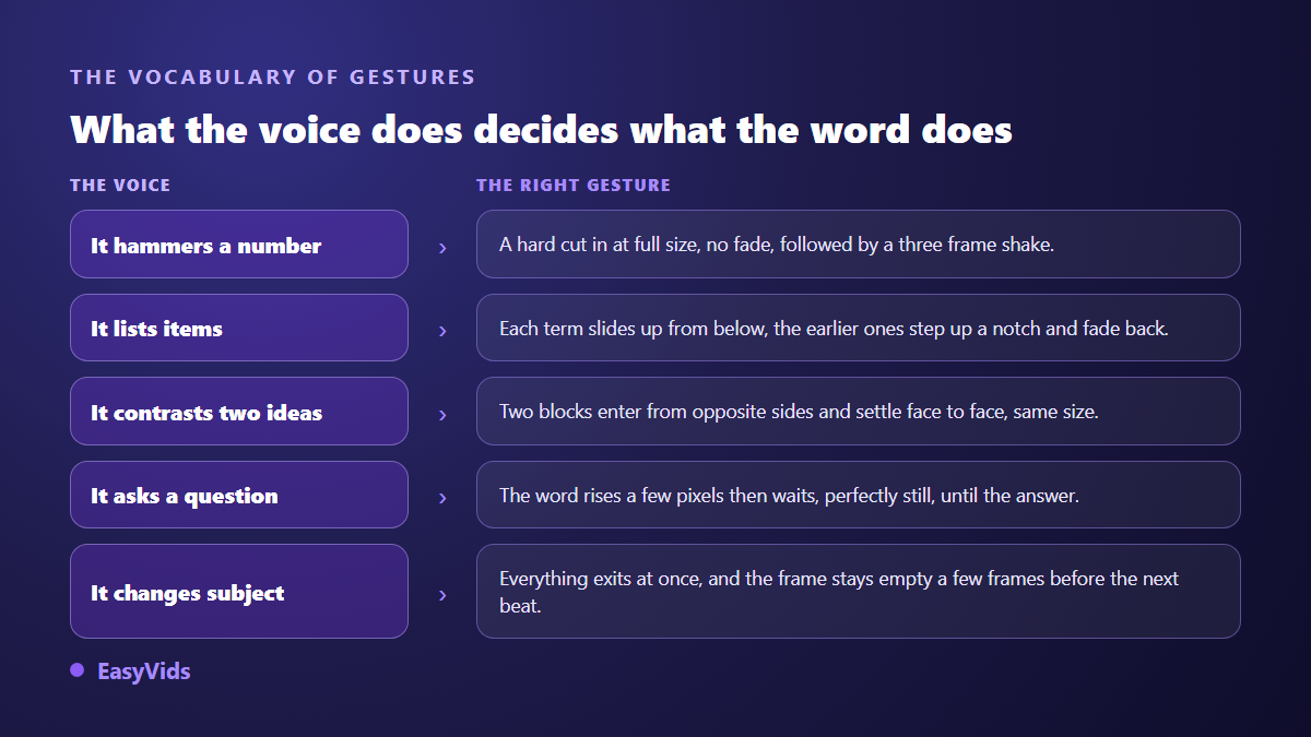
- The voice hammers a number: hard cut in at full size, no fade, plus a three frame shake.
- The voice lists items: each term slides up from the bottom while the previous ones step up and fade back.
- The voice contrasts two ideas: two blocks enter from opposite sides at equal size and settle facing each other.
- The voice asks a question: the word rises a few pixels and waits, perfectly still, until the answer.
- The voice insists: a short pulse while the delivery slows, with no displacement.
- The voice changes subject: everything leaves at once, and the frame stays empty for a few frames.
In the online editor, a text element carries its own animation tab: entrances, exits and looping accents such as pulse, shake, jolt, sway or blink, each adjustable in intensity. For a gesture the catalogue does not cover, keyframes take over on position, scale, rotation and opacity, with adjustable easing curves. That is more than enough for everything above.
Sizes that survive a phone screen
Video is not read like a web page. On a 1920 pixel wide frame, these are the thresholds we hold ourselves to: a dominant word sits between 90 and 220 pixels tall, a title between 64 and 140, secondary text between 32 and 56. Below 28 pixels nothing survives platform compression. Keep anything meant to be read at least 5 percent away from every edge, and never show more than three readable blocks at once. Favour heavy weights and wide letterforms: thin strokes vibrate in motion and encoding finishes them off.
Background, colour and silence
The professional default is a flat background. One dark colour, one accent, nothing else, so the text becomes the only subject. If you want texture behind the words, a generated image works provided you desaturate and blur it heavily, as covered in our AI image generator guide. Silence matters as much as movement: an empty frame between two ideas beats a continuous stream that tires the eye within twenty seconds.
Producing without compositing software
Two routes lead to the same result. The first runs through an online editor: import the voice, run the transcription, collect pre-timed word groups, style and animate each one, export. Everything happens in the browser. The second builds the video in code: a page animated in HTML and CSS, photographed frame by frame and encoded, which keeps the text perfectly sharp at any size and matches a brand palette to the pixel. That is the route we use for our own motion design films. Either way the spend is counted in credits, and the detail lives on the pricing page.
Mistakes that show immediately
- Too many words on screen: a full sentence in small type is just a badly placed caption.
- The same effect from start to finish, which turns the video into an animated slideshow.
- Text still moving while the viewer tries to read it.
- Appearances landing after the voice instead of ahead of it.
- Thin light type on a light background, unreadable after the first compression pass.
- No silence at all: continuous motion drains attention faster than boredom.
Frequently asked questions
Do I need professional software for kinetic typography?
No. An online editor with keyframes on position, scale and opacity covers every gesture described here. Compositing software becomes useful for textures, complex masks and 3D, not for putting words on a voice.
How do I sync text to a voice without counting seconds?
Transcribe the audio. Transcription returns dated segments, which the editor cuts into short word groups with their start times. You adjust from those markers instead of hunting for moments on a waveform.
How many words should be on screen at once?
Two to four for a rhythmic appearance, six at most for a sentence you want people to read. Beyond that, viewers stop reading and wait it out. Three readable blocks at the same time is the hard ceiling, hook and signature included.
Does kinetic typography replace captions?
No, and keeping both is the better call. Animated text carries the strong words, captions carry accessibility and the full message for sound off viewing. Just park the captions in a zone that never collides with the full frame text.
Which font works best for animated text?
A heavy sans serif with wide, open shapes. Avoid thin italics, script faces and anything built on one pixel strokes: motion and compression destroy them. One family per video is plenty, with size and weight doing the work.
Kinetic typography rewards method more than graphic talent: voice first, timings measured rather than guessed, two to four words per appearance, and a gesture chosen for what the sentence actually does. The rest is refinement. To animate your first text on a voice over, creating an account opens the editor and the production workshop, and the EasyVids studio keeps writing, voice and editing in one place.