You drop a title onto your video. It appears in one block, sits frozen for eight seconds, then vanishes. The message lands, but nothing holds the eye, and the viewer has already scrolled past. Text animation changes that relationship: the word arrives, it takes its place, it gives the reader time, then it hands the frame to the next one. It is the cheapest upgrade in editing, because it needs no shoot, no illustration and no production budget.
The trap comes right after. A catalogue of effects opens, everything looks tempting, and the video ends up with nine different animations in forty seconds. This guide works the other way round: the nine effects that genuinely cover the need, what each one says, and the timing that makes them readable instead of tiring. For the wider discipline, our complete motion design guide sets out the principles; here the work happens at the level of the word.
The short answer
Nine effects are enough. Three bring text in: fade, directional slide and zoom in. Three give it impact: pop, bounce and rotation. Three keep it alive during the shot: pulse, shake and float. The rule that matters most is the three times rule: a short entrance, a still stretch for reading, an exit faster than the entrance. One entrance effect per video, one exit effect, and the result already looks deliberate.
What separates animated text from text that just wobbles
The eye follows movement before it reads. That is a reflex, not a preference. Text that moves in attracts attention, which is exactly what you want on a keyword, a number or a name. The problem starts when the movement continues: while text is moving, it is not being read. Motion exists to deliver the reading, never to accompany it.
Animators Ollie Johnston and Frank Thomas set out twelve principles of animation in their 1981 book The Illusion of Life. Two of them are enough for text. Slow in and slow out first: a move that leaves sharply then brakes feels right, while a constant speed feels mechanical. Anticipation second: a tiny pull back before the move gives the word weight. Everything else is layout.
The 9 text animation effects, grouped by what they say
Names differ from one tool to another, families do not. These nine effects appear in every serious catalogue, and each one carries a different intention. Choosing an effect means choosing what you want to say, not picking a fashionable style.
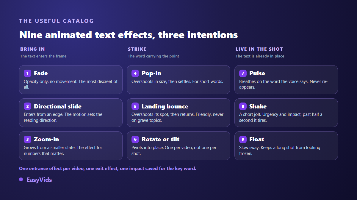
- Fade: the text appears through opacity, without moving. Neutral and quiet, ideal for credits, names and anything that must not steal the shot.
- Directional slide: the text enters from an edge. Direction carries meaning: a stacking list enters from the bottom, a section title from the left, following the reading direction.
- Zoom in: the word grows from a smaller state. It points and it pulls closer, which makes it the effect for the number your argument rests on.
- Pop: the text overshoots its size briefly before settling. Energetic and short, best kept for words of two or three syllables.
- Bounce: the text passes its position then springs back. Friendly and familiar, so avoid it on a serious subject.
- Rotation or flip: the text pivots into place. Theatrical and loud. One per video, never one per shot.
- Pulse: text already in place breathes slightly. It stresses a word while the voice says it, without making it reappear.
- Shake: a short, nervous jolt. It carries urgency, alert or impact. Past half a second it becomes unpleasant.
- Float: a slow, continuous drift. It keeps a long shot from looking frozen, especially when the voice over runs on and the image never changes.
A tenth habit matters as much as the nine effects: the background. Animated text on a busy image becomes unreadable the moment it starts moving. A flat colour, a restrained gradient or a deliberately darkened image behind the text solves it, and generating that background usually takes less time than digging through a stock library.
Entrances, impacts and living effects
The three entrances answer one question: how does the text arrive? Fade disturbs nobody, slide gives a direction, zoom gives importance. Keep entrances between three and six tenths of a second for a short word, up to eight tenths for a full sentence. On our own productions the value that works best sits around half a second, with clear braking at the end of the move.
Impact costs something. Pop, bounce and rotation pull hard on attention, so they wear out fast if they return on every shot. One impact per short video, two at most on a video of a minute, always on the word that carries the argument. Intensity matters as much as the choice: the same bounce exists in soft, normal and strong versions, and a strong bounce on a serious message produces the opposite of what you intended.
Pulse, shake and float do not bring text in, they inhabit it. They should follow the voice. A pulse landing on the spoken word makes the picture feel like it is listening to the narration, while the same pulse placed at random reads as a display glitch. These effects sit on top of an entrance rather than replacing it: in a serious editor, entrance, exit and accent are three separate settings that coexist on the same element.
Two reveals that turn text into the image
The typewriter reveals the text letter by letter at a steady speed. It tells the story of writing happening, and works well on a short message, a typed search or a line of dialogue. Unlike the nine effects above, it is rarely a one click preset: you build it by chaining text elements of increasing length, or you have it written by an engine that produces the video from code.
Text cut out of the image follows another logic: the letters become a window and the footage shows through them. The effect is striking on an opening title, and it calls for a text shaped mask rather than an animation. Our editor offers one, alongside circle and rectangle masks. A slow move on the video behind the letters is then enough to bring the title alive without animating the text at all.
The three times rule: entrance, reading, exit
Animated text works like a spoken sentence: it starts, it lasts, it ends. Reading time is the part everyone forgets, and it decides everything. Time yourself reading the text under your breath, then add half again. A six word title needs roughly two and a half seconds of stillness, not eight tenths.
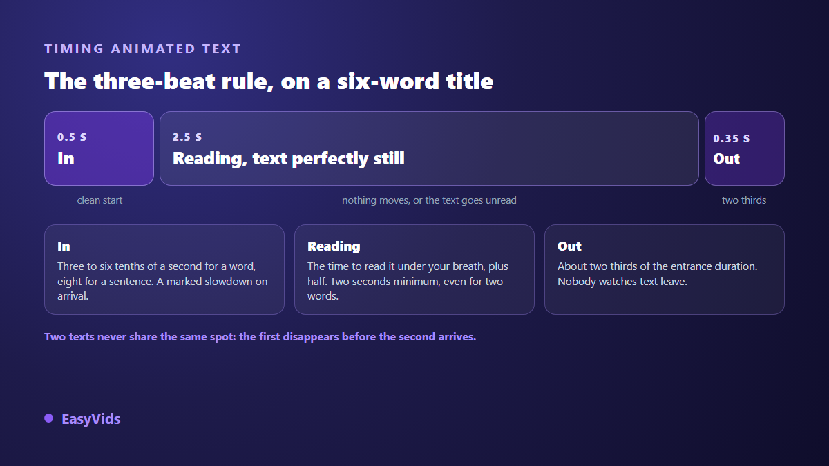
The exit runs faster than the entrance, around two thirds of its duration. A slow exit makes the video feel sluggish, and nobody watches text leave. One more point: if two texts follow each other in the same spot, the first must be completely gone before the second arrives. Two blocks crossing each other stay unreadable even for half a second.
Five readability rules that come before any effect
A beautiful effect on unreadable text is still a failed shot. Our productions apply five measurable rules, and they hold whatever tool you use. They govern thumbnail text as well, read in a tenth of a second inside a list of suggestions, and our thumbnail examples sorted by niche show what a title cut down to three words looks like. The same markers are what let you judge a thumbnail maker in three tries before handing it your covers.
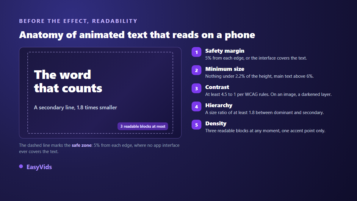
- Safe margin: anything meant to be read stays at least 5 % away from every edge, or the app interface will cover it.
- Minimum size: no text under 2.2 % of the image height, and the main text never drops below 6 % of that height.
- Contrast: the WCAG accessibility guidelines set a ratio of at least 4.5 to 1 between body text and its background. Over an image that means a darkened layer, never a simple blur.
- Hierarchy: a size ratio of at least 1.8 between the dominant text and the secondary text, otherwise nobody knows where to start.
- Density: three readable text blocks on screen at most, and a single point of accent per frame.
The same rules apply to captions, the most watched form of animated text there is. The word by word style popular on social feeds relies on exactly these size and contrast constraints, and our method for rebuilding those animated captions covers the settings that keep them readable on a phone.
Applying these effects without animation software
The EasyVids online editor runs in the browser and stays free with an account. You place a text element, open the Animation tab and pick from four categories: entrance, exit, accent and Ken Burns. The catalogue holds more than sixty patterns, each in three intensities and sorted by style family. Reapplying an entrance replaces only the entrance, so the exit and accent already set on that text stay untouched.
Two shortcuts are worth knowing. Magic edit dresses a whole sequence at once while avoiding the same motif on two neighbouring clips. Keyframes take over when no preset fits: set opacity, position, scale or rotation at one moment, another value later, and the curve handles the rest. The wider workflow is covered in our guide to editing video online, and plan details live on the pricing page.
Frequently asked questions
Which effect should I pick when unsure?
A fade for service text, a slide from the bottom for the text carrying the message. That pair covers most cases and never looks wrong. Add one impact later, on the single word that truly matters in the video.
How long should text stay on screen?
As long as it takes to read it under your breath, plus half again. Two seconds is a sensible floor even for two words, because viewers must notice the text before reading it. In vertical formats, stretch it a little further: people often read while walking.
Can I animate text without professional software?
Yes. An online editor with an animation catalogue covers the nine effects described here, and keyframes handle the edge cases. Professional animation software still earns its place on complex branded packages, not on a readable title that enters and exits cleanly.
Do text animations slow down exports?
Not noticeably. Export time depends on the length of the video, its resolution and the number of tracks, not on whether a title fades or slides. Animate freely without counting rendering seconds.
Open your last video and find the three moments where a word really matters. Animate only those. A chosen entrance, a respected reading time, a quick exit: the difference shows on the first attempt, and even more on a phone. Creating an account opens the editor and its animation catalogue, and the EasyVids studio gathers the writing, visuals, voice over and editing in one place.