Your videos surface thousands of times in recommendations and the view counter barely moves. That is the most common pattern on a channel that publishes regularly: the topic works, the video gets served, but the thumbnail fails to turn an impression into a click. Everything you do to improve YouTube CTR targets that one second, the moment your image is seen and dismissed.
Click-through rate has a rare quality: it reacts fast, and you fix it without filming anything again. Swapping a thumbnail on a published video takes three minutes. This guide lists nine specific changes, ordered from the biggest win to the finest detail, with a way to check that each one earned its place. If the technical basics are still shaky, our complete guide to YouTube thumbnails covers them, so we will not repeat them here.
The short answer
Fix what survives at thumbnail size first: one focal point, three words maximum, a subject that separates from the background. Those three carry most of the gain. Readable emotion, showing the stakes instead of the topic, and pairing the image with the title come next. One rule governs the rest: change one thing at a time, on a video that already has steady impressions, and wait one to two weeks before you judge.
Read your numbers before you touch the image
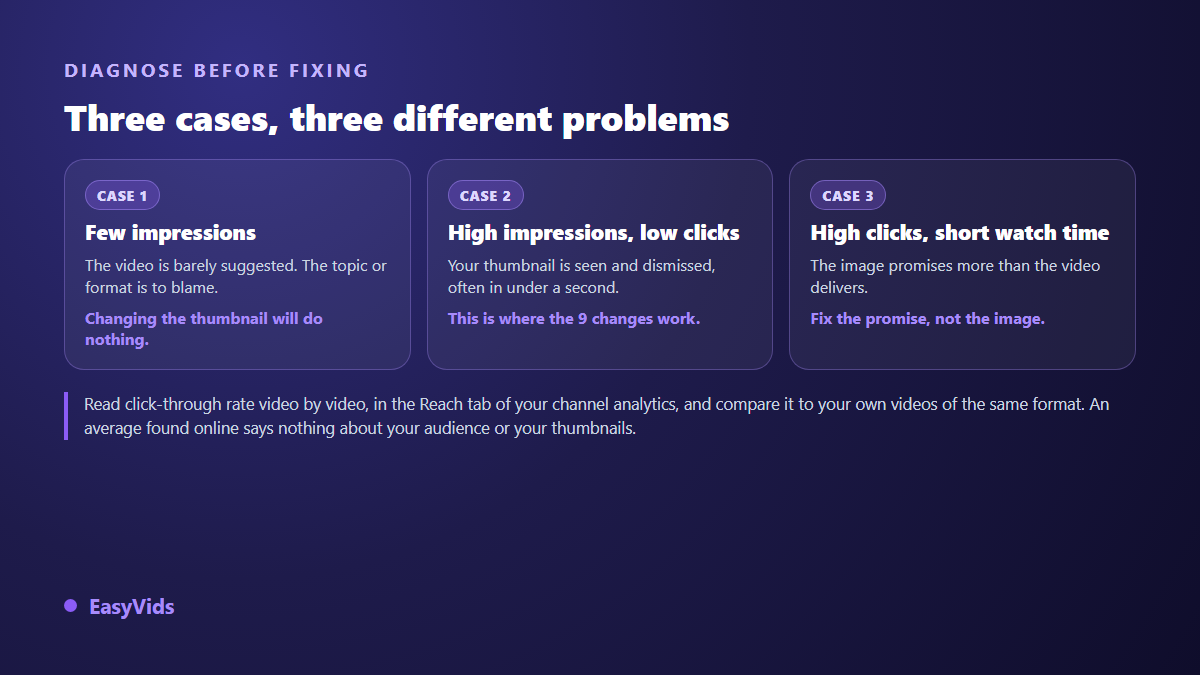
Click-through rate is read video by video, in your channel analytics, in the section that reports impressions and impressions click-through rate. Two numbers matter: how often YouTube showed your thumbnail, and what share of those showings produced a click. According to the YouTube Help Centre, half of all channels and videos sit between 2 % and 10 %, a range so wide it tells you nothing personal. Your own median, format by format, is the only reference worth using.
That reading exists to confirm the thumbnail is really the problem. Three situations look similar in a dashboard and call for completely different work, and only one of them is solved by a new image.
One clarification saves hours: according to the YouTube Help Centre, impressions only count times your thumbnail was shown on YouTube itself. Traffic arriving from an external site, a share or an embedded player is excluded, because nobody saw a thumbnail there. A video pushed by a newsletter can therefore post a poor click-through rate while delivering your best view count of the month.
The nine changes, in the order that pays
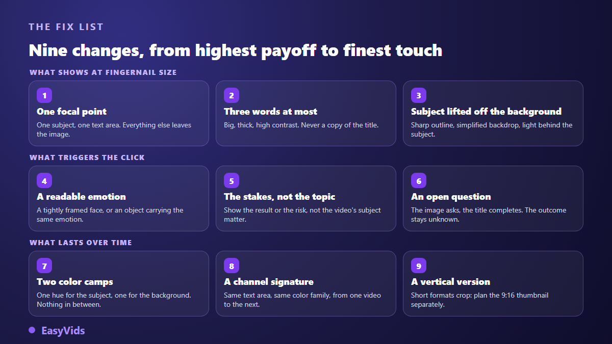
They are not equal. The first three work on legibility, the only thing left when your image is the size of a stamp in a mobile feed. The next three work on the desire to click. The last three build something that outlives the current upload.
- One focal point: a subject, a text area, nothing else.
- Three words maximum, very bold, never a copy of the title.
- A subject lifted off the background: clean edge, simplified backdrop, rim light.
- Readable emotion, carried by a tight face or by an object.
- The stakes rather than the topic: the outcome, not the thing itself.
- An open question that the title completes and the image never resolves.
- Two colour camps, one for the subject and one for the background.
- A channel signature: same text position, same colour family, every time.
- A dedicated vertical version for short-form, designed separately.
1 to 3: what survives at thumbnail size
The first move is to remove, not to add. A thumbnail holding a face, an object, a logo, an arrow, a frame and a sentence holds nothing at all: the eye finds no anchor and moves on. Keep one main subject and one text zone. Anything that does not serve the promise leaves the frame, including your logo, which nobody looks for there.
Text is the second lever and the most abused. Three words are enough, four at most, and they never repeat the title: they add what the title leaves out. An image and a title carrying the same information waste half the available surface. Set those words in heavy weight with a stroke or a drop shadow, then shrink the image on your own screen and check they still read.
The third change is purely technical: separate the subject from the background. A clean edge, a simplified or slightly blurred backdrop, a light source behind the subject, and the thumbnail reads instantly. That is the gap between an image people decode and an image people understand. Our piece on the psychology behind a strong click-through rate explains why this sorting happens before any conscious decision.
4 to 6: what actually triggers the click
A legible image does not create a click, it makes one possible. Emotion and promise decide the rest. A tightly framed face with a clear expression remains the fastest route, because the eye finds a face before anything else. If you never film yourself, move the emotion onto an object or a situation: a hesitating hand, a broken part, a screen showing an unexpected result.
The fifth change is the least intuitive. Show the stakes, not the subject. A recipe video does not show a dish, it shows the reaction to the dish. A software video does not show an interface, it shows what somebody got out of it. That switch sits at the centre of the most copied thumbnail formula, taken apart, and it transfers to any niche, including the quiet ones.
The sixth fits in one line: image and title are a pair, never a duplicate. The image asks, the title completes, and the outcome stays unknown. The limit shows up quickly. A promise the video does not keep buys one click, then damages the video for good, because disappointed viewers leave within seconds and that exit counts for more than the click.
7 to 9: what compounds over time
The seventh change is colour. Pick two camps: one hue for the subject, another for the background, clearly opposed. A six colour palette turns to grey mush at small size. Warm on cool, or the reverse, holds up best in a crowded feed sitting next to competitors who all push saturation.
The eighth is a channel decision rather than a video decision. Keep your text in the same position, hold one colour family, treat the subject the same way. A subscriber should recognise your thumbnails before reading the channel name. It is the only change whose effect grows over time, and the only one that asks for discipline rather than design skill.
The ninth covers short-form. A 16:9 thumbnail cropped to vertical loses its text and sometimes its subject. Plan a dedicated version from the start, subject centred, text clear of the areas the interface covers. Exact dimensions, maximum file weight and accepted ratios are gathered in our thumbnail size sheet, based on the values published by the YouTube Help Centre.
Producing variants without losing an evening
The blocker is rarely knowledge of these rules, it is time. Making four versions of one thumbnail by hand costs an evening, and nobody does it twice. That is what the Thumbnail tab of the EasyVids generator shortens. You describe the scene in one sentence, pick a style matching the big channel families, from gaming to tutorial to documentary, set the emotion, add overlay text if you want any, and render in 16:9 for a standard video or 9:16 for short-form.
Two practical details. You can attach reference images, a face photo for instance, so that you appear on the thumbnail instead of a generated stranger. And generations run server side: launch several in a row, leave the page, and they wait for you in a history kept separate from your other images. That is what makes testing realistic, since comparing requires having several candidates in hand. How credits work is set out on the pricing page.
Test instead of guessing
A thumbnail can be replaced on a published video as often as you like, without losing views or comments. That makes your back catalogue the best testing ground, usually better than waiting for the next upload: an older video that still gets served gives you a stable impression volume, and therefore a clean comparison.
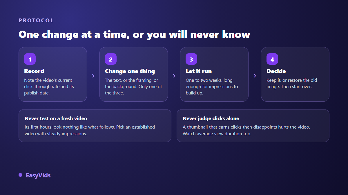
The protocol is four steps and one rule: one modification at a time. Change the text, the crop and the background together and you may well get a better result, but you will not know what to repeat next time. Write down the starting rate, change one thing, let it run one to two weeks, then decide.
YouTube also offers a thumbnail test and compare tool, described in its Help Centre: it serves several thumbnails on the same video and picks the winner on the share of watch time obtained, not on clicks alone. Access depends on channel eligibility. When it is available to you it beats any manual comparison, since it runs the versions in front of the same audience at the same time.
Mistakes that push click-through rate down
Some fixes lower the number while coming from good intentions. These are the ones we see most often on the thumbnails people send us.
- Adding an element with every new version instead of removing one.
- Writing a full sentence that disappears the moment the image shrinks.
- Repeating the title word for word and wasting half the message.
- Changing three things at once, then being unable to conclude anything.
- Judging a change after two days, on a few hundred impressions.
- Promising more than the video delivers, and losing viewers in ten seconds.
- Forgetting the vertical version and letting an automatic crop cut the subject.
What a high click-through rate does not tell you
A high rate is not a goal in itself. It measures the strength of a promise, not viewer satisfaction. An exaggerated thumbnail can lift the number for a week, then drag average view duration down, and the video stops being recommended. A modest rate on a long video people actually watch is a good sign, not a problem to fix.
Read both together, always. A change that lifts click-through rate without hurting watch time is a real gain, and you can repeat it across your library. A change that lifts the first number by crushing the second is a debt, and it comes due in the following weeks of recommendations.
Frequently asked questions
What click-through rate should I aim for?
Anything above your own median. According to the YouTube Help Centre, half of channels and videos sit between 2 % and 10 %, which is far too wide to serve as a target. Compare each video with your own videos of the same format and similar age, never with a figure found elsewhere.
Does changing a thumbnail on a published video reset its performance?
No. Replacing a thumbnail keeps views, comments and history intact. You do it from the video settings, as often as needed. Older uploads that still get served regularly are in fact the most convenient place to run your first tests.
How long before a thumbnail change can be judged?
One to two weeks on an established video, or long enough to gather an impression volume comparable to the previous period. Over two days, what you see is noise. Record the starting figure before you change anything, otherwise the comparison is worthless.
Do I need a face on the thumbnail?
No, but you need an emotion, and a face is simply a convenient way to show one. A faceless channel gets the same effect from an object, a hand, a situation or a before and after contrast. Our guide to running a YouTube channel without showing your face works through those substitutions niche by niche.
Are AI generated thumbnails allowed?
Yes. YouTube policy targets the result rather than the tool: a thumbnail must not mislead about the content of the video or breach community guidelines. A generated image that represents your video honestly raises no issue. An image promising a scene that never appears does, whether it was generated or photographed.
Take your last five uploads, note their click-through rate, and find the one with many impressions and few clicks. Apply the first three changes to that video only, leave everything else alone, and come back in two weeks. It is the shortest improvement loop available to you, and it costs only the time spent making images. To produce your variants in minutes, create an account and open the Thumbnail tab of the EasyVids studio.