Your video is finished, the title is written, and one small image now decides whether anyone watches it. That image is where most creators lose an hour, because designing was never their job. An AI thumbnail generator changes the nature of the task: you stop building the picture and start describing it.
Describe it badly, though, and you get something that looks fine on a large screen and reads as mud at the size of a fingernail, which is the only size that counts. This walkthrough covers the whole operation, from the first line you type to the file you upload, with the settings that matter and the checks that save a second attempt. For the design principles underneath, our complete guide to YouTube thumbnails covers what this page assumes.
The short answer
Describe a composition rather than a scene, pick a style and an emotion, add a face photo if you want to appear on it, generate three to five variants, then add the text yourself on the image you keep. Generation takes under a minute; choosing and checking takes the rest. The EasyVids studio puts those steps in a single tab, in the browser, with nothing to install.
What AI does well, and what it still gets wrong
Image models now deliver a sharp subject, decisive lighting and a clean background in a few dozen seconds. On a thumbnail, that is exactly the slow part of the job: finding a strong visual, lighting it, lifting it off its background. No stock photo, no retouching software, no cutout work.
What those models still get wrong is writing. Letters warp, accents vanish, and one word in three is invented as soon as the phrase runs past a few characters. The practical rule follows: ask the model for the picture, write the words yourself. You keep the speed and you keep control of what decides readability.
Step 1: describe a composition, not a scene
A thumbnail prompt has little in common with an illustration prompt. You are not telling a story, you are placing elements inside a frame. Six pieces of information are enough: subject, framing, facial emotion, lighting, background colour, and the area the model must leave empty. That last one is the one everyone forgets, and it is what makes the text possible later.
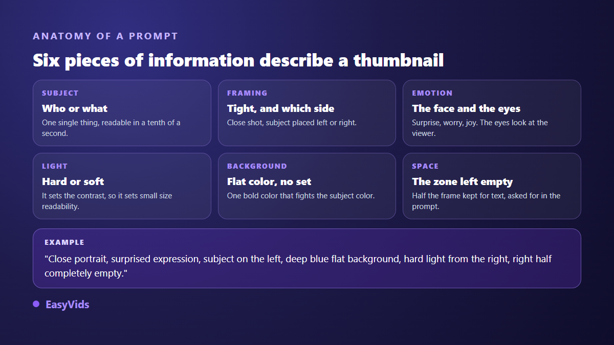
Six fragments to combine into one sentence, whatever your topic is.
- Close crop, the subject fills the left half of the frame.
- Flat deep blue background, no scenery, no secondary detail.
- Hard light coming from the right, strong shadows.
- Surprised expression, eyes looking straight at the lens.
- Right half completely empty, reserved for text.
- Saturated colours, two dominant tones only.
When the blank page wins, the studio can draft that prompt from a plain theme, and the suggestion stays editable before you launch. The logic is the same as for any generated image, and our library of image prompt examples offers more reusable building blocks.
Step 2: style and emotion write half the prompt for you
Two menus in the Thumbnail tab carry most of the load. The first sets the style: viral, gaming, vlog, documentary, tutorial, horror, luxury or spiritual. The second sets the facial emotion: surprise, shock, joy, fear or serious. Each choice injects lighting, saturation and expression cues you no longer have to spell out.
Match the style to the promise of the video, not to your mood of the day. A software tutorial dressed as a shock documentary pulls in curious viewers who leave after ten seconds, and that exit costs more than the extra click was worth. The loudest treatment wins in niches where everyone shouts, and loses everywhere else. If you are aiming at the entertainment formula, our breakdown of the MrBeast thumbnail separates what transfers from what does not.
Step 3: put your own face on it
A human face is still the first thing the eye locks onto. To make it yours, upload a photo of yourself as a reference before generating; the studio accepts several reference images depending on the model. Use a sharp, front facing shot in neutral light, framed at the shoulders. A dark, blurry or three quarter photo produces a rough result you will discard.
Reusing the same photo across thumbnails builds instant recognition in a subscription feed. It is the same mechanism as keeping a character stable across images, explained in our method for holding one face across every image. If you never show your face, a recurring object, hand or animal plays the same anchoring role, and that motif can start life on paper: turning a drawing into a finished visual relies on the very same reference dropped in before generating.
Step 4: text is where AI still lets you down
The studio has a field for text shown on the thumbnail, and it earns its place when you are judging a composition quickly. For the version you publish, take the other route: generate the image with its empty zone, then place the words on top. Font, size, colour and outline become yours, and so does readability.
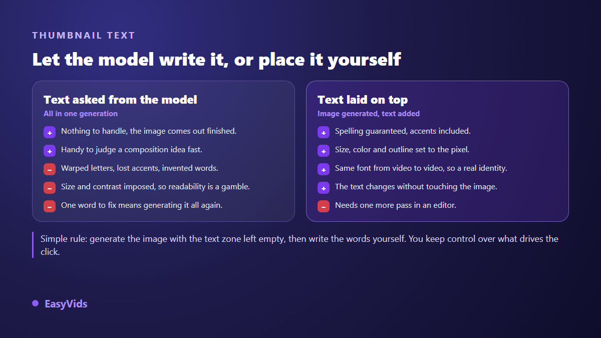
Three words is the target, four the ceiling. They never repeat the video title: the title states the subject, the thumbnail states the stake. A dark outline or drop shadow under light lettering keeps the words legible on any background. The studio editor handles this pass well: drop the image in, type over it, and save the preview as a PNG.
Step 5: size, weight and upload
According to the YouTube Help Centre, a custom thumbnail goes up at 1280 x 720 pixels, with a minimum width of 640 pixels, in JPG, PNG or GIF, and under 2 MB. The option only appears on a verified account, so a missing button in your channel studio is almost always a missing verification. The expected ratio is 16:9, which is the first of the two formats offered in the Thumbnail tab, the second being the 9:16 of vertical videos.
A generated image will not always land on those exact dimensions. Resize it to 1280 x 720 before uploading rather than letting the platform decide, and watch the file weight, because a busy render grows fast. Safe margins, overlaid interface zones and the exact values live in our thumbnail size reference.
How many variants before you decide
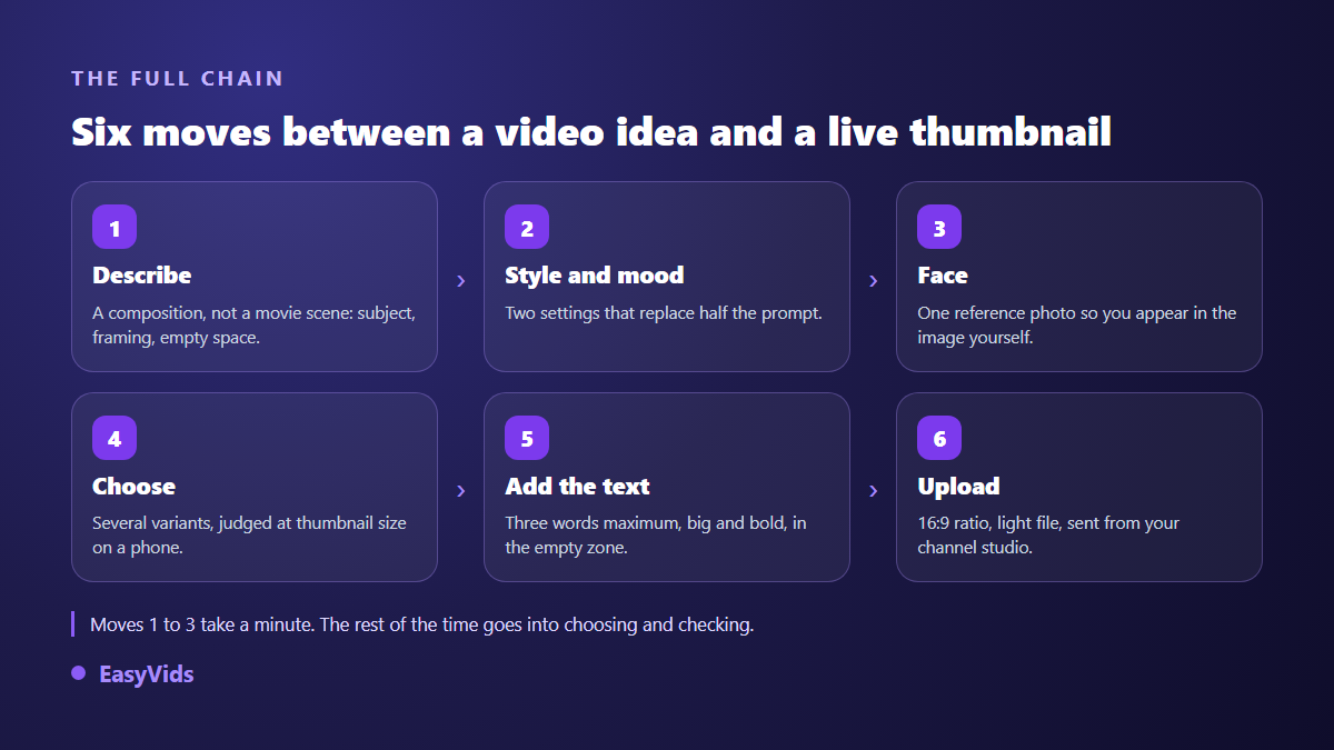
A single proposal cannot be judged, because you have nothing to compare it with. Three to five variants of the same prompt give you a real choice, and the gap between them tells you what the model understood. Every thumbnail you produce lands in its own history, separate from your other images, with direct download and item by item deletion.
Judge them small, never full screen. Shrink the image to thumbnail size, look at it on a phone, sitting next to competing videos. Whatever survives that test survives the feed. The mechanics behind the click are unpacked in our analysis of thumbnails that earn clicks, and they often explain why the prettiest variant is not the strongest one.
Mistakes that waste the most time
Six flaws come back again and again with beginners. Each one is fixed in the prompt, before anything is generated.
- Describing a full scene: the model pushes the subject back and the image dies when scaled down.
- Forgetting the empty zone: the text ends up sitting on a face.
- Asking the model for a whole sentence: warped letters and lost accents.
- Stacking three visual ideas: a thumbnail holds one subject.
- Choosing a detailed background: compression turns it to mush.
- Reviewing at full size instead of the size viewers actually see.
Covers for vertical videos
Short form needs its own treatment. The 9:16 ratio generates in the same tab, but the framing changes everything: the interface covers the bottom of the image with the title, description and action buttons. Keep the subject in the upper third and the lower band neutral, and cut the text shorter than you would in 16:9, since vertical covers appear smaller in suggestion lists.
Holding one visual identity across a channel
A channel is recognised before it is read. Lock two dominant colours, one typeface and one text position, then keep them from video to video. Consistency beats variety: a subscriber who recognises your image in a fraction of a second clicks more often, even on a topic they only half care about. For a starting composition, our thumbnail ideas sorted by niche give patterns to adapt rather than copy. The studio runs on credits, and the plans are laid out on the pricing page.
Frequently asked questions
Can you really make a thumbnail without design skills?
Yes, because the skill required is now description rather than drawing. You state a subject, a crop, an emotion and an empty area, and the model builds the picture. The only manual step worth keeping is the text, and it takes seconds in an online editor.
Can an AI thumbnail generator write the text properly?
On a few characters, sometimes. On a full phrase, rarely in a reliable way, and accented languages fare worse. Use generated text to judge a composition, then type the final words over the image. It is also the only way to control size and contrast, which is what readability depends on.
Do I need a photo of myself?
No, but a reference photo changes a lot if you want to appear on the image. Without one, the model invents a different face every time, which kills recognition across videos. Faceless channels swap the human anchor for a recurring object, hand or animal.
Is an AI generated thumbnail against YouTube rules?
The YouTube Help Centre targets misleading thumbnails, meaning images that show something the video does not contain, rather than the way the image was produced. A generated image that honestly reflects the content is fine. Avoid the real face of a public figure, which raises image rights questions well beyond platform policy.
The gap between a wasted thumbnail and one that earns clicks no longer sits in the software, it sits in the description and the text. Describe a frame, reserve the empty zone, place three readable words, check it small, publish. To try the method on your next video, creating an account opens the Thumbnail tab with starting credits and no bank card.