You need a visual. A cover image for an article, a clean product shot for your store, an illustration to carry a video. You open a stock library, scroll past three hundred thumbnails, and land on the one your competitor already uses. An AI image generator removes that detour: you describe what you want to see, and you get a visual that exists nowhere else, framed for the exact use you have in mind.
The first attempt almost always disappoints. The framing is off, the light is flat, the character no longer has the face from the previous image, and the file comes out in the wrong ratio for the platform. Every one of those problems has a method behind it, and none of them requires drawing skills. This guide walks the whole chain, from writing the prompt to commercial usage rights.
The short answer
An AI image generator turns a written description into an original visual. Result quality depends far less on the model you pick than on three decisions that are yours alone: prompt precision, a consistent art direction and the use of reference images. A prompt that names the subject, the framing, the light and the render gives you a usable image in two or three tries. A style locked once holds a whole series together. A reference image reused across generations keeps the same face or the same product. Ratios, retouching and rights follow from there.
How an AI image generator actually works
An AI image generator does not look up an existing photo. It builds one, starting from a field of random noise it cleans step by step until the result matches your description. That is why two runs of the same prompt never give exactly the same image, and why rewriting a failing prompt beats hammering at it.
Three inputs drive the result. The prompt describes what you want to see. The aspect ratio sets width against height, and it shapes composition far more than people expect: a model does not frame the same scene the same way vertically and horizontally. Reference images carry what no sentence can describe, a specific face, a colour scheme, the exact shape of a bottle. Not every model accepts references, and that is the first thing to check the moment you work on a series rather than a single image. As soon as the use gets specific, that checklist grows, and our method for judging a YouTube thumbnail generator in three tries shows how to decide on measurable skills rather than on a gallery of samples.
Fast models and refined models also serve different moments. Fast ones answer in seconds and consume little, ideal for exploring ten directions and picking one. Refined ones render skin, texture and detail, and belong to the final version. That draft then finish logic is the same one described in our guide to AI video generation, since a generated video is really a series of images produced shot by shot.
Writing a visual prompt that returns something usable
Most people give up at the prompt. A request like 'a beautiful sunset' lets the model decide for you, and it always picks the most average version, the one it has seen a thousand times. A working prompt answers six questions in a stable order: the subject, what it does, how it is framed, how it is lit, what sits behind it, and the overall render.
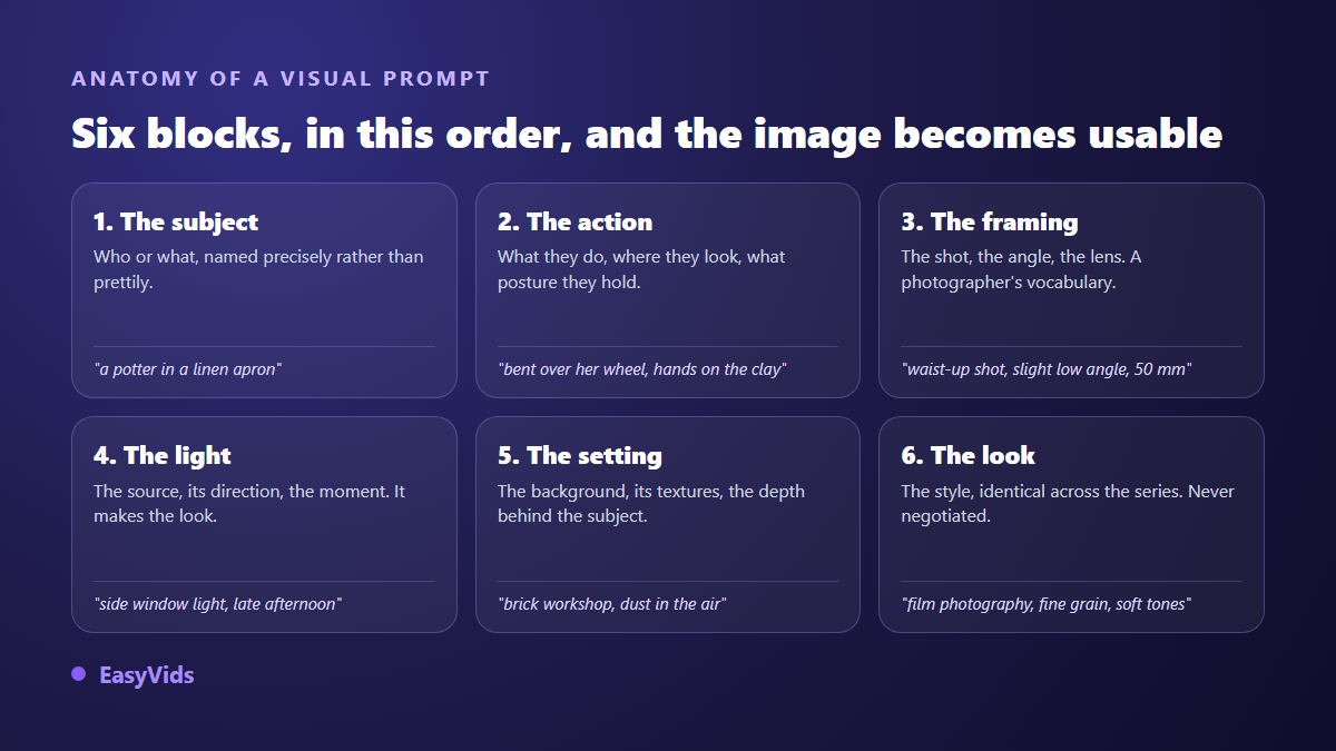
- Subject: name it precisely. 'A potter in a linen apron' beats 'an artisan'.
- Action: what they do, where they look, how the body sits. A described pose stops hands landing anywhere.
- Framing: wide shot, waist shot, close up, angle, focal length. Photographers' vocabulary speaks best to the model.
- Light: source, direction, time of day. It decides whether an image looks flat or has depth.
- Setting: the background, its materials, the depth behind the subject, what stays out of focus.
- Render: photography, illustration, 3D, watercolour. This block never changes across a series.
Cut everything that means nothing. Piles of flattering adjectives, resolution tags and expressions of awe dilute the model's attention without adding anything. Three precise lines beat fifteen enthusiastic ones. Where a negative instruction is supported, use it to push away what keeps coming back: a watermark, burned in text, a stray reflection, an extra limb.
Then change one variable at a time. If you move the subject, the light and the style together, you will never know what improved the result. Generate four variants, keep the best, change a single block, repeat. Three cycles are usually enough to land the image you had in mind.
Style and art direction
A single image can be beautiful by accident. A consistent set never is. What separates an amateur feed from a professional one is rarely the quality of each visual on its own: it is that they all look related. Same palette, same light, same grain, same way of framing. The channels with the best click through rates apply that principle to the letter, and our breakdown of the MrBeast thumbnail formula shows what a palette held without exception delivers, visual after visual.
So name your style instead of wishing for it. The formulations that work borrow from image trades: fine grain film photography, ink and wash illustration, matte 3D with soft edges, watercolour on textured paper, two colour screen print, studio photography on a neutral backdrop. Write three lines of visual charter, paste them at the end of every prompt, and vary only the subject. That constraint feels rigid at first, and it is exactly what produces the collection effect brands look for. That charter carries over into animation, where the same palette and the same shapes become a moving identity: our motion design guide shows how to set it in motion without complex software.
Keeping the same character or product across images
This is the limit that discourages most people. You get a perfect character, you run the next scene with the exact same description, and the face has changed. It is not a flaw in your wording: the model starts from different noise, so from a different face. Repeating the description will never be enough, however carefully it is written.
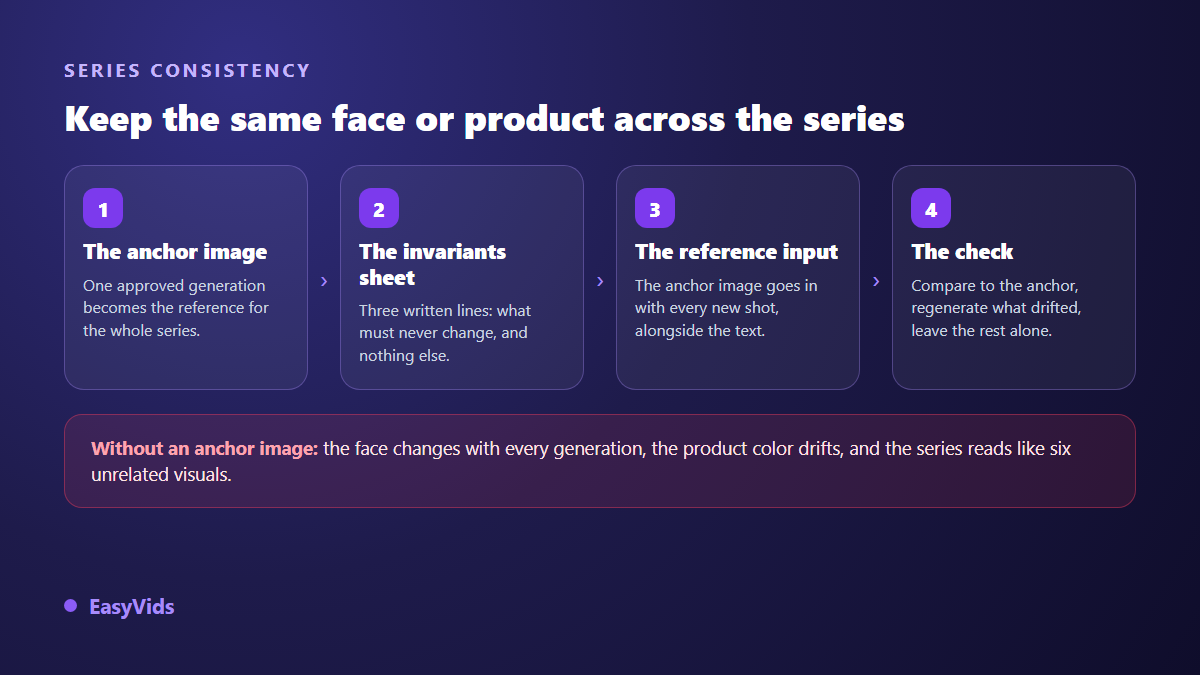
The method that works has four steps. Validate a base image where the character or the product is exactly right. Write a short sheet of invariants, the three or four traits that must never move: a haircut, a jacket colour, a cap shape. Feed that base image as a reference into every new generation, alongside the text. Then compare each result to the base and regenerate what drifted, leaving the rest alone.
Two honest caveats. Models read references differently: some treat them as loose inspiration, others truly respect the face they are given. And the further a scene moves from the base, opposite angle, opposite light, the more drift returns. For a long series, produce several base images, one per angle. The same discipline runs through our step by step YouTube video method, where characters return episode after episode.
Product photography from a single phone shot
This is the use that pays off fastest. You shoot your item on a table with your phone and get a catalogue visual: crafted background, studio light, believable staging. The model does not reinvent the product, it relights it and places it in a scene. The order of operations matters more than the tool you use.
- Shoot flat, in daylight, no flash, the product sharp and whole in frame.
- Clean the background first: a proper cutout stops the model inventing material at the edges of the object.
- Describe the scene, not the product: an oak board, polished concrete, a soft shadow falling to the right.
- Set the ratio immediately: square for a product page, vertical for a social feed, wide for a banner.
- Generate three moods from the same source photo before refining a single one.
- Check the label and any text on the final visual. That is where AI gives itself away.
One ethical line matters here. Staging is fair, altering the product is not. Changing the real colour of a garment, erasing a seam, stretching a bottle, all of that invites returns and disputes. What the customer receives has to match what they saw.
Ratios and resolution: generate for the final use
Cropping always destroys something. An image composed horizontally and then cut vertical loses half its setting and knocks the subject off centre. Decide the ratio before generating, not after, and produce two versions when you publish in two places. Models compose differently per ratio, which is an advantage rather than an obstacle. Some uses add their own readability constraints, and a video thumbnail is the most demanding of them, which is why we gave it a dedicated YouTube thumbnail guide.
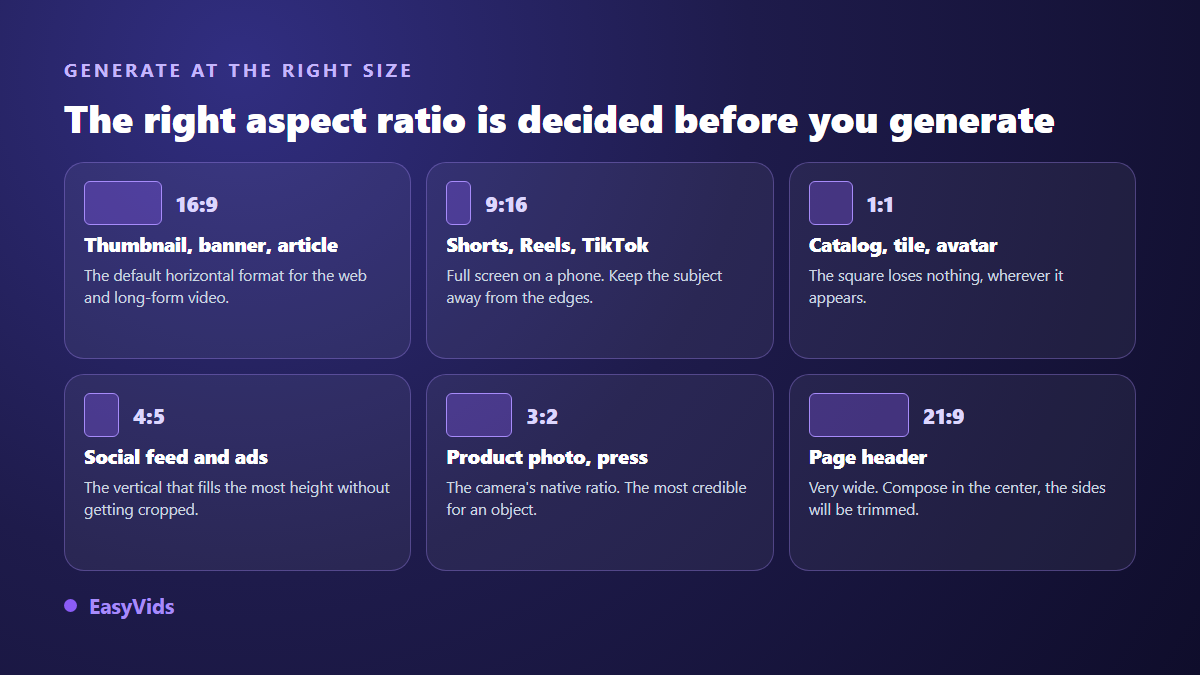
On resolution, generate large and scale down, never the reverse. A reduced image stays crisp, an enlarged one goes soft. For the web, around 1600 pixels wide covers an article visual, and weight matters as much as definition: a heavy file slows the page and costs you ranking. Export to WebP and keep the original aside. Vertical needs one more precaution: the app interface covers the top and the bottom of the image, a band you are better off keeping clear from the moment you generate, and one our guide to setting subtitles on Instagram Reels maps out precisely. Print works differently, sized in centimetres at roughly 300 dots per inch, which is where AI upscaling earns its place.
AI retouching: upscale, cut out, restore
Upscaling rebuilds detail rather than stretching pixels, which turns a fast generation into a printable file and rescues an old photo destined for a poster. Go easy on faces: an aggressive pass smooths skin into a waxy look that reads instantly as fake.
Cutouts and background replacement isolate a subject in a second, where classic software asked you to trace the outline by hand. Outpainting invents what sat outside the frame, which rescues a photo too tight for the ratio you need. Restoration repairs scratches, tears and faded colour on old prints, and colourises black and white convincingly. Always work on a copy: these passes are not reversible, and after three of them you often prefer where you started.
Commercial usage rights for generated images
Two different questions hide behind that phrase. Are you allowed to use this image for your business? That one is contractual, and it lives in the tool's terms of service. Can you stop someone else reusing the same image? That one is copyright, and it varies sharply from country to country.
On the first, most studios grant commercial use of what you produce, sometimes reserving that freedom for paid plans and watermarking free output. Two checks are worth the time before you commit: no watermark on export, and confirmation that your images are not used to train a model or feed a public gallery. Ours are set out on the pricing page and in our frequently asked questions.
On the second, several jurisdictions hold that an image produced entirely by a machine, with no creative human input, carries no copyright protection. Your composition, retouching and assembly do count. In practice, keep a record of your prompts, your edits and your dates. The bans are the same everywhere: do not name a living artist to copy their style, do not show trademarks, logos or protected characters, do not generate a real person's face without consent, and disclose AI use where the platform requires it.
The tells that give a generated image away
Audiences spot a careless visual within seconds, and nearly always for the same reasons. None of them is hard to fix.
- Text burned into the image, usually unreadable. Add it afterwards in an editor.
- Hands, fingers and handled objects. Reframe rather than reroll twenty times.
- Light that is too perfect, with no shadow and no flaw, giving a plastic shop window feel.
- A style that shifts between visuals inside the same series or carousel.
- Backgrounds crowded with pointless detail that drown the subject.
- Asymmetric eyes and jewellery, visible only when you zoom, so zoom before publishing.
Frequently asked questions
Do prompts have to be written in English?
Not with recent models, which handle most languages well. English keeps a small edge on photographic and style vocabulary, because models saw more descriptions written that way. Writing in your own language and leaving the technical terms in English is a sound compromise.
Can I use AI generated images on an online store?
Yes, provided the tool's terms allow commercial use and the image does not mislead the buyer about the product. Staging is acceptable, altering the item itself is not. Check that exports carry no watermark, or your product page will advertise another service.
How do I get several images that truly match?
Lock a three line charter reused word for word in every prompt, and feed one validated image as a reference into each generation. Consistency comes from what stays fixed, not from the precision of what changes. For a recurring character, the base image is not optional.
What size should I generate for print?
Start from the final size in centimetres and count roughly 300 dots per inch. A standard generation rarely covers a large format, which is where AI upscaling comes in. Generate at the right ratio first, then upscale. The reverse order ruins the framing.
Does a generated image replace a real product photo?
Not entirely. It handles mood shots, banners, settings and lifestyle scenes very well. For the product page itself, start from a real photograph of the item and use AI to light it and stage it. The customer has to recognise what arrives.
An AI image generator does not replace your eye, it removes the wait between an idea and a visual. What makes the difference is small: a prompt structured in six blocks, a charter held from the first visual to the last, a base image for anything recurring, and a ratio chosen before you generate. If those visuals are meant to become videos, a carefully handled voice over carries half their impact. To try the full chain, images included, create your account and run a first series.