The clip is good. The play is clean, the commentary works, and the video sits at a few hundred views while the same moment takes off on another channel. Nine times out of ten the gap has nothing to do with your edit. It comes from the gaming thumbnail, a stamp sized image that decides, in a quarter of a second, whether a player clicks or keeps scrolling.
Generic thumbnail advice only half works here. Gaming audiences read signals of their own: a rarity colour, a boss silhouette, a damage number, a scrap of interface recognised instantly. This page walks through those codes, gives fifteen ideas sorted by video type, then shows how to build the image without opening a photo editor. For the fundamentals that apply to every niche, our complete guide to YouTube thumbnails sets the base this article builds on.
The short answer
A gaming thumbnail that works shows one stake, never a full scene. A subject cut out from the background, two colours in opposition, a clear emotion carried by a face or a character, three words at most, and one element that visibly belongs to the game so the title is recognised before anything is read. Glows, sparks and arrows exist only to push the eye toward that single stake. You do not need a photo editor to produce this kind of image: the EasyVids studio generates the thumbnail from a written description, at the right ratio, and hands you the file.
Why general rules fall short in gaming
In most niches your thumbnail sits next to very different thumbnails. In gaming it sits next to videos about the same title, often the same patch, sometimes the same sequence. The viewer sees a column of images that look alike, sharing the official palette and the same characters. Making the game recognisable is therefore the starting point, not the argument.
There is a second difference. Viewers arrive with two very distinct intentions. Either they want spectacle, and they expect a promise of emotion. Or they are stuck in their own game, and they want a precise answer. A thumbnail that mixes both speaks to nobody. Decide which one you serve before you pick a composition.
Six visual codes gamers read without thinking
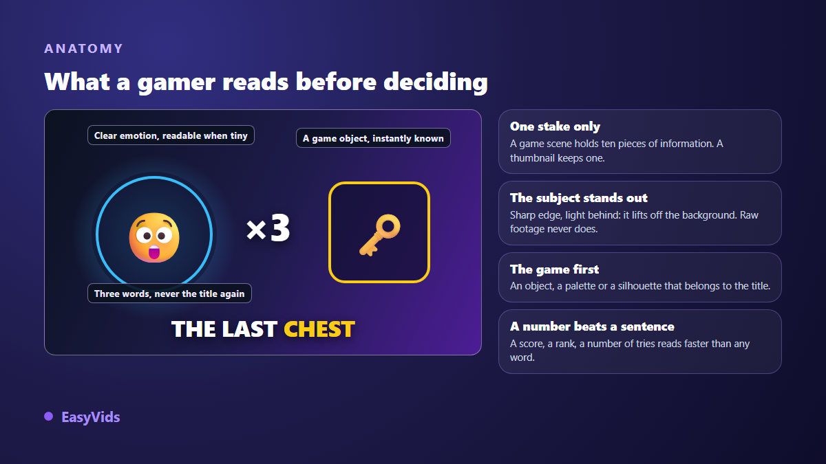
Six signals come back in almost every thumbnail that performs on gaming channels. They are not decoration: they replace words you will never have room to write.
- Game recognition: a piece of interface, a weapon, a skin or a palette identified in under a second.
- The rarity code: games tie colour to value, gold, purple, orange. An object in that colour reads as rare with no explanation at all.
- A cut out subject: crisp edge, light behind, drop shadow. Exactly what a raw screenshot never does.
- Exaggerated scale: a boss three times too large, an object pushed into the foreground, a hand spilling out of frame.
- A number: a score, a rank, a level, an attempt count. Numbers read faster than words, even at tiny sizes.
- Visible emotion: your face in a corner, the character's expression, or an owned reaction. Without emotion, it stays a screenshot.
Gameplay, highlights and let's plays: 5 ideas
These videos sell a feeling. The thumbnail has to freeze the instant before things tip over, never the outcome: show the ending and curiosity dies.
- The frozen tipping point: the moment just before the death or the win, health bar at its lowest, nothing else in frame.
- The mirrored duel: your character left, the opponent or boss right, split by a crack or a vertical bolt.
- The impossible counter: a score, a time or a damage total set huge against a dark background.
- The inset reaction: your face or avatar in a corner medallion, blunt expression, never centred.
- The isolated loot: the rare item pulled out of the inventory, set on a halo, everything else darkened.
Guides, tips and builds: 5 ideas
Here the viewer wants a solution. The thumbnail should look like an answer: structured, almost diagrammatic, promising efficiency rather than emotion.
- Before and after: the base character left, the optimised version right, a hard split down the middle.
- The annotated map: a fragment of the map with a circle and an arrow on the spot, never the whole solution.
- Three slots: three weapons, three classes or three locations, numbered on one band.
- The build sheet: the weapon centred, four attachment icons around it, a damage number on top.
- The crossed out mistake: the common move marked with a red cross, the fix in green right beside it.
News, rankings and challenges: 5 ideas
These formats live on opinion and anticipation. The thumbnail has to state a position, a disagreement or a number nobody can scroll past.
- The shrunken tier list: two tiers only, best and worst, with the expected character in the wrong one.
- The patch versus: the same weapon before and after the update, a red downward arrow between them.
- The unrevealed reveal: a silhouette in shadow, a question mark, the official palette around it.
- The counted challenge: hours, deaths or attempts set huge, your exhausted face right next to it.
- The uneven podium: three game tiles at different sizes, the winner clearly the largest.
These fifteen compositions move from one title to the next with nothing changed but the scenery. If your channel reaches beyond gaming, our library of 51 thumbnail ideas sorted by niche covers the equivalents for cooking, finance or travel.
Match the code to the genre
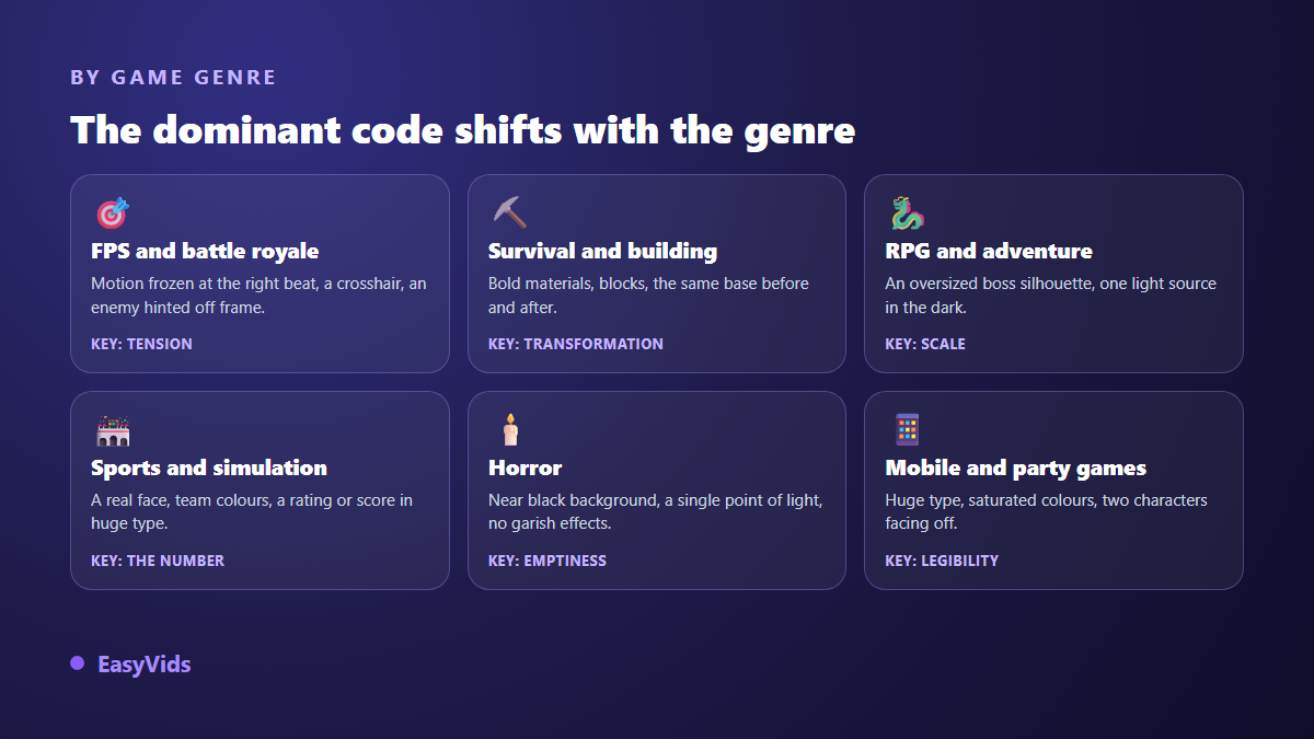
A competitive shooter and a horror game do not call for the same image. Shooters and battle royales need tension: a frozen gesture, a reticle, a threat implied off frame. Survival and building games live on material, and the before and after of one base beats any lighting effect. Role playing games run on scale: an oversized boss silhouette behind a tiny character tells the whole story wordlessly. Sports and simulation need a real face and a number. Horror rewards restraint: a near black background, a single point of light, no loud effects. Mobile and party games hand half the frame to typography, because the thumbnail will be seen on a small screen.
One trap runs across all of them: reusing the official key art. It is beautiful, it is already composed, and that is the problem, because everyone else uses it too. There is also a rights question that is far from theoretical. Several publishers issue usage rules for their content on video platforms, such as the game content guidelines published by Nintendo, and those rules usually treat footage captured during your own session differently from promotional artwork and music. An image you produced yourself protects you better than a collage of official assets.
Text: three words, and never a copy of the title
The rule holds everywhere and matters most in gaming, where the frame is already busy. Three words maximum, in capitals, with an outline or a shadow so they survive a loaded background. The text does not summarise the video: it adds what the image cannot say. If the picture already shows the boss and the title already names it, write the constraint or the count instead: no armour, bare hands, attempt 47.
Placement matters as much. The bottom right corner is covered by the duration badge, and part of the lower edge disappears under the progress bar once playback has started. Exact dimensions and the zones the interface hides are covered in our thumbnail size reference.
The thumb test is harder in gaming
A gaming thumbnail is almost always busier than average, so it survives small sizes badly, and small is exactly how it will be judged. According to the YouTube help centre, a custom thumbnail is uploaded at a 16:9 ratio and 1280 by 720 pixels, yet it appears on a phone at a fraction of that. The only test that counts is to shrink your image to the width of a fingernail, look at it from an arm away, and check that the subject and the text still read.
When nothing survives, the cause is nearly always the same: two subjects compete for attention, or the background shares the brightness of the character. Remove an element rather than enlarging another. The most extreme version of this discipline, the one used on challenge channels, is broken down in our analysis of the most copied thumbnail formula.
Building a gaming thumbnail with AI
An online studio replaces the classic capture, cut out and retouch chain. In EasyVids the work happens in the Thumbnail tab, which is not a plain image generator: it writes the prompt for you from your settings, then returns a thumbnail at the ratio you picked. You describe the subject in one sentence, choose the style, the emotion and the text, and regenerate as often as you need.
- The subject: one plain sentence, such as a helmeted player facing a dragon in a burning cave.
- The style: a Gaming style exists, with neon glow, vivid colours and an action feel, alongside vlog, documentary and tutorial styles.
- The emotion: surprise, shock, joy, fear or serious. This setting drives the facial expression.
- The overlay text: optional, added on top of the image in bold type.
- The format: 16:9 for a standard video, 9:16 for a short form cover.
- References: attach a photo of your face to appear on the thumbnail, or a capture from your session to keep the mood of the game.
One limit deserves to be stated plainly, because it applies to every current image model: text baked in by AI sometimes comes out malformed, especially with long words. The workaround is simple. Generate the thumbnail without text, then add your three words on top, or regenerate until the letters come out clean. Prompt logic itself is the same as for any visual, as described in our AI image generator guide, and every generation uses credits, with the plans detailed on the pricing page.
Traps specific to gaming thumbnails
The mistakes in this niche are not the usual ones. A cooking thumbnail fails because it is bland, a gaming thumbnail fails because it is overfull. One point deserves care: under YouTube's spam and deceptive practices policy, a thumbnail that suggests content the video does not contain can be removed, and repeat offences hit the whole channel. The promise has to hold in the first seconds of playback.
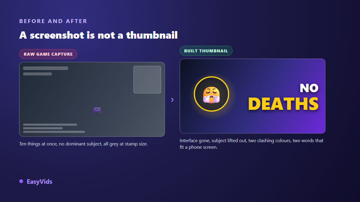
- A raw screenshot posted as is: the game looks good, but the image has no dominant subject.
- The interface left in place: health bar, minimap, chat, inventory. Pure noise stealing attention.
- Saturation applied everywhere: when everything glows, nothing stands out.
- The ending shown in advance: you answer the question before it is asked.
- The same composition on every video: the channel disappears inside its own suggestion list.
- A promise the video does not keep: the click is won, watch time is lost, and the signal sent is bad.
Test two thumbnails instead of guessing
Your instinct belongs to someone who already knows the video, which makes it a poor judge. According to the YouTube help centre, the Test and compare tool in YouTube Studio runs up to three thumbnails against each other on the same video and names the one that performs best. That is the only honest way to settle a debate between two compositions.
On numbers, to avoid false targets: the YouTube help centre states that half of all channels and videos sit between a 2 and 10 per cent click through rate, and that comparisons only make sense against your own videos. The full reasoning, including what a high rate can hide, is developed in our article on the psychology behind clicks.
Frequently asked questions
What size should a gaming thumbnail be?
The same as any YouTube video: a 16:9 ratio, 1280 by 720 pixels, a file under the weight limit stated in the YouTube help centre, as JPG or PNG. For a short form cover, build a separate vertical image rather than cropping the wide one.
Do you need to show your face on a gaming thumbnail?
No. A face is a shortcut to emotion, not an obligation. An expressive game character, a hand reaching for an object or a headset in the foreground does the same job. Plenty of gaming channels never show their creator.
Can you use official game artwork on your thumbnail?
Be careful. Footage captured during your own session is generally accepted under the usage rules publishers put out, while promotional artwork, logos and press assets are often governed separately. Check the publisher's official page for the game concerned, and prefer an image you produced: it sets you apart as well as protecting you.
How many words belong on a gaming thumbnail?
Three at most, sometimes none. Text earns its place only when it adds something absent from the image and the title. A number beats a sentence, because it still reads when the thumbnail is the size of a stamp.
Is an AI generated thumbnail a problem on YouTube?
Not in itself. What the platform acts on is a misleading, shocking or bait driven thumbnail, however it was produced. A generated image that honestly represents the video is treated like a hand made one.
A good gaming thumbnail is not invented in front of a design tool: it is decided beforehand, by answering one question, which stake am I showing. Style, colours, number and text all follow from that answer. Pick one of the fifteen ideas, produce two versions, let the platform settle it, then start again on the next video. To build these images without a photo editor, creating an account opens the Thumbnail tab and its styles, including the one built for games.