The edit is done, the audio is clean, the shots hold up. Then comes the thumbnail, and that is where most vlogs quietly lose. A vlog thumbnail has no shiny product to place in the middle, no record score, no dramatic before and after. It has to make someone want to spend twenty minutes with you, starting from an ordinary day.
The usual reflex is to push harder: open mouth, red arrow, capital letters everywhere. It works once, then your channel starts looking like every other channel, and the people who click leave after thirty seconds. Here are eleven vlog thumbnail ideas that earn the click honestly, how to build them, and the line you should not cross. The general rules of composition sit in our complete guide to YouTube thumbnails; everything below is narrowed down to vlogs.
The short answer
A good vlog thumbnail shows one moment, never a summary of the day. It places the location, lets a genuine reaction show, and puts three words at most in an empty area, well away from the bottom right corner where the video duration sits. The rest is consistency: same framing, same palette, same text position from one episode to the next, so a subscriber recognises your channel before reading the title.
Why vlog thumbnails follow different rules
In most niches, the image has an obvious subject. A recipe has its dish, a review has its object, a gaming video has its character. A vlog has you and a context. The thumbnail therefore has to manufacture a stake out of almost nothing, and that stake always comes from the same place: a situation a viewer can tell themselves in one second, without a caption.
The audience is different too. Vlogs are watched by people who already follow you or who are deciding whether to. They are not hunting for information, they are choosing company. Too aggressive an image sends the wrong signal, too quiet an image sends none. The balance is won on gaze and light rather than effects, as the psychology behind a strong click through rate explains.
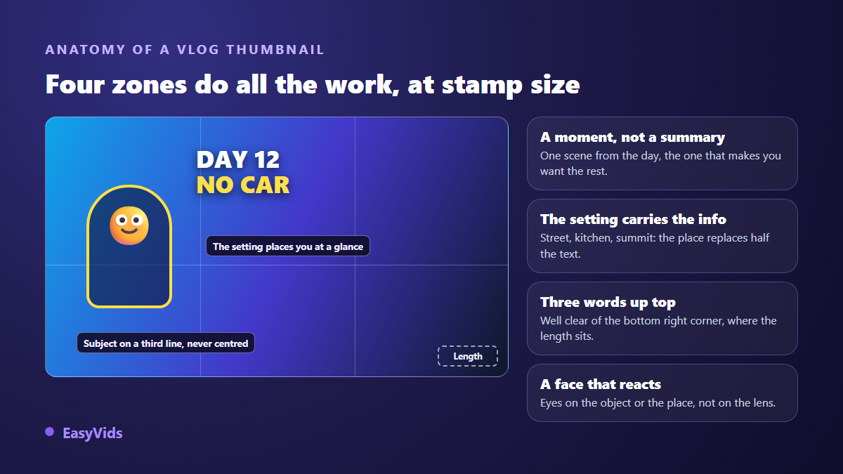
The four zones that carry the image
In a recommendation feed your thumbnail is seen smaller than a business card, usually on a phone. Anything outside these four zones simply vanishes.
- Subject on a third: your face or silhouette takes about a third of the width, never the exact centre, which flattens the composition.
- A background that places you: a street, a kitchen, a summit, a station platform. The location replaces half the text you were about to write.
- Three words up top: the bottom strip is eaten by the video duration, and by the progress bar on videos already started.
- One readable emotion: eyes turned towards the object or the place, not towards the lens, so attention lands where the story is.
Everyday vlogs: four ideas
These videos sell presence and texture. The thumbnail has to freeze a precise instant, never a pose against a blank wall. What these four share: they show a scene the viewer will genuinely find in the video.
- The off frame gaze: you stare at an object placed at the edge of the image, half cropped. The viewer fills in what they cannot see yet.
- The object in hand: the parcel, the dish, the tool, framed very tight with the rest of the room darkened. One sharp point is enough to create a subject.
- Two real moments: the start and the end of the day, split by a clean line. Both shots must exist in the edit, otherwise the promise collapses.
- Owned mess: the room mid project behind a subject lifted by light. The contrast tells the story before the text does.
Travel and days out: four ideas
Here the scenery beats you, and the rule flips. The smaller your silhouette, the more the image breathes and the more impressive the place looks. A giant face in front of a beautiful landscape ruins both at once.
- The tiny silhouette: you, seen from behind, on a third of the frame, inside a very wide landscape. Text goes in the sky or on the water, the only empty areas.
- The first person view: hands on handlebars, shoes at the edge of a pier, the tray in front of you. No face at all, and yet you are there.
- The recognisable landmark: a monument, a shop sign, a street plate, with the place name written small in a corner. The location does the hook for you.
- Weather as the subject: heavy rain, fog, last light of the day. An extreme condition creates a real stake without exaggerating anything.
Challenge vlogs and series: three ideas
As soon as a vlog tells a challenge, a move or a transformation, the thumbnail can carry a number. That is the only case where a giant figure earns its place, and only if the figure is true.
- The honest counter: day 12, kilometre 40, attempt 3. A number reads faster than a word, even at tiny sizes.
- The stated bet: three words that set the rule of the game, with a focused face next to them and no forced grimace.
- The episode template: same band, same colour, same position, only the number changes. That is what turns a pile of videos into a series.
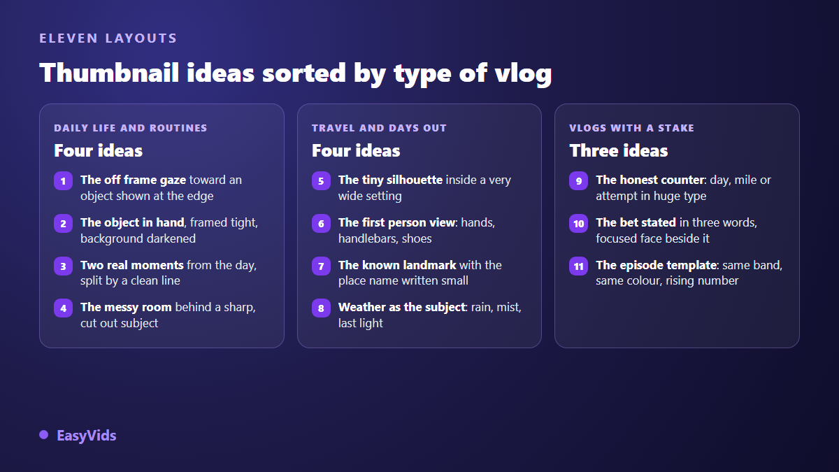
These eleven compositions travel from one vlog to another with nothing changing but the setting. If your channel covers more than vlogs, our library of 51 thumbnail ideas sorted by niche gives the equivalents for cooking, tutorials or finance.
Text: three words, never the title again
The title is already printed under the thumbnail. Copying it wastes the only surface you have. Thumbnail text should add what the title does not say: a constraint, a place, a number, a reaction. If the title announces a day in the countryside, the thumbnail can say no electricity, and together they become a story.
Three words is a ceiling, not a target, and two are often better. Set them bold, with an outline or a drop shadow so they survive any background, then check the image shrunk to thumb width on your phone. If you have to squint, remove a word instead of enlarging the type. Keep that text high or in an empty area: the bottom right corner is always covered.
The exact line between a hook and clickbait
The difference is not how loud the image is, it is what happens after the click. A strong hook followed by a video that keeps its promise lifts watch time. The same image followed by a video that never shows the announced scene sends people away, and that signal reaches recommendations quickly. Under YouTube's spam and deceptive practices policy, a thumbnail suggesting content that is not in the video counts as misleading metadata and can be removed, with a strike attached.
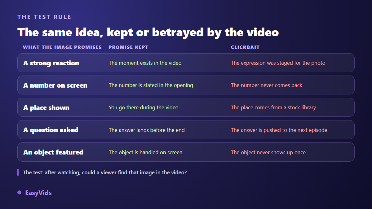
The test fits in one question. After watching the video, would a viewer recognise the thumbnail image? If yes, the hook holds, however expressive it is. If not, it is no longer a hook, and the channel pays in lost subscribers first, in reach second.
Keeping a signature across episodes
A vlog lives on habit. When your thumbnails share a palette, a text position and a framing, your channel grid becomes recognisable and subscribers click because they recognise you, not because they were startled. Lock three elements and leave them alone for at least ten episodes: one accent colour, one typeface, one position for the subject. If some episodes use generated visuals rather than your own photos, the same demand applies to the person on screen: keeping the same face from one image to the next needs reused references, never a description retyped from prompt to prompt.
Building a vlog thumbnail with AI, in practice
An online studio replaces the usual photo, cutout and retouch chain. In EasyVids the work happens in the Thumbnail tab, which is more than an image generator: it assembles the prompt from your settings, then renders a thumbnail at the ratio you picked. You describe the scene in one sentence, set the rest through menus, and regenerate as many times as needed.
- Subject: one plain sentence, such as a person sitting on a pier at sunrise with a travel bag beside them.
- Style: a vlog and lifestyle style exists, with natural light and warm tones, alongside gaming, documentary, tutorial and premium styles.
- Emotion: surprise, shock, joy, fear or serious. That setting decides the facial expression.
- Overlay text: optional, added on top of the image in large type.
- Ratio: 16:9 for a standard video, 9:16 for a short form cover.
- References: attach a photo of your face to appear on the thumbnail, or a photo of the location to keep the real atmosphere of the shoot.
One limit deserves to be said plainly, because it applies to every current image model: baked in text sometimes comes out distorted, especially with long or accented words. The workaround is simple. Generate the thumbnail without text, then lay your three words on top, or rerun the generation until the letters come out clean. Generated thumbnails stay in their own history, and one of them can be set directly as the cover of a video project. Each generation uses credits depending on the model, and the plans are listed on the pricing page.
Test instead of guessing
Your opinion of your own thumbnail is worth little, since you already know the video. The audience opinion can be measured. According to YouTube's help centre, the Test and Compare tool in YouTube Studio runs up to three thumbnails against each other on the same video and picks the one earning the largest share of watch time; access depends on channel status. Failing that, swap the thumbnail on an older video and watch the click through rate over the following weeks, keeping the title untouched so you measure one thing at a time.
Frequently asked questions
Do I have to show my face on a vlog thumbnail?
No, and plenty of travel channels work from behind or in first person. A face helps when the relationship is the subject, on a family vlog or a daily journal. As soon as the place or the activity carries the interest, a silhouette is enough and ages better.
What size should a vlog thumbnail be?
The same as any YouTube video. According to YouTube's help centre, the recommended thumbnail is 1280 by 720 pixels, with a minimum width of 640 pixels, in JPG, PNG or GIF, under 2 MB. Uploading a custom thumbnail also requires a verified account. The full set of constraints sits in our note on exact thumbnail dimensions.
Is an AI generated thumbnail a problem?
Not in itself. What matters to the platform is not how the image was made, but what it promises. A generated thumbnail that faithfully represents a scene from the video is fine. A thumbnail announcing a scene that never appears counts as misleading metadata, whether it was generated or photographed.
How long should a thumbnail take?
Around fifteen minutes, split differently from what you would expect: two minutes to choose the scene, five to produce two or three versions, and the rest to compare them at tiny size. Choosing the scene decides almost everything, production merely carries out that decision.
Should I change the thumbnail on a video that never took off?
Yes, and it is often the highest return move on an existing catalogue. The thumbnail can be replaced at any time from YouTube Studio without touching the video or losing the views already earned. Change one thing, wait a week or two, then compare click through rate over a comparable exposure window.
A good vlog thumbnail does not shout, it tells: one moment, one place, one reaction, three words. Pick the idea before opening any tool, build two versions rather than one, and let the numbers decide. To produce those thumbnails without retouching software, creating an account opens the Thumbnail tab of the EasyVids studio, with your own photos as references and no bank card required.