You saw an animated video explain an offer in fifty seconds, with no camera and no actor, and you wanted the same thing. Then you went looking for motion graphics examples to show your team, and you landed on studio showreels: gorgeous films, no explanation, no way to tell what actually makes them work. Watching never taught anyone how to rebuild.
This article takes eleven of the most used motion graphics examples and takes them apart: the composition, the accent, the timing, and the gesture that makes a shot pleasant to watch. Each one comes with the way to produce it without animation software. If the term itself is still fuzzy, our complete motion design guide covers the ground before we get into individual cases.
The short answer
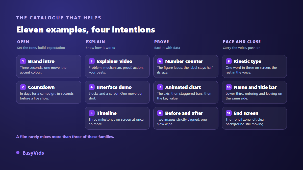
The examples in circulation come down to eleven families: the brand sting, the one minute explainer, kinetic typography, the number counter, the animated chart, the lower third, the before and after wipe, the timeline, the end screen, the countdown and the interface demo. Each serves a precise intention, and all of them share the same three signs: a composition that is not centred by default, one dominant element, and entrances that do not all start on the same beat. Once you can spot those signs, any of these examples can be rebuilt from a written script and an art direction held from the first shot to the last.
What to look at before copying an example
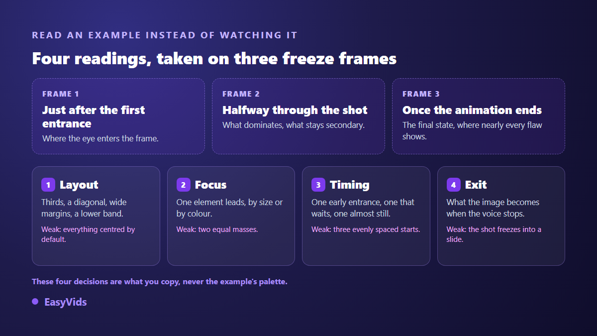
A motion graphics film is not read like a photograph. Pause it at three moments: right after the first element lands, halfway through, and once every animation has finished. Most flaws show up at the third stop, when a sliding line of text ends its run against the edge of the frame, or a decorative shape settles on top of a word you were meant to read. Four readings then describe any shot.
- Composition. Where the eye enters the frame: a block on a third, a diagonal, a very wide margin on one side, a lower band. Dead centre should be a decision, never a reflex.
- Accent. One element dominates, through size, colour or contrast. Two elements competing for attention both lose it.
- Timing. One thing enters early, another waits, a third barely moves. Three entrances on the same interval read as a template straight away.
- The ending. What the frame becomes once the animation is done and the voice is still talking. A shot frozen for four seconds is not motion graphics, it is a slide.
1. The brand sting: three seconds that set the tone
A logo that draws itself, reassembles or lands on a flat colour opens one video out of two. It works on a single condition: it has to be short enough that nobody ever thinks about skipping it. Three seconds is plenty, five already drags, and the brand does not need to appear twice. The effective gesture is almost never a zoom. A mask that slides to reveal the logo, or a stroke that draws itself until a shape closes, reads as craft in a way scaling up never does. Save the brand accent colour for that exact moment, or it loses its power by the third shot.
2. The one minute explainer: four beats, not five
This is the most requested example, and the one most often spoiled by cramming. Its structure is stable: a problem the viewer recognises, a mechanism shown through a diagram that builds itself, a proof, a call to action. Four beats for around a minute of voice over. The classic mistake is listing features in the second beat when its job is to show how something works: an arrow linking two blocks explains more than six bullet points. Write the voice over first, split it into shots afterwards. The text sets the durations, never the other way round.
3. Kinetic typography: the word that lands on the beat
A flat background, no illustration, and the words carrying the idea arrive with the narration. It is the cheapest form of the craft, since it needs neither characters nor sets. The difficulty sits elsewhere: still reading time. A group of words has to hold its position long enough to be read, and that is exactly the time beginners cut to gain pace. On our own shots we rarely keep more than one word in three on screen, the ones carrying the argument, and leave the rest to the voice. Our kinetic typography guide covers how to time the words against the recorded voice.
4. The number counter: the figure that holds the eye
A number rolling up from zero holds attention for a mechanical reason: while it moves, the eye waits to see where it stops. It works on three conditions. The figure takes up a disproportionate share of the frame, otherwise the effect falls flat. The label beside it stays clearly smaller, at least half the size, so the reading order is obvious. And the counter finishes at least a second before the shot ends: a number that lands on the cut is never read at all.
5. The animated chart: data you actually watch
Bars rising, a line drawing itself, a segment closing on a circle: the animated chart replaces a table nobody would look at. The principle fits in one sentence, never show everything at once. Lay down the axis, let the bars rise one after another with a short offset, then give the accent colour to the value that matters while the rest stay neutral. One figure per shot, two at most. Our animated infographic guide walks through turning a dataset into a sequence people watch to the end.
6. The lower third: the quietest example of all
The band that appears at the bottom of the frame to give a name and a role is the most discreet example, and the one that reveals the level of finish. Three rules cover it. It sits in the lower third without clashing with the areas platforms use for their own overlays. It enters from one side and leaves the same way, never through a soft fade. And it holds for four to six seconds: long enough to be read twice, short enough that nobody wonders why it is still there. The name carries the accent, the role is set half the size.
7. The before and after: the wipe that slides across
Two states of the same image, split by a vertical line travelling across the frame. It is the favourite of every trade where the result is visible: renovation, retouching, interior work, graphic design. Success depends on framing. The two images must be aligned to the pixel, otherwise the eye sees a jump rather than a transformation. The wipe moves slowly, in a single pass, and often pauses in the middle to leave both halves visible together for a second or two. A very short line of text goes with it, never a full sentence.
8. The timeline: ten years on one line
A line draws itself, points appear along it, and each point opens a date with a brief caption. The example serves company presentations, project stories and historical explainers. Its known weakness is crowding: past five milestones visible at once, the shot becomes a diagram nobody can read in video. The fix is to slide the line so only three show at a time, the one just left behind, the one being narrated, and the one coming. Only the active milestone carries the accent colour.
9. The end screen: the last seconds decide the next video
An animated end screen sends the viewer somewhere instead of letting them leave. According to the YouTube help centre, an end screen sits in the final twenty seconds of a video and runs between five and twenty seconds, which defines the shot to compose very precisely. The area used by clickable cards has to stay clear of text, and the background should keep moving gently: the moment the image freezes, it reads as a dead screen and the viewer closes. Our YouTube outro guide covers the placements and the reading order that work.
10. The countdown: the number that builds anticipation
Used ahead of a launch, a sale or a live stream, a countdown is only worth making if it is honest. A number ticking down with no real date behind it is spotted quickly and costs more credibility than it buys. Two forms exist. The second by second countdown, kept for the last minutes before opening, where continuous movement holds people in the waiting room. And the daily countdown, more useful for a campaign: it publishes every day with a single figure changing, which yields a run of short videos for one piece of writing.
11. The interface demo: showing a product without filming it
Rather than a tiring screen recording, the demo abstracts: blocks stand for the interface, a cursor moves, a panel opens, a value changes. The benefit is practical rather than aesthetic. The diagram stays true even when the interface changes its look next month, it shows no real data, and it lets you dwell on the step that matters instead of running everything at the same speed. Keep one gesture per shot. A demo chaining four actions in one shot loses everyone, while four shots of one action each follow effortlessly.
Rebuilding these examples with AI, without animation software
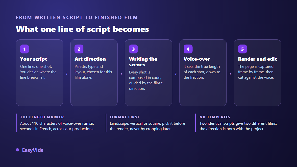
All eleven examples share one trait: they are shapes, text and colour in motion, not filmed footage and not clips from a video model. That is precisely what a code based render engine produces. The principle is the one we use for our own films: a page is composed in HTML and CSS, then photographed frame by frame and encoded as video. Text stays sharp at every size, brand colours are exact, and the length of each shot is set by the length of its voice over.
The script drives everything, and that is the real break from animation software. One line of text equals one shot: you decide the cutting by adding or removing line breaks. The AI first writes the art direction of the film, palette, typography and composition, then every scene on top of it. That is what gives a real film its unity, where scenes written separately give you a slideshow. You can supply your brand colours, your font, your logo and your images; without them, the art direction is derived from whatever you did send. Credits are what a render consumes, and the pricing page has the detail.
What separates a good copy from a bad one
Copying an example is not about reusing its palette, it is about reusing its intention. The flaws that show up in early productions are always the same, and all of them can be fixed before rendering.
- Centring everything. Dead centre is a strong choice when it is rare. Used everywhere, it flattens the whole film.
- One entrance effect for everything. Fade plus a small upward slide on every element is the signature of a template, and it shows within ten seconds.
- Text set too small. Films are watched on phones. Below roughly one fiftieth of the frame height, nothing reads.
- Two equal masses crossing. A giant figure behind a headline only works if it is clearly paler, or moved out of the text area entirely.
- Shots that run long. Once the animation is over, the frame stops saying anything while the voice keeps going.
- Losing the brand kit halfway. An accent colour that shifts from shot to shot breaks the unity everything else was building.
Frequently asked questions
Where can I find motion graphics examples worth studying?
Studio showreels and designer portfolios are full of them, but they show a result and never hand over the mechanism. To learn, take a short video you like and stop it at three moments: after the first entrance, halfway, and once the animations are done. You will read the composition, the accent and the timing far faster than by watching it ten times through.
How long should a motion graphics piece run?
A brand sting fits in three seconds. An explainer plays between forty seconds and a minute and a half. An individual shot lasts as long as its voice over, most often five to fifteen seconds. Duration is never a target in itself: the script sets it and the edit respects it.
Do I need drawing skills to rebuild these examples?
No. Ten of the eleven examples use no illustration at all: they are words, geometric shapes, lines and numbers. The work is composition and rhythm, not drawing. The only case that needs visuals is the product demo, and one photo or screenshot is enough.
Do these examples work in vertical format?
Yes, provided you recompose rather than crop. A giant number, a lower third or a timeline designed in landscape lose their balance the moment you cut the sides off. Pick the format before producing: the same intention composes well vertically, with a stacked hierarchy instead of one spread across the width.
How is this different from a video made by an AI model?
A generative model builds realistic imagery from a description, with a share of unpredictability and text that often comes out mangled. Code based motion graphics do the opposite: every element is placed and timed, the text is sharp, the brand colours are exact. The two sit well together in one film, one for atmosphere shots, the other for anything meant to be read. Our text animation guide covers the effects worth using in that second category.
A motion graphics example is not there to be copied, it is there to be taken apart. Read its composition, its accent, its timing and its ending, then rewrite those four decisions for your own subject: that is what separates an honest influence from a lifeless trace. To move from analysis to production, creating an account opens the writing, the voice over and the editing, and the EasyVids studio keeps those steps in one place.