You describe what you want, you hit generate, and back comes a soft image: average framing, flat light, a background that talks over the subject. The model is rarely the problem. Your AI image prompt left it too many decisions, and a model that decides for you always picks the most average version, the one it has seen a thousand times.
The fastest way to improve is not another theory. It is to start from a prompt that already works, then change one piece of it. Below are twenty one examples, ready to paste, sorted by use case. They all follow the same skeleton, the one set out in our complete guide to AI image generation, so you can adapt them without breaking them.
The short answer
A usable AI image prompt names five things in a stable order: the subject, the framing, the light, the setting and the render. Anything that fits none of those five segments can usually go. Copy the example that matches your use, swap in your own subject, leave the rest untouched for the first run, then change one segment at a time.
The five segment skeleton
There is nothing mystical about this structure. It is how a photographer or an illustrator would brief a colleague. It works because it closes, one by one, the doors the model would otherwise open on its own. Every segment removes a decision, and one decision less is one surprise less at render time.
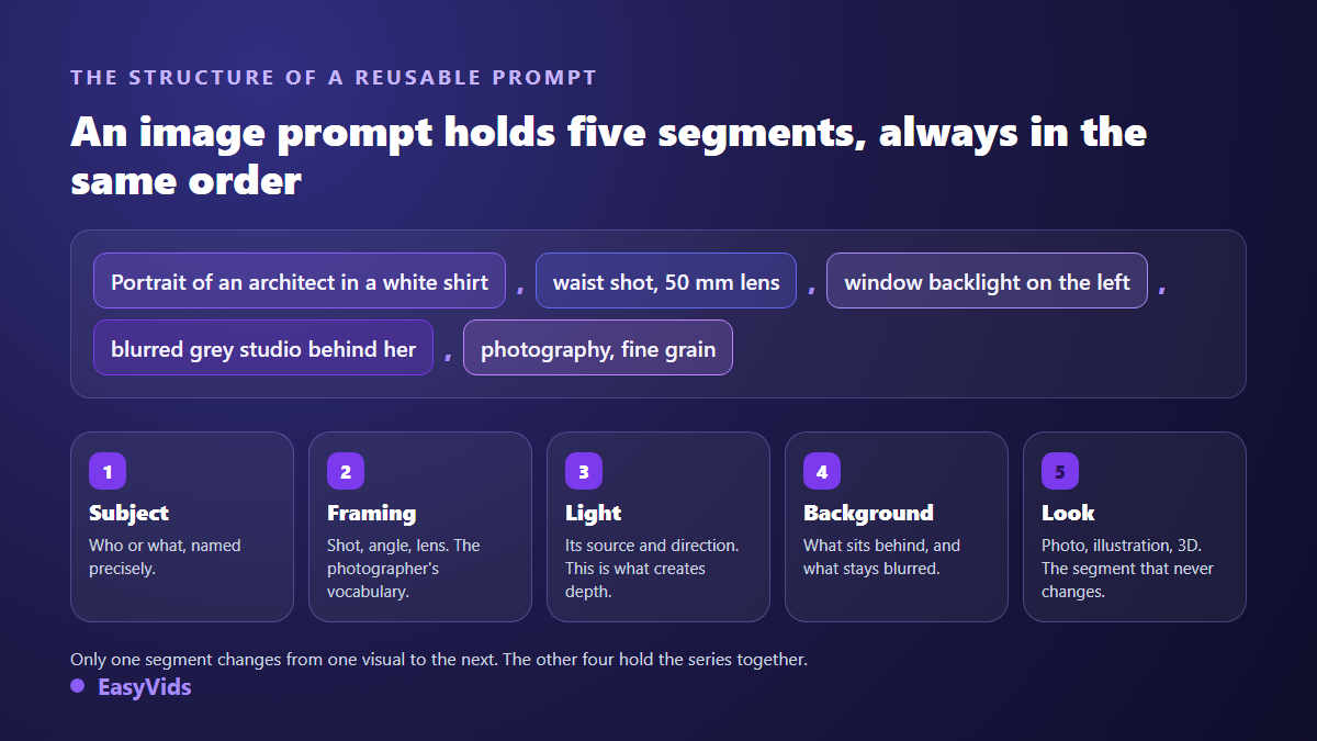
- Subject: who or what, named precisely, with one detail that anchors it. 'An architect in a white shirt' beats 'a woman'.
- Framing: wide shot, waist shot, close up, high angle, low angle, focal length. Photographers' vocabulary speaks best to these models.
- Light: source, direction, time of day. Described light is what separates an image with depth from a cardboard one.
- Setting: what sits behind the subject, its material, and above all what should stay out of focus.
- Render: photography, ink illustration, watercolour, matte 3D, screen printed poster. This is the segment that stops moving once your series starts.
Whatever falls outside those five can go without regret. Resolution tags, stacks of flattering adjectives and expressions of awe dilute the model's attention while describing nothing visible. Three precise lines beat fifteen enthusiastic ones, and they stay readable when you need to fix them.
Three habits before you copy anything
These prompts are starting points, not magic formulas. Three habits decide what you get out of them.
- Generate several variants of the same prompt, then choose. Two identical runs never produce the same image, and the best one often lands on the third try.
- Change one segment at a time. Move the subject, the light and the render together and you will never know which one helped.
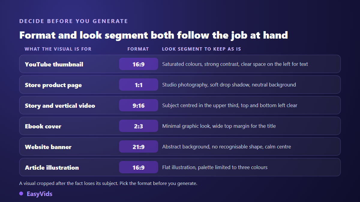
- Lock the aspect ratio before generating, never after. A model composes a scene differently in vertical and horizontal, and a late crop always cuts something useful.
Portraits and characters: three prompts
Portraits punish vagueness fastest. Name the role, dress the character, decide where they look. If that character has to come back across several visuals, description alone will never hold and you will need a reference image.
- Professional portrait. 'Portrait of an architect in a white shirt, seated at her drafting table, waist shot, window backlight from the left, blurred grey studio behind her, photography, 50 mm lens, fine grain.'
- Tight portrait. 'Close portrait of a chef in a linen jacket, looking into the lens, restrained smile, soft light from above, dark green tiled background, studio photography, textured skin, no smoothing.'
- Illustrated character. 'Comic style character, young librarian with short hair, standing three quarter view, curious expression, even frontal light, plain white background, ink illustration with flat colour, ochre and midnight blue palette.'
Product photography: three prompts
This is the use that pays back fastest. One rule outranks the others: describe the scene, not the product. Supply the product as a reference photo or name it plainly. Anything you over describe, the model will feel free to reinvent, and a reinvented label costs you a return.
- Cosmetics. 'Serum bottle on a pale stone, three quarter close up, raking light from the right, soft cast shadow, beige plaster background, advertising photography, controlled reflections.'
- Fashion accessory. 'Pair of white trainers floating in mid air, side view, two source studio lighting, crisp shadow on the floor, two tone coral and cream background, catalogue photography, centred composition.'
- Food. 'Steaming cup of coffee on an oak table, forty five degree high angle, morning light from a side window, biscuit crumbs around it, food photography, shallow depth of field.'
Scenery and atmosphere: three prompts
Backgrounds tolerate a looser subject, but they demand a time of day and a weather. Time of day is the highest return setting in the whole prompt: it decides colour, shadow length and the feeling of the image.
- City at dawn. 'Cobbled lane in an old town, low mist, street lamps still lit, wide shot at eye level, blue pre dawn light, film photography, visible grain.'
- Flat lay. 'Desk seen from above, open notebook, pen, mug and a succulent, diffuse daylight, pale wood background, flat lay photography, airy composition with free space on the right.'
- Landscape at sunset. 'Wheat field at sunset, wide shot, low sun in the axis, dust in the air, silhouette of a lone tree on the left, wide angle photography, warm tones.'
Illustration and graphic style: three prompts
Once you leave photography, the render segment becomes the most important of the five. Name a real technique rather than a vague mood: watercolour, screen printing and matte 3D each carry their own constraints, and the models know them.
- Watercolour. 'Watercolour illustration of a fox asleep on a tree stump, visible paper grain, light ink outlines, rust and sea green palette, white background, centred composition.'
- Graphic poster. 'Two colour screen printed poster, stylised mountain and geometric sun, simple shapes, midnight blue ink on cream paper, visible print texture, free space at the bottom for a title.'
- Soft 3D. 'Matte 3D render of a small house on a round base, soft edges, diffuse lighting with no hard shadow, pastel palette, plain peach background, miniature object style.'
Thumbnails and social visuals: three prompts
Here the prompt works for an image that will be seen very small. According to the YouTube Help Centre, thumbnails upload at 1280 by 720 pixels, yet they often display far smaller in suggestions: reserve a clear zone for your text at generation time, and let the face take up real space. The rest of the legibility rules sit in our dedicated YouTube thumbnail guide.
- Reaction. 'Portrait of a startled man, mouth open, chest shot placed on the right of the frame, high contrast lighting, bright orange background with a halo, horizontal 16:9 format, large empty zone on the left for text.'
- Before and after. 'Frame split in two by a clean line, a messy kitchen on the left, the same kitchen tidy on the right, identical lighting on both sides, saturated colours, horizontal 16:9 format.'
- Vertical for Shorts. 'Close shot of a hand holding a phone with a blank screen, frontal light, purple gradient background, vertical 9:16 format, free space above the hand.'
Banners, backgrounds and brand visuals: three prompts
Brand visuals follow the opposite logic to portraits: they have to leave room. A good banner background tells no story, it hosts a headline. Ask explicitly for a calm zone and rule out recognisable shapes that would compete with your message. An end screen is the same exercise, except that this empty space has to hold clickable cards, and our guide to the YouTube outro shows where they land.
- Abstract background. 'Abstract background of fluid violet and midnight blue shapes, soft gradient, subtle grain, no recognisable form, calm centre, very wide horizontal format.'
- Corporate photo. 'Modern office in a slight high angle, two blurred people in the background, sharp empty table in the foreground, late afternoon light, corporate photography, neutral tones.'
- Repeatable pattern. 'Pattern of stylised monstera leaves, thick even outlines, two greens and one beige, cream background, flat vector illustration, seamless at the edges.'
Book covers and inside illustration: three prompts
A book visual is judged as a thumbnail, in a list, next to dozens of others. It needs a simple symbol, a clear top margin for the title, and above all no generated text inside the image: letters invented by a model give themselves away instantly. Add your title afterwards, in an editor, with a real typeface.
- Children's illustration. 'Children's book illustration of a small girl in a yellow coat walking in the rain under a red umbrella, wide shot, simplified city behind her, gouache, palette limited to four colours.'
- Plain cover. 'Book cover, thin line drawing of a light bulb, deep plain blue background, vertical composition, wide empty top margin, minimalist graphic render, no text in the image.'
- Illustrated diagram. 'Open notebook seen from above with three numbered steps and simple icons, flat style with no shadows, blue and off white palette, light background, horizontal format.'
Aspect ratio is decided in the sentence, not only in the setting
Here is something we verified across our own generations, and it explains a lot of baffling results: the sentence beats the setting. A prompt loaded with wide framing vocabulary, wide shot, cinematic composition, comes back horizontal even when vertical is selected in the interface. The reverse holds too: a vertical instruction written into the prompt returns a vertical image while the setting says horizontal. Our studio therefore writes a format sentence at the head of every prompt it sends, on every screen, because the technical parameter alone did not hold.
Two other levers are worth knowing before you grind on wording. Reference images carry what no sentence describes, a specific face, a colour scheme, the exact shape of a bottle: our interface accepts up to five, and not every model can read them. When a model has no input field for them, the studio refuses the request before charging anything rather than discarding them silently and billing you anyway. Most models also expose a fast tier and a refined tier: explore with the first, finish with the second, and see what each one consumes on the pricing page.
Fixing a prompt that returns nothing usable
When an image misses, the temptation is to rewrite everything. That is almost always wasted effort. Walk back through the five segments in order and find the missing one. Nine times out of ten only one is missing, and it is the framing or the light.
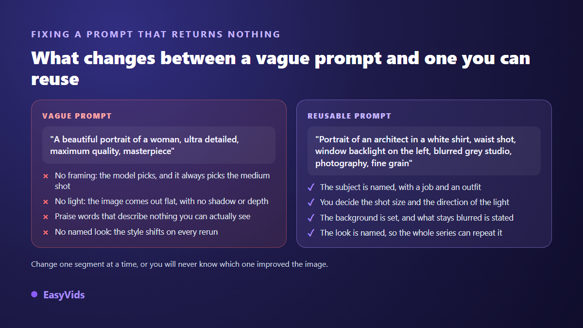
- Flat image with no depth: the light is missing. Give a source and a direction, never just 'well lit'.
- Subject too small or badly placed: the framing is missing. Name the shot and say where the subject sits in the frame.
- Background drowning the subject: the setting is over described. Cut it to one material and ask for it to stay soft.
- Style shifting on every rerun: the render is unnamed. Fix it and copy it word for word.
- Unreadable text burned into the image: ask explicitly for an image with no text and add yours later.
- Suspect hands and fingers: change the framing instead of rerolling the same shot twenty times.
Frequently asked questions
How long should an AI image prompt be?
Between twenty and forty words in the vast majority of cases, roughly the length of the examples above. Shorter and at least one of the five segments is missing. Longer and the instructions start contradicting each other, so the model drops part of them, often the part you cared about most.
Why does the same prompt never give the same image twice?
Because the model does not retrieve an existing picture. It builds one from random noise it cleans until the result matches your description. The starting point changes on every run, so the output does too. Treat that as an advantage: generate several variants of one prompt and choose, rather than rewriting.
How do I keep the same face across several images?
No description, however detailed, will do it. Validate a base image where the character is exactly right, then feed that image as a reference into every new generation alongside the text. Compare each result to the base and regenerate only what drifted.
Do these prompts work on any image generator?
The five segment skeleton does, it is tool independent. The details vary: some models accept reference images, others do not, and available ratios differ. Run a prompt as it stands first, then adjust the render segment, which is the one models interpret most differently.
Copy three of these prompts, change only the subject, and look at what your first series gives you: comparing your own results is what turns the skeleton into a reflex. Then keep your best formulations in a document and reuse them as templates, segment by segment. To try them right away, on stills and on video shots alike, create your account and run a first generation.