You finish the edit, you open YouTube Studio, and the image you spent an hour composing is rejected. Or it uploads fine, but the text turns to mush the moment it lands in a recommendation feed. YouTube thumbnail size is not a last minute detail. It is a constraint worth knowing before you open the first layer, because it decides what survives once the image is scaled down.
This page gathers the official values published in the YouTube Help Center, then explains what they actually mean while you build the image. The numbers fit in five lines. Everything else, the areas covered by the interface, the recompression, the real display width in feeds, deserves to be understood once and for all. For the creative side, our complete guide to YouTube thumbnails covers subject, contrast and wording. Here we talk pixels and files.
The short answer
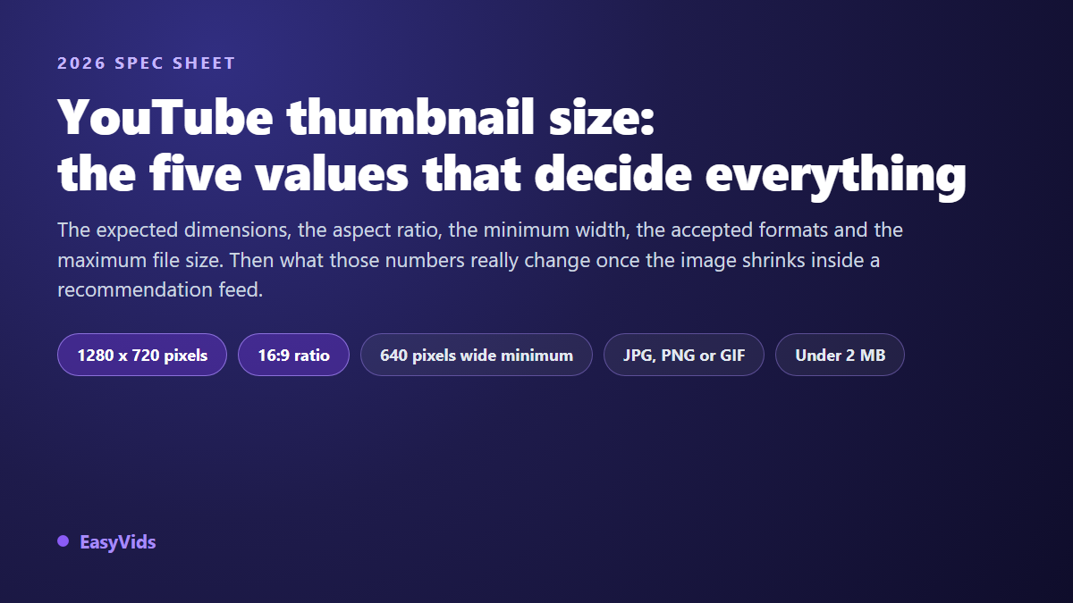
According to the YouTube Help Center, a custom thumbnail should be 1280 x 720 pixels, follow a 16:9 aspect ratio, be at least 640 pixels wide, arrive as JPG, PNG or GIF, and stay under 2 MB. Those five values are enough for the file to be accepted. The rest of this page exists so the image stays readable once the platform has resized it and dropped it among twenty competing thumbnails.
The official specifications, line by line
Here are the constraints as the platform documents them, with the reason behind each one. The key distinction: minimum width and recommended size do not serve the same purpose. The first avoids a rejected upload, the second avoids a soft looking image on large screens.
- Recommended dimensions: 1280 x 720 pixels. The reference size, kept by YouTube as the high definition version of your thumbnail.
- Aspect ratio: 16:9. The shape of players and previews. A square or vertical image gets cropped, or padded with bars.
- Minimum width: 640 pixels. Below that, the upload is refused. Between 640 and 1280, it passes, but the image stretches on bigger surfaces.
- Accepted formats: JPG, PNG and GIF. An animated GIF does not animate as a thumbnail: only its first frame is kept.
- Maximum weight: 2 MB. The limit applies to the file you upload, not to the versions the platform serves afterwards.
- Verified account. Uploading a custom thumbnail still depends on account verification: if the button is missing in YouTube Studio, look there before blaming your file.
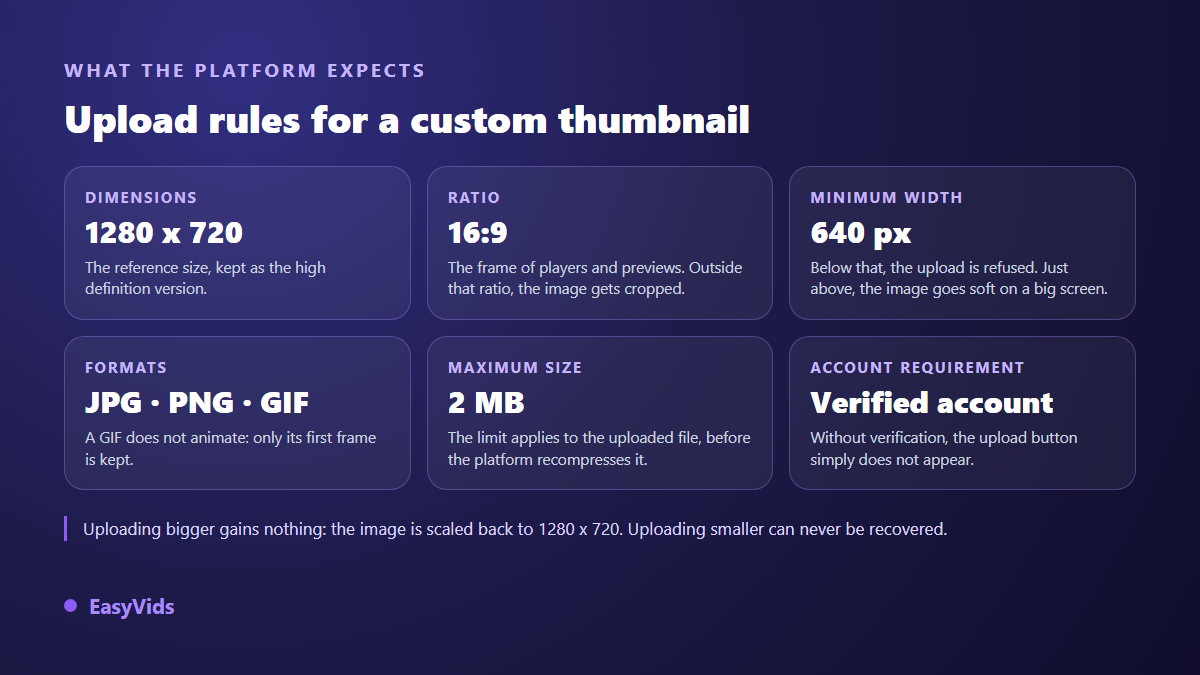
One detail saves a lot of frustration: uploading something larger than 1280 x 720 does not improve anything, because it gets scaled back to that size. A smaller image, on the other hand, never recovers. The missing pixels do not exist, and upscaling produces that slightly soft look that gives away a rushed thumbnail.
Why 1280 x 720 and not bigger
YouTube does not serve your file as it is. The platform builds several reduced versions and delivers whichever matches the display surface. The YouTube Data API documentation describes these variants under five names: default, medium, high, standard and maxres, the last one matching 1280 x 720 exactly. Your original file is only a starting point: it feeds a family of smaller thumbnails.
That mechanism explains two things. The original resolution only matters on large surfaces, such as a connected TV home screen. And all the readability work happens on the reduced versions, the ones a few hundred pixels wide. Composing while looking only at the full size file means composing for the version almost nobody sees.
The 16:9 ratio, and what happens if you drift from it
16:9 is not an aesthetic suggestion, it is the shape of the frame your image will sit in. A square thumbnail gets trimmed on the sides or padded, depending on the surface. Either way, part of your composition disappears. The maths is simple: 1280 divided by 720 gives 1.78, and any image matching that ratio fits without distortion, whatever its resolution.
The classic trap is reusing a visual designed for another network. A square post image or a vertical poster does not transfer: recompose it, do not crop it. We gathered the ratios and resolutions each platform expects in our reference on video formats, which helps whenever the same campaign goes out in several places.
Staying under the file limit without ruining the image
The weight limit catches people out, because a 1280 x 720 image exported with default settings easily exceeds it as a PNG. PNG keeps every pixel and grows fast on detailed photography. JPEG compresses, and is the right answer in the vast majority of cases. The working rule: JPEG for photographic thumbnails, PNG only for flat colour graphics with crisp text and few gradients.
- Export as JPEG at around 85 % quality. The visible difference on a thumbnail is nil, the weight saving is large.
- Work at 1280 x 720 directly, rather than at 4000 pixels wide scaled down at the last second.
- Avoid wide gradients and grain: they inflate the file and degrade worst under compression.
- Flatten layers and strip unnecessary metadata before exporting.
- If you are still over the limit, lower the quality before lowering the dimensions: losing pixels costs more than losing a little fineness.
One last point decides the final sharpness: the platform recompresses your image whatever quality you started from. A composition packed with small details comes out dirty after that pass. Flat areas, a cut out subject and two or three very large words survive far better. The technical constraint and the readability constraint push in the same direction: simplify.
The areas the interface covers
Your 1280 x 720 pixels are not all usable. The bottom right corner carries the duration label on almost every surface, so a face placed there gets clipped. The bottom edge, across the full width, carries the red progress bar as soon as a viewer has started the video. On desktop, hover buttons appear top right. And depending on the surface, corners are rounded.
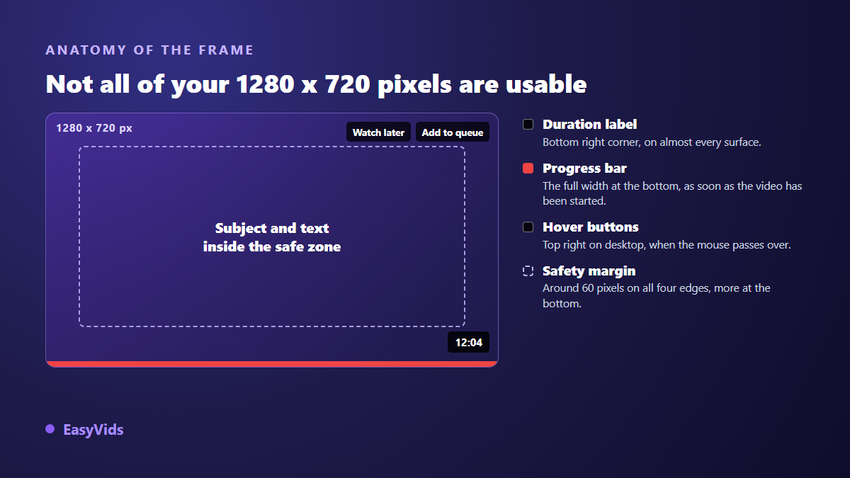
The practical takeaway fits in one sentence: keep the subject and the text centred, and leave roughly sixty pixels of margin on all four edges, a little more at the bottom. That margin is invisible when everything goes well, and it saves you the moment a surface crops differently. Putting anything important in a corner is the surest way to lose it.
The size your thumbnail is really judged at
Here is the number that should drive your composition, and it is not 1280. In a recommendation feed on a phone, a thumbnail often occupies only a few hundred pixels of width. The smallest served variants go down to 120 pixels. Your image is therefore judged at a scale where ten words become a grey smear and a distant face becomes a dot.
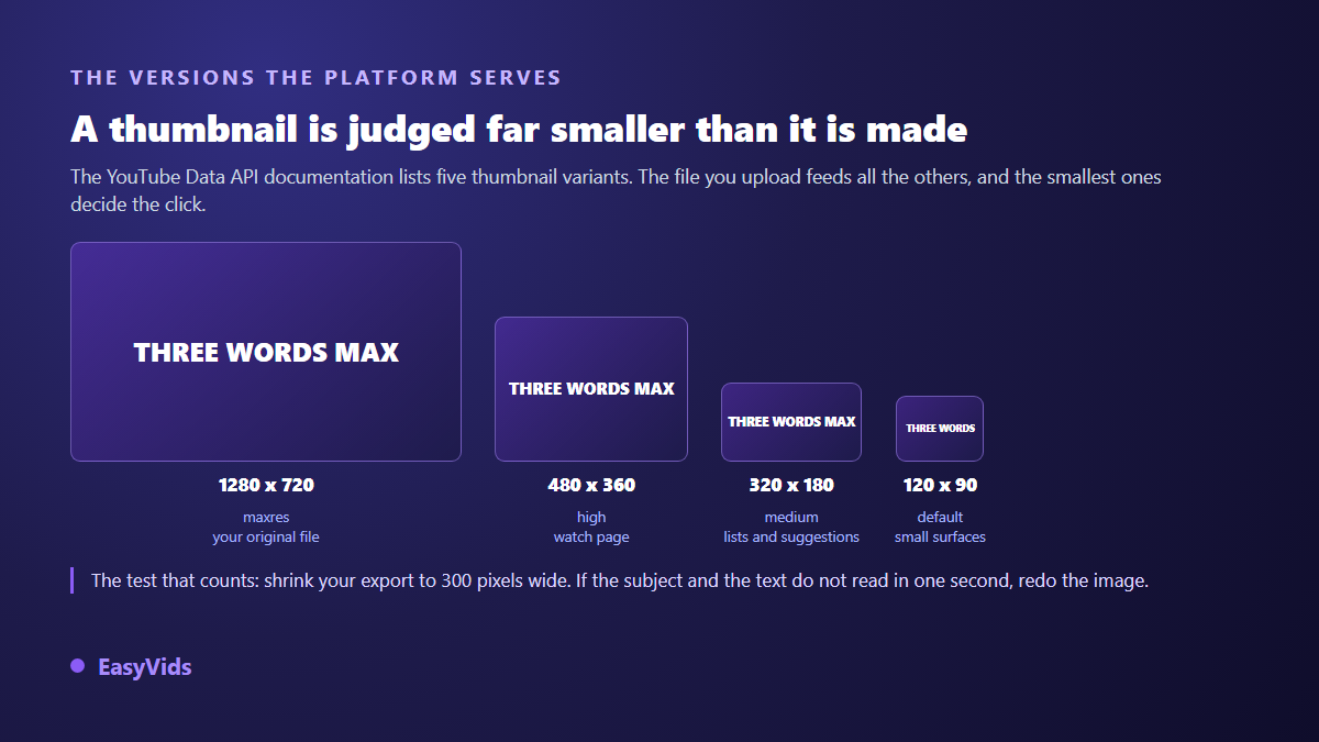
The check takes ten seconds and belongs before every upload. Scale your export down to about 300 pixels wide, then look at it from an arm away. If the subject is unclear and the text does not read in one second, rebuild the image. This test catches nearly every composition mistake, long before the analytics do.
Shorts and vertical thumbnails
For short form, the logic changes. The preview is vertical, in 9:16, and the image sits inside the playback interface: title at the bottom, buttons on the side, channel name. The rules for uploading a Short thumbnail have shifted several times, so check the current state in the YouTube Help Center before building a process around it. The visual principle does not change: subject centred, nothing important near the edges, text large enough to survive a small preview.
Thumbnail, banner and profile picture are three different sizes
This is where a lot of confusion starts. A thumbnail has nothing to do with your channel page assets, which follow their own specifications, also published by the YouTube Help Center. Mixing them up produces blurry or truncated images with no obvious cause.
- Video thumbnail: 1280 x 720 pixels, 16:9, under 2 MB.
- Channel banner: at least 2048 x 1152 pixels, with a central safe area of roughly 1235 x 338 pixels, the only part visible on every device.
- Profile picture: a square image around 800 x 800 pixels, displayed small and cropped to a circle.
Generating an image already in the right ratio
The simplest route is to generate inside the right frame instead of cropping afterwards. In the EasyVids studio, the Thumbnail tab asks for the subject in one sentence, a style among several visual directions, an emotion, the text to display, then a ratio: 16:9 for a standard video, 9:16 for short form. You can attach a face photo as a reference so you appear in the image. The method for writing those descriptions sits in our guide to AI image generation.
An honest caveat: the image comes out in the ratio you asked for, not necessarily at exactly 1280 x 720 pixels, and its weight depends on the model you pick. So the final step is yours, with any image tool: resize to 1280 x 720 and export as JPEG under the limit. Each generation uses credits, and the plans are listed on the pricing page.
Frequently asked questions
What is the exact size of a YouTube thumbnail?
1280 x 720 pixels, 16:9, with a minimum accepted width of 640 pixels according to the YouTube Help Center. Uploading larger brings nothing, since the image is scaled back to that size. Uploading smaller shows immediately as soon as the thumbnail is displayed large.
What if the file is over the size limit?
Switch from PNG to JPEG, then lower the export quality until you are back under 2 MB. A quality setting of 80 to 85 % is indistinguishable on a thumbnail. Only reduce the dimensions as a last resort: that is where you lose sharpness on large screens.
JPG or PNG for a thumbnail?
JPG in most cases: thumbnails are mainly photographic and the weight stays manageable. PNG keeps an edge for flat colour graphics with big lettering and hard edges, where JPEG compression can leave a halo around the text.
Can I use a vertical image for a Short?
The preview for short form is vertical, so 9:16 is the right ratio. Upload rules on the YouTube side have changed more than once, so check the relevant Help Center page before publishing in volume. Either way, keep the subject centred: the playback interface eats the edges.
Can I change the thumbnail of a published video?
Yes, at any time from YouTube Studio, without touching the video itself. The replacement takes a few minutes to propagate. It is a good habit on an older video whose click through rate has stalled: the new image goes back to work on the same recommendations.
The five values on this page take a minute to memorise, and they prevent most upload rejections. The real work starts right after: getting an image that still holds up at stamp size. To produce visuals directly in the right ratio, without opening any software, create your account and try the Thumbnail tab. The EasyVids studio keeps video, voice, music and visuals in one place.