You built a good thumbnail. The face is sharp, the colours pop, the composition holds. Then you add words, and the whole thing turns to mush the second it shrinks to feed size. Most thumbnail text ideas fail for the same three reasons: too many words, a font that thins out on scaling, and not enough contrast between the letters and whatever sits behind them.
These are three decisions you make once and reuse on every upload. This page gives the actual values, a ten second way to check them, and the five mistakes that show up in almost every thumbnail that underperforms. For framing, background and subject choice, our complete guide to YouTube thumbnails covers the rest of the chain.
The short answer
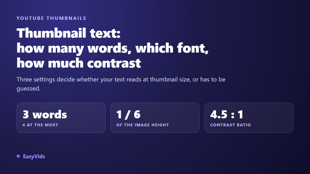
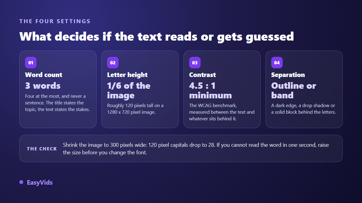
Three words, four at the very most, in capitals. One heavy sans serif, on the narrow side, used across the whole image. Capital letters at least one sixth of the image height, roughly 120 pixels on a 1280 by 720 frame. A contrast ratio of at least 4.5:1 between the letters and what passes behind them, secured with a dark outline, a hard drop shadow or a solid bar. And nothing that matters in the bottom right corner, where the duration badge sits.
Word count: three, never a sentence
Thumbnail text is not a summary. It carries one word of tension, the one that sharpens the angle. Your title already sits next to the image on every surface. Copying that title into the picture spends half your available space saying the same thing twice.
The three word ceiling is not a taste preference, it comes from reading time. Someone scrolling a feed gives each thumbnail a fraction of a second. In that window they register a shape, a dominant colour, a face, and they read a cluster of words, not a line of text. Past four words the letters shrink automatically, and the text stops being a signal and becomes decoration.
Channels that push this furthest often drop to one or two words set very large, and let the image do the rest. That is the mechanism broken down in our breakdown of the MrBeast thumbnail formula, where the text works as a label rather than a phrase.
- A number on its own: readable from across the room, and impossible to misread.
- A two beat contrast: before and after, free or paid, expected against reality.
- One loaded word: banned, failed, finally, wrong.
- A two word question: why though, it works.
- A struck through word with its correction beside it.
- A series tag: an episode number, always in the same corner.
Where the text goes, and the two zones to leave empty
Placement matters as much as size, because two areas of the frame are covered by the interface no matter what you upload. The bottom right corner takes the duration badge. The bottom edge, across the full width, takes the red progress bar as soon as a viewer has started the video. A word sitting there disappears. Keep a safety margin on all four edges too, since thumbnails get cropped and rounded differently depending on the surface. File and dimension constraints are covered in our reference on thumbnail dimensions.
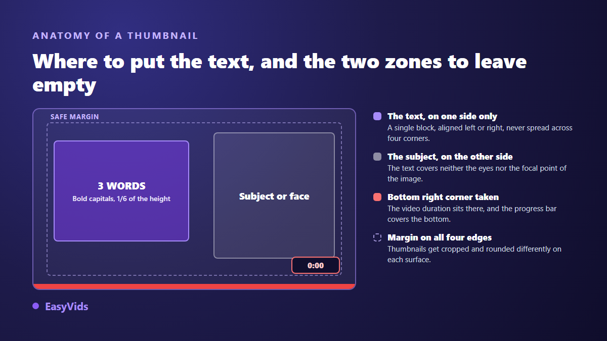
One composition rule simplifies everything: a single text block on one side, the subject on the other. Text left and face right, or the reverse. That split avoids the most common failure, a word laid across someone's eyes, which ruins both elements at once. If your text runs to two lines, align both to the same edge and keep them the same size.
Which font: four families, one clear winner
A thumbnail is not a poster. It is seen small, recompressed, usually on a phone held at arm's length. So the criterion is not elegance, it is how a letterform survives scaling. Letters survive when they have thick strokes, open counters, those internal spaces in a, e and o that fill in first, and no ornament.
- Heavy, slightly condensed sans serifs. The default answer for almost every channel: thick strokes survive scaling, and the narrower width buys you one more word per line.
- Heavy geometric sans serifs. Cleaner and more neutral, right for tutorials, professional topics and channels selling trust rather than shock.
- Serif faces. Reserve them for documentary, luxury or historical registers, and only in the heaviest weight, since fine serifs clog the moment the image shrinks.
- Scripts, thin italics and decorative faces. Drop them. They become a grey smudge at actual display size.
One font per thumbnail, two at the very most if you want to detach a hook word. And the same font from video to video: typography is the first thing that makes a channel recognisable in a feed, ahead of colour and long before a logo. The same legibility logic applies to text burned into the video itself, and our notes on choosing a subtitle font apply the same habits to moving text.
Letter size: the one sixth rule
Size is a proportion of the frame, never a point value. Our working rule: cap height never drops below one sixth of the image height. On a 1280 by 720 thumbnail that means letters around 120 pixels tall. It looks absurd while you compose at full screen. It is exactly right.
The check takes ten seconds. Scale your image down to 300 pixels wide, roughly what a feed thumbnail occupies, then step back and look at it. Your 120 pixel capitals are now 28 pixels. If the word does not read in one second, the problem is nearly always size, not typeface. Faster variant: squint until the image blurs. What survives is mass and contrast, which is what a scrolling eye actually perceives.
Contrast: the only setting you can actually measure
Contrast is computable, which makes it the most reliable of the three settings. The WCAG 2.2 accessibility guidelines, published by the W3C, set a minimum ratio of 4.5:1 between text and its background, and 3:1 for large text, from 18 point or 14 point bold. Those thresholds target web pages rather than thumbnails, but they give an honest floor: below it, part of your audience simply will not read the word, especially on a screen in daylight.
The trap is what passes behind the letters. White text on a dark background clears the ratio easily, right up to the moment it crosses a bright patch of the photo. Contrast becomes local, so you have to guarantee it rather than hope for it. Three techniques cover every case.
- An outline: a dark stroke a few pixels wide around each letter. Discreet and effective, unforgiving when too thin.
- A hard drop shadow: offset down and right, no blur. It lifts the text off the image.
- A solid bar: a flat colour block behind the word. The only method that guarantees the ratio whatever the background, and the fastest to apply.
On colour, white and yellow on a dark ground remain the safest choices. Bright red on blue vibrates and tires the eye. Green on red is worth avoiding, since that is precisely the pair confused by the most common inherited colour vision deficiency. Holding one text colour across videos also builds channel identity, which connects to our piece on what actually triggers the click.
Caps, punctuation and accented characters
Capitals almost always win on a thumbnail: they align heights, fill the space better and read faster across three words. Punctuation stays minimal. One exclamation mark per thumbnail is plenty, two look salesy, three look suspect. A full stop on three words does nothing. If you publish in a language with accented characters, keep headroom above the letters, or the accent gets cropped by the frame edge.
The text mistakes that cost you clicks
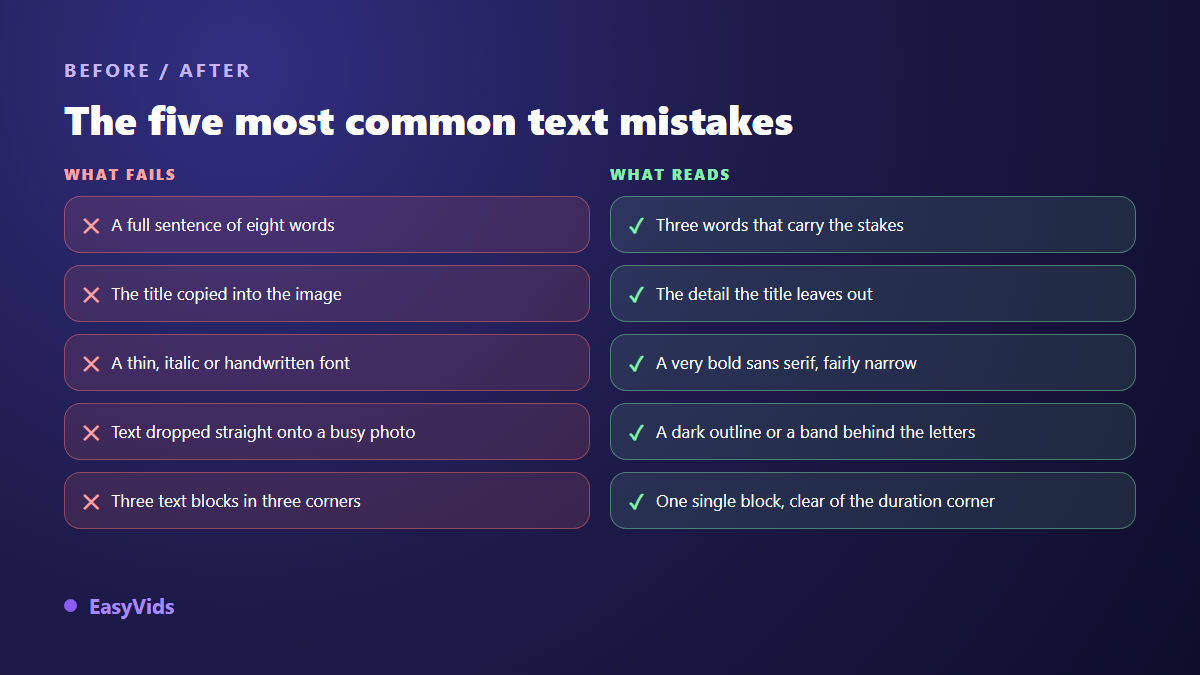
Most failed thumbnails are not ugly. They are unreadable at the size they will be seen, or redundant with the title printed right below them. Here are the five most frequent faults with their direct fix.
A sixth fault deserves its own paragraph: text that promises something the video does not deliver. An inflated hook wins clicks for a few hours, then watch time collapses as viewers leave on discovering the gap, and the recommendation system reads that signal. Honest curiosity lasts, exaggeration gets billed quickly.
Getting an AI to write the words without typos
Image generators can now write words inside a picture, which was not a given until recently. They still slip on long words, on languages other than English and on accented characters. Two habits fix most of it: give a very short string in quotes, and read the output letter by letter before publishing.
In the EasyVids studio, the generation workspace has a dedicated Thumbnail tab, kept separate from ordinary images. You describe the subject, type the overlay text in its own field, then pick a style among eight registers (viral, gaming, vlog, documentary, tutorial, horror, luxury, spiritual), a facial emotion, and a 16:9 or 9:16 frame. The text you type is passed to the model in quotes, which limits spelling drift. You can attach a face photo as a reference to appear on the thumbnail, download the result, or set it directly as the thumbnail of the video project you are working on. Plan details live on the pricing page.
When a word still comes out misspelled after two attempts, the cleanest exit is to generate the image without text and lay the words yourself in any composition tool. You then control the font, the size and the outline, which are the three settings that decide the outcome.
Test two wordings instead of guessing
Thumbnail text is the cheapest thing to change after publishing and the most profitable to revisit. Changing three words does not mean re editing the video. YouTube Studio offers a thumbnail test and compare tool, which puts several images against each other on the same video and reports the better performer, according to the YouTube help centre. Availability depends on your channel, so check your interface before planning around it. Failing that, publish one version, let it gather stable data, then change only the text and keep the image identical. For starting points, our library of thumbnail examples by niche gives concrete models to adapt.
Frequently asked questions
Does a thumbnail always need text?
No. A very legible thumbnail with a single subject and a strong expression sometimes performs better with no words at all. Text earns its place when the image alone does not state the stake, or when your niche expects it. Test both on comparable videos before deciding for your channel.
What is the maximum number of words?
Three, or four when the fourth is very short. Beyond that, letter size falls below the readable threshold at feed scale. If you cannot get down to three, the text is usually trying to summarise the video instead of stating a stake.
Which font should I use if I have no paid typefaces?
A heavy, slightly condensed open source sans serif is more than enough. Weight matters more than the name: a free face in extra bold beats a famous one at regular weight. Pick it once, then keep it across every upload.
How do I check contrast without a measuring tool?
Convert the image to black and white. If the text stays clearly lighter or darker than its surroundings, contrast holds. If it dissolves into grey, add an outline or a bar behind the letters. This rough test catches almost every problem case in seconds.
Should the thumbnail repeat the video title?
No, and this is the most common mistake. The two are read together: the title states the subject and the promise, the thumbnail states the stake, the result or the tension. Repeating the title wastes half your space and tells viewers they already know everything.
Lock these three settings once: three words, a heavy narrow font held across videos, and contrast guaranteed by an outline or a bar. Your thumbnails will become readable before they become pretty, which is the right order. To build one and its text in the same pass, creating an account opens the full studio, thumbnail tab included.