You generated a great face, wrote three punchy words, and the thumbnail still looks flat. Nine times out of ten the subject is not the problem: the thumbnail background is swallowing it. Too busy, too pale, too close to the colour of the clothes, and the eye has nowhere to land. In a suggestion feed displayed at thumb width, that means a tile nobody can tell apart from the twenty others.
The background is still the layer most creators handle last, even though it decides everything else: how readable the text is, how sharp the outline looks, which colour catches the eye from a distance. This page collects thirteen backgrounds that work, sorted by family and by situation. If you are starting from scratch, our complete guide to YouTube thumbnails covers the overall composition first; what follows is only about what sits behind your subject.
The short answer
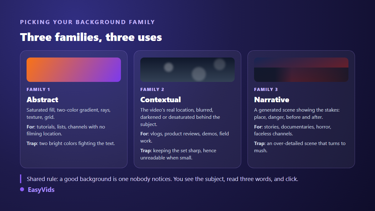
A good thumbnail background does one job: it opens a clear gap between the subject and everything around it. Three families cover nearly every case. Abstract backgrounds, flat saturated colour, gradients, rays, texture, for subjects with no location. Contextual backgrounds, the real setting of the video, blurred and darkened, for vlogs, reviews and field content. Narrative backgrounds, a generated scene showing what is at stake, for stories and documentaries. In all three, one rule decides the outcome: the background must be clearly darker or clearly lighter than the subject, never the same value.
Why the background decides readability
A thumbnail is almost never seen at full size. According to the YouTube Help Center, the recommended file is 1280 by 720 pixels at a 16:9 ratio. In a phone suggestion feed, that image appears at a fraction of the width. Background detail is the first thing to vanish, leaving nothing but a mass of colour. That mass, not the finesse of your scenery, decides whether the subject stands out or drowns.
Two practical consequences follow. A background with more than three colour zones turns into grey mush once shrunk. And the edges are not really yours, since the player interface drops the duration and sometimes a badge there. Exact values and covered zones are set out in our thumbnail dimensions sheet. Remember that the background does its work in the centre, not in the corners.
Three tests every background must pass
Before discussing styles, one check rules out the bad options. It takes a minute and stops you publishing an image that only works on your own monitor.
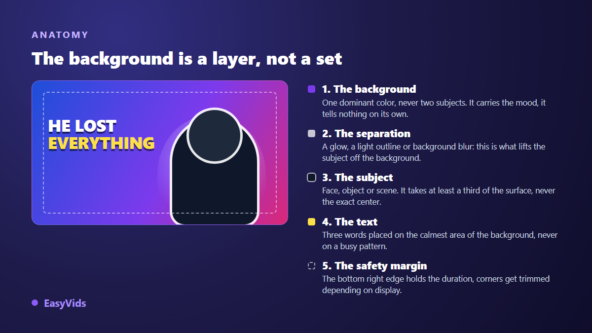
- The thumb test: shrink the image to thumb width on your phone. If the subject no longer detaches from the background, nothing else will save the thumbnail.
- The greyscale test: convert the image to black and white. If subject and background merge, you were relying on hue instead of brightness, and that never survives at small sizes.
- The feed test: put your thumbnail next to three competing videos on the same topic. If they all share the same dominant colour, change yours, however good it looks.
- The quiet zone test: find where the text will sit. If no area of the background is plain enough to carry it, the background is too busy.
Family 1: abstract backgrounds, the safe bet
These backgrounds represent nothing. They add no information, and that is exactly their strength: all the attention stays on the subject and the text. They suit channels with no filming location, list videos, tutorials, and any content where the setting adds nothing.
- Flat saturated colour: one solid tone, picked opposite the dominant hue of the subject. The most robust background there is, and the one that survives every display size.
- Two colour gradient: two neighbouring tones on a diagonal, purple into midnight blue, orange into red. It adds volume without adding detail.
- Plain dark: very deep grey or a slightly blue black. It lifts any lit subject and stays the default choice when nothing else suggests itself.
- Speed lines: rays running from the subject towards the edges. The eye follows the lines and lands on the face with no effort.
- Subtle texture: concrete, crumpled paper, fabric, a light grid. It breaks the flatness of a solid colour without ever competing with the subject.
One point about saturation is often misread. Bright colours work because they contrast with the platform interface, which is white or dark grey depending on the viewer theme. They stop working the moment everyone in the niche uses them. The formula of the big entertainment channels, broken down in our analysis of the MrBeast style, rests less on colour than on the brightness gap between a strongly lit subject and a very dark background.
Family 2: contextual backgrounds, the setting of the video
Here the background says where the video happens. It works on recognition: viewers identify a place before they read the title. The trap is always the same, keeping the setting sharp. A sharp setting carries too much information and collapses into clutter once the tile shrinks. The setting has to be treated, never left raw.
- Blurred real setting: a frame pulled from your own footage, blurred then darkened two steps. The place stays recognisable, the detail stops interfering.
- Desaturated location with one colour accent: the same setting stripped of colour except for one object kept vivid. That object becomes the entry point for the eye.
- Split background: the starting state on the left, the result on the right. The dividing line acts as a landmark and tells the story without a word.
- Workbench or desk: bench, desk or kitchen table, shot from above or blurred behind the subject. The natural background for tutorials, product tests and demos.
Two adjustments make these reliable. Darken the setting behind the subject, never the whole frame: local contrast matters more than overall brightness. And always leave one deliberately empty area, usually the third opposite the subject, so the text lands on a plain surface.
Family 3: narrative backgrounds, when the scene is the subject
These backgrounds tell something. They suit story channels, documentaries, horror, and any content with no face to show. The difficulty is balance: the scene must read instantly, so it has to be simplified far beyond what you would imagine for an illustration.
- Mood scene: a place that sums up the video, a forest at night, a server room, a city in the rain, shot with shallow depth of field so only the foreground is sharp.
- Rim light halo: a light source placed behind the subject head, drawing a bright outline all around. This is the background that separates best, whatever the niche.
- Neon background: a dark dominant crossed by two complementary neons, usually cyan and magenta. Instant gaming and tech signals, out of place anywhere else.
- Scale contrast: something huge behind a tiny subject, or the reverse. The size imbalance plants a question only the video answers.
A method note: a narrative background almost always fails because it contains a second subject. Two characters, two points of interest, and the eye hesitates. Keep one focal point and let the rest become coloured material. For compositions already proven by niche, our thumbnail examples sorted by topic show which family dominates in each category.
Contrast is the one rule you cannot bend
All these families rest on the same mechanism: the gap in value, meaning brightness, between subject and background. A light subject needs a dark background, a dark subject needs a light one. Playing on hue alone, a blue subject on a green background for instance, gives an image that looks fine on a large screen and falls apart at small sizes, because both areas share the same brightness.
When the natural gap is missing, three fixes exist and stack well. Add a light outline a few pixels wide around the subject. Place a glow behind it. Darken the background locally, right behind the silhouette. These three moves build an artificial separation that holds even on a tile a few dozen pixels wide.
Making the background with AI
In the EasyVids studio, the Thumbnail tab of the quick generation page asks for a description of the subject, then offers a style among eight, viral, gaming, vlog, documentary, tutorial, horror, luxury and spiritual, an expression among five, and either 16:9 for YouTube or 9:16 for vertical formats. The style mostly drives the background: it sets the light, the saturation and the mood behind the subject. You can type the text to display, and attach a face photo as a reference to appear on the image yourself, when the selected model accepts references.
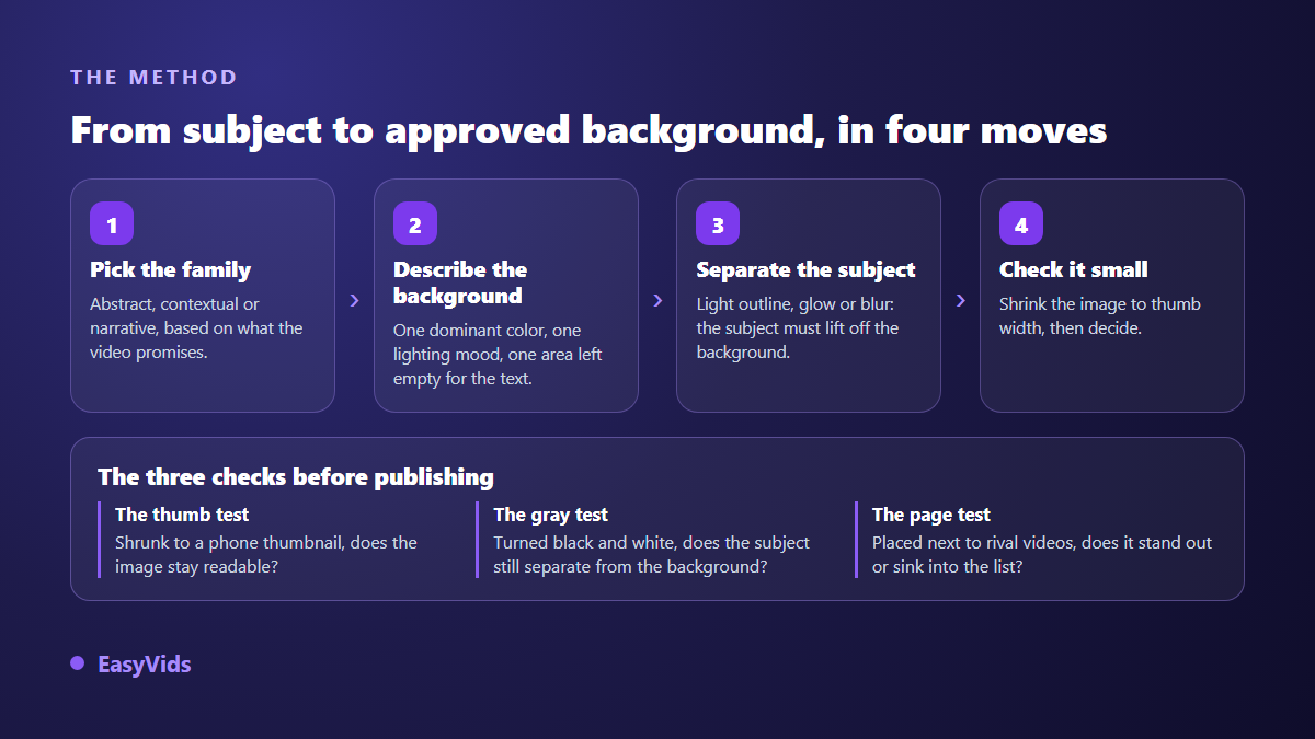
When you want to control the background on its own, use the Images tab on the same page: describe the setting, generate several variants, and keep the one that leaves the calmest area for text. A helper button writes the full prompt from a simple theme, and you edit it afterwards. How to write those descriptions is covered in our AI image generator guide. Every thumbnail you produce stays in a history kept separate from your other images, and can be set as the thumbnail of the matching video project in one click.
Five wordings that reliably produce usable backgrounds. Each describes a mood, a light and an area left free, never a subject.
- Deep purple to midnight blue gradient, studio lighting, no detail in the right half.
- Blurred night street in the rain, bokeh lights, cool dominant, shallow depth of field.
- Saturated orange flat colour with rays from the centre, poster style, plain surface on the left edge.
- Textured concrete wall lit from the side, soft cast shadow, neutral palette, no objects.
- Dark server room, cyan and magenta neons, light haze, left half deliberately empty.
Always generate several variants of a background rather than one you then try to rescue. Not every engine reacts the same way to that kind of instruction, and the criteria that really separate one AI image generator from another explain why some return clean flat areas where others add stray detail. Image generation runs on credits, with credits granted at sign up so you can try the whole chain, and the plans are set out on the pricing page.
The most common background mistakes
- Pure white: it merges with the light interface and makes the edges of the thumbnail disappear.
- A sharp, detailed setting: gorgeous large, unreadable as soon as the tile shrinks.
- Two bright colours of equal weight: they fight for attention and leave no room for text.
- The same background reused across a whole channel: recognition turns into monotony and videos stop standing apart.
- The subject dead centre on a symmetrical background: the image goes static, with no reading direction.
- A background promising something the video does not deliver: the click arrives, so does the exit, and the platform measures it.
Test instead of guessing
No rule replaces a measurement on your own audience. According to the YouTube Help Center, the thumbnail test and compare feature rotates up to three images on the same video and picks the winner on share of watch time, not on click through rate alone. It is the right tool to settle a choice between two families: submit the same composition with an abstract background, then with a contextual one, and let the platform answer. Change one variable at a time, otherwise the result teaches you nothing.
Frequently asked questions
Do I have to cut out the subject to change the background?
Not necessarily. Two routes exist. Classic cut out work, in a photo editor, separates a photographed subject from its setting. Direct generation produces subject and background in a single image: you describe both in the same request and the separation is already done. The second route is faster, the first stays essential when you must keep one specific photo.
Which background colour performs best on YouTube?
No colour wins in the abstract. What stands out is the gap with two things: the colour of your subject, and the dominant tone of neighbouring thumbnails in your niche. Look at a results page on your topic, note the majority hue, and deliberately take another. Purple works when everyone is in red, and the reverse holds just as well.
Can I use a frame from the video as the background?
Yes, and it is often the best choice for vlogs and demos, because the visual promise matches the content exactly. One condition: treat the image first. Blur the setting, darken the area behind the subject and leave a plain surface for the text. A raw screenshot almost never has the contrast you need.
Should the background be different for Shorts?
The logic changes, yes. The preview of a short format is vertical, and the player interface covers the bottom and the right side with the title, the buttons and the channel name. So the background must stay very simple, with the subject pushed towards the upper third. A background designed for 16:9 and then cropped vertically always loses its text area.
How many backgrounds should I generate before choosing?
Three to five variants are enough, provided they come from different families. Generating ten versions of the same gradient teaches you nothing. Compare an abstract, a contextual and a narrative one on the same composition, then run the thumb test on each. The decision takes seconds.
Take your latest thumbnail and ask the only question that matters: is the background helping the subject stand out, or competing with it? When in doubt, darken the background, clear a plain area for the text, add a light outline around the subject. Those three moves usually settle it. To generate your backgrounds and thumbnails in one place, in 16:9 and vertical alike, create your account and try three families on your next video.