You ask viewers to subscribe out loud, and nothing happens. The line slips past, the video rolls on, the moment is gone. A YouTube subscribe button animation changes the mechanics: instead of a request that lives only in the audio, you place a short visual reminder on screen, at the exact second the viewer decides you are worth following. It takes a couple of minutes to build, then works on every video after that.
People stall on the same belief: that this needs a transparent animation file, a compositing app and an evening of work. It does not. A subscribe reminder is a simple stack: a shape, a word, a movement, sitting on a track above your footage. If the animation vocabulary is new to you, our motion design guide covers the timing and legibility rules used here.
The short answer
A subscribe button animation is built in a video editor by stacking a rounded shape, a very short word and an entrance plus an exit animation. It stays visible for 3 to 5 seconds, appears once or twice per video, and carries a brief sound. One clarification saves a lot of disappointment: the button you draw is not clickable. What actually takes the click is the platform button, the branding watermark and the end screen subscribe element, which our guide to YouTube outros covers in detail. Your animation is there to steer the eye toward them.
Three subscribe prompts, only one is yours
According to the YouTube help centre, two subscribe prompts belong to the platform. The first is the branding watermark: a small square image uploaded once in YouTube Studio, under Customisation then Branding, which then appears over your videos. The help centre asks for a light square image, in the region of 150 pixels a side, and lets you pick when it shows: at the end of the video, at a start time you set, or for the whole runtime.
The second is the end screen subscribe element. Again from the YouTube help centre, a video must run at least 25 seconds to carry an end screen, that screen occupies between 5 and 20 seconds at the end, and it accepts four elements at most. The third prompt is yours: the animation you edit into the file. It does not click, and that is exactly what makes it free. No size, duration or position rule applies to it.
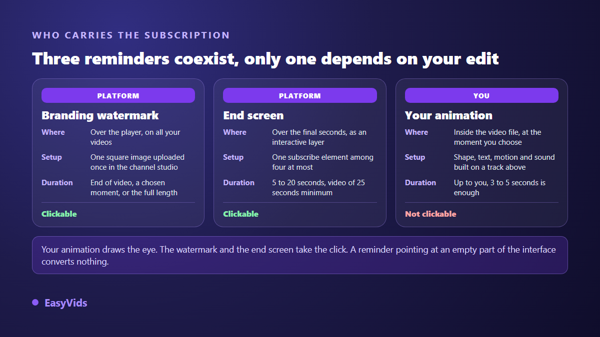
The useful combination fits in one sentence. Your animation catches the eye, the platform features take the click. A drawn reminder pointing at an empty corner of the interface looks nice and converts nothing, so open one of your own videos first and note where the button and the watermark actually sit on a viewer's screen.
Timing beats design
A reminder dropped at random reads as an advert. Placed well, it reads as a logical next step. The rule of thumb: ask right after you have kept a promise, never before. A viewer who has just understood something is available. A viewer asked for a favour before receiving anything closes up, and your next request lands even worse.
- After the first useful answer. You have just delivered what the title promised. The reminder slides in at the side, without cutting the narration, then leaves.
- On the peak moment. The demo works, the comparison lands, the result appears. Attention is at its highest, so the reminder rides on it.
- Before the outro, not during it. The end screen already carries its own subscribe element. Doubling the request at the same second crowds the frame instead of reinforcing it.
Six parts of a reminder people actually notice
A failed reminder is almost always too faint or too wordy. Six parts make it readable, and none of them needs design skills. They all sit in the basic settings of an online editor.
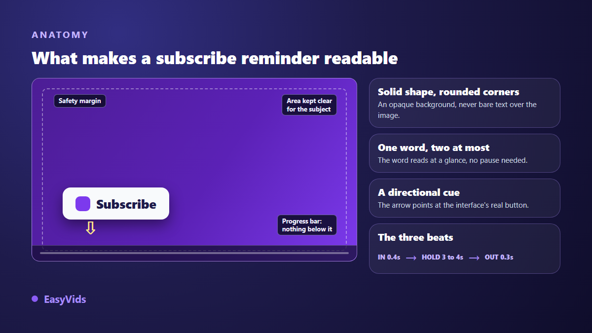
- A solid rounded shape. Bare text over footage becomes unreadable the moment the background changes colour. The shape settles it.
- One word, two at most. Subscribe reads at a glance. A full sentence forces a pause, so nobody reads it.
- A colour reserved for this job. Pick a shade you use nowhere else in your branding, and keep it across every video.
- A directional cue. An arrow or a highlight circle pointing at the real button, not a decoration parked in the middle.
- A safe margin. Nothing against the edges, nothing under the progress bar, nothing in the caption band.
- A size built for a phone. Shrink your preview to thumbnail size: if the word stops being readable, make it bigger.
Movement: three entrances that work, one that wears out
The animation is not there to impress. It buys a fraction of a second of attention without pulling focus from the video. Three entrances do the job. A slide from the nearest edge suggests the element came from the interface itself. A pop, a slight scale overshoot then settle, catches the eye quietly. A zoomed fade stays sober, which suits calm subjects and serious topics.
The one that wears out is familiar: the permanent pulse, a button growing and shrinking on a loop for twenty seconds. Viewers stop seeing it by the third cycle, then it becomes noise. Hold the three beat rule instead: an entrance of roughly four tenths of a second, a hold of 3 to 4 seconds where nothing moves, an exit faster than the entrance. Our editor offers around twenty entrances and as many exits, from fade to bounce, and our rundown of animated text effects explains what each one says.
Sound: a short cue, not a fanfare
A silent reminder loses half its effect, especially with viewers who listen more than they watch. A short cue is enough: a notification note, a light chime, a dry hit. The sound library built into our editor holds these cues, tuned for editing, and dropping the track under the animation is all it takes. Keep the cue well below the voice, around a fifth of its volume, and reuse the same one every time. Repetition builds the reflex, volume does not.
Building it in a browser, step by step
None of this calls for an animation suite. It happens in a browser, on stacked tracks, exactly the way our online video editing guide describes. Six steps, and the first one decides the rest.
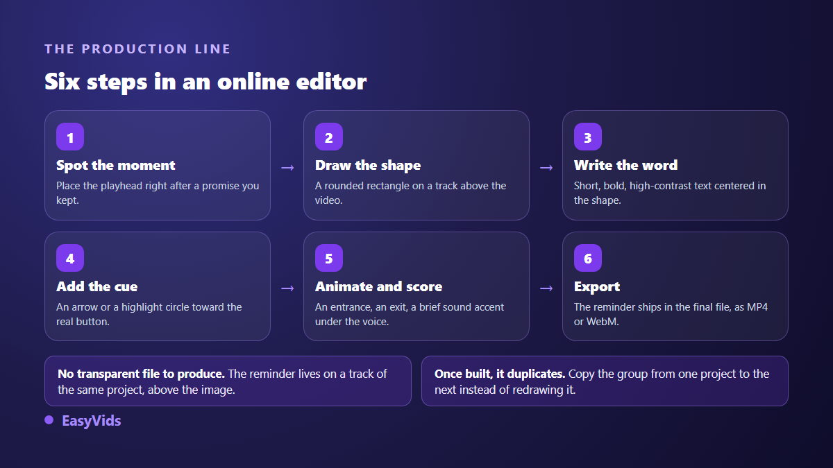
- Find the moment. Play the video, stop right after a promise is kept, park the playhead there.
- Place the shape. Add a rectangle on a track above the video, then raise the corner radius with a slider. No drawing involved.
- Write the word. Short, large, high contrast, centred in the shape. Group the two so they move together.
- Add the cue. The sticker library provides arrows, including a downward arrow and a highlight circle, made to point at something.
- Animate and score it. One entrance, one exit, then the short sound dropped on the audio track under the voice.
- Export. The reminder ships inside the final file, as MP4 or WebM, at the quality you choose.
Two honest notes to close this step. You have no transparent file to produce: the reminder lives on a track in the same project, above the picture, and a flat export carries it. As for our engine that builds animation entirely from code, with no templates, it is still under construction and is not open on every account yet. The online editor covers this need comfortably, and our plans are listed on the pricing page.
Vertical changes where it goes
A reminder designed in landscape then cropped to vertical ends up under an interface element half the time. In vertical, the bottom of the screen and one side column carry the platform controls, the channel name and the description. The genuinely free zone is the central band, slightly above the middle. Always check on a phone before publishing, never on a wide preview, because the layout shifts from one device to another.
On short vertical formats the request rests mostly on your voice and on screen text. According to the YouTube help centre, end screens do not appear on Shorts, so the reminder you edit into the video becomes your only visual lever there. That alone justifies spending a little more care on it.
What the platform rules actually forbid
A visual reminder is entirely allowed. What you promise around it is another matter. The YouTube policy on spam, deceptive practices and scams explicitly targets subscriptions obtained through exchange or reward, sub for sub first among them. An animation announcing a gift for anyone who subscribes puts you under that rule. The animation on its own does not.
Second point: the platform logo and official buttons are governed by its brand usage rules, which cover distortion and recolouring in particular. Drawing your own button, in your colours and your shape, removes the question entirely. It also gives you an element that belongs to you and becomes recognisable, which a generic copied button never will.
Frequently asked questions
Can I use the real YouTube subscribe button in my video?
Reusing the official logo and buttons follows the platform brand usage rules, which cover distortion and recolouring among other things. The simplest route is to draw your own: a rounded shape, your colour, one word. You gain freedom, and the reminder becomes part of your branding instead of a borrowed asset.
How long should the reminder stay on screen?
Between 3 and 5 seconds of steady presence, framed by a quick entrance and a quicker exit. Shorter, and viewers cannot identify it. Longer, and they file it as advertising and ignore it, including the next times.
Do I need a transparent video file to add the reminder?
No, and that is the most common misunderstanding. A transparent file exists to carry an element from one application into another. If you build the reminder inside the project that already holds your video, placing it on an upper track is enough: the final export contains the animation.
Does it work on short vertical formats?
Yes, provided you keep it in the central band of the frame, away from the controls and the interface text. On those formats, according to the YouTube help centre, end screens do not appear, so your animation and your voice carry the request alone.
Should I also say subscribe out loud?
A short line spoken as the reminder appears makes it noticeably stronger, provided it fits in one breath and gives a reason. Subscribe if you want the rest of this series works better than a bare instruction. Our call to action formulas offer more, sorted by format.
A subscribe reminder is not judged on how many effects it chains, but on how consistent it is: same shape, same sound, same moment, video after video. Build it once, properly, then simply place it well. To assemble yours in a browser, with no animation software to install, create an account and open the editor in the EasyVids studio with your next video.