You have an annual report, a quarterly review or an internal study, and inside it a handful of numbers that genuinely matter. You drop them onto slides, export the deck as a video, and your audience leaves before the third chart. The subject is not the problem. The form is. An animated infographic is not a prettier table scrolling past: it reveals a number at the exact second the voice says it, then lets the eye settle before moving on.
The hard part is rarely technical. It is editorial: deciding which numbers earn a shot, and which ones go back into the appendix. This guide follows that order. First the cut, then the visual shape that suits each type of data, then the pacing, and only at the end the production itself. If motion vocabulary is new to you, our complete motion design guide covers the groundwork before we get into numbers.
The short answer
An animated infographic is a short video where figures are staged through movement: a number that lands, a bar that grows, a ring that fills, a line that draws itself. The production rule fits in three lines. One number per shot, never two. One spoken sentence per number, saying what it means rather than what it equals. A shot length locked to that sentence, somewhere between five and fifteen seconds. Everything else, colour, type, entrance effects, either serves that structure or damages it.
Animated or static: two different objects
A static infographic gives everything at once. The reader picks a path, goes back, compares two columns at their own pace. That is a reference document, and it works beautifully as a press asset or a downloadable appendix. An animated infographic does the opposite: it imposes an order. You decide what is seen first, what follows, and what never appears at all. That control is a real advantage when your message has a single conclusion. It becomes a handicap the moment your audience needs to dig.
One warning about the statistics that circulate around this format. You will meet the claim that images are remembered sixty times better than text, or that the brain processes visuals sixty thousand times faster. Those lines have travelled through sales decks for years, and attempts to trace the original study have never succeeded. Keep them out of your video: an unverifiable number in the opening shot undermines every real number that follows.
Cut it down: three numbers, not thirty
The biggest flaw in data videos is not visual, it is quantitative. You want to show everything because everything took work. The result is a parade of charts nobody remembers. A two minute video carries three to five numbers comfortably, no more. So the cut happens before the writing, and it hurts: half your data will not make it.
Five questions are enough to decide, in this order.
- Does this number change a decision? If not, it belongs in the appendix.
- Is it memorable without its unit? One customer in three survives until tomorrow, 34.7 percent of respondents does not.
- Does it have a reference point? A lone figure says nothing. Against last year, or against a target, it speaks.
- Can you put its source on screen? Data whose origin you cannot name has no place in a film.
- Does it fit in one spoken sentence? If it takes three, that is not a shot, that is a chapter.
Pick the shape that carries the message
Once the numbers are chosen, each one calls for a shape. The choice follows the nature of the comparison, never the appeal of the effect. Comparing quantities, showing change over time, expressing a share of a whole and presenting a ranking are four different intentions, and they do not call for the same drawing.
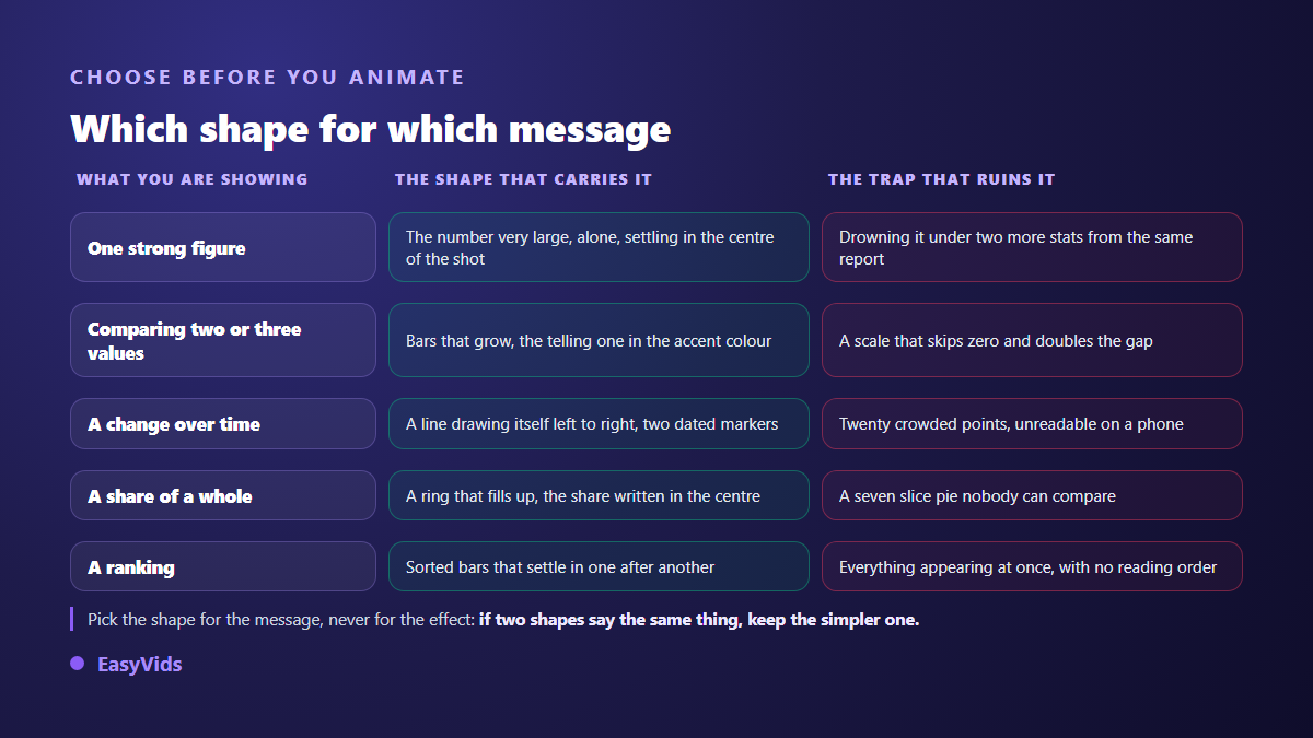
One precaution applies to all of them: the scale must stay honest. Edward Tufte, in The Visual Display of Quantitative Information published in 1983, calls lie factor the ratio between the size of the effect shown in the graphic and the size of the effect present in the data. An axis starting at ninety instead of zero turns a two point gap into a cliff. In motion the distortion is worse still, because a bar that grows lends it a force the static chart never had.
The same book defends another idea that pays off here: the ratio between the ink spent and the information actually carried. On a five second shot, anything that does not help read the number steals attention. Background grids, three dimensional bars, drop shadows, legends nobody has time to parse. Remove everything whose removal costs nothing.
One number per shot, and the voice sets the length
Pacing is the second reason people leave, right after overload. One rule settles it: the shot lasts exactly as long as the sentence spoken over it. A shot still on screen eight seconds after its animation finished is no longer motion design, it is a filmed slide.
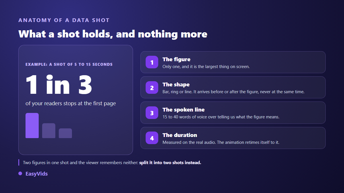
On our own productions, a sentence of fifteen to forty words lands a shot of five to fifteen seconds, which is the window where a figure has time to be read without the viewer getting restless. Past that, split into two shots rather than speeding up the read: a rushed voice is audible, and it tires people out.
The voice carries as much weight as the chart. A figure announced flatly evaporates; the same one delivered with a beat before the number stays. The settings that make that difference are covered in our guide to a genuinely natural AI voice over, where punctuation matters far more than most people expect.
Write the script before you draw anything
An animated infographic is written as a demonstration, never as a table of contents. The structure that works most often has five movements, each taking one or two shots.
- The observation. A situation your audience recognises instantly, with no figures at all.
- The surprising number. The one that contradicts intuition, shown alone, uncommented for a second.
- The explanation. Why the number is what it is, in a single sentence.
- The consequence. What it concretely changes for the person watching.
- The action. One only, phrased as an instruction, held on screen longer than the rest.
Write that text for the ear, not the eye. Numbers get spoken: close to a third reads better out loud than 32.4 percent, even when the exact value stays on screen. It is one of the rare cases where the written and the spoken version may differ without misleading anyone: the voice rounds, the frame gives the precision. The last movement, the action, is built like a proper end screen: our guide to the YouTube outro gathers the layouts that send viewers to another video instead of closing the tab.
Building the shots without animation software
Three routes exist, and they serve different needs. Template libraries let you swap the text inside an animation somebody else built: fast, but your numbers move into a frame designed for other people, and your brand never quite fits. An online editor lets you compose the shots yourself, with more freedom and a little more time. The third route has each shot written for your project, then computed frame by frame.
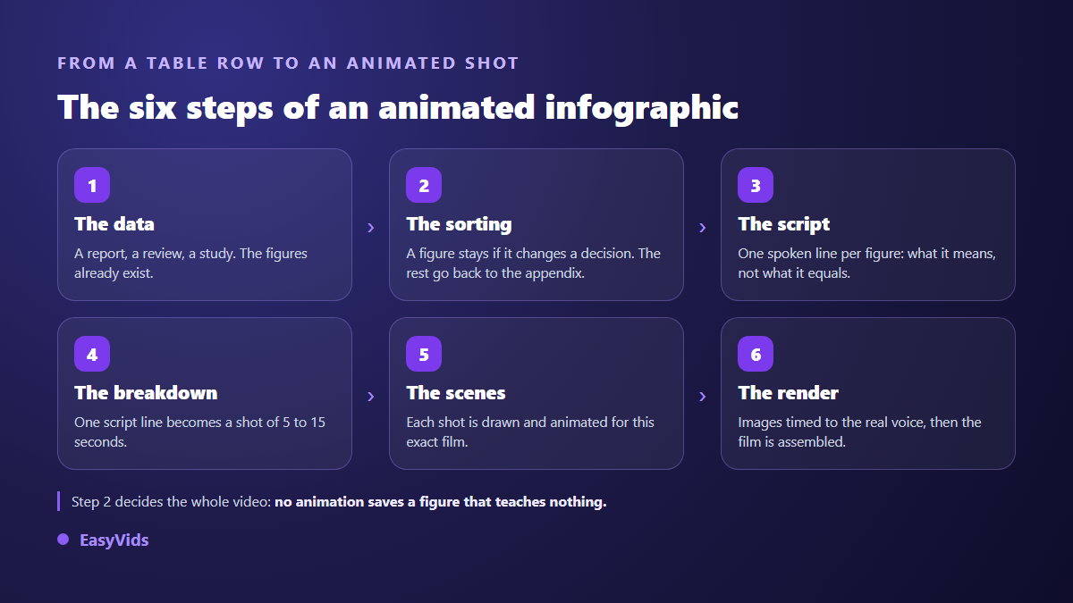
That third route is what we are building at EasyVids, on the dedicated motion page. You paste your script, one line becomes one shot, and the AI first writes an art direction for that specific film, then every animated scene that follows it. You can attach up to twelve images, a logo, your colours and your typeface. The film is then photographed frame by frame on our servers and assembled with the voice over. For numbers the consequence is decisive: the text stays perfectly sharp, which no video generation model guarantees today, and the colours are exactly yours.
An honest note: this part is still under construction and is not open on every account yet. The rest of the studio is available from sign up, including the image generator for your icons and backgrounds, voice over, music and editing. Our plans are listed on the pricing page.
Mistakes that undermine your numbers
- A truncated axis that exaggerates a gap, all the more misleading once animated.
- A percentage with no base: up 40 percent on what, and compared to when?
- Three dimensional charts, which distort areas and add nothing to the reading.
- No source on screen, when one discreet line at the bottom would do.
- Pointless decimals, which slow the read without adding precision anyone uses.
- Two numbers in one shot, fighting for attention and both losing it.
Readability: the thresholds you can measure
Three constraints are not matters of taste. The W3C accessibility guidelines for web content, in their 2.1 version published in June 2018, set a contrast ratio of at least 4.5 to 1 between body text and its background, and 3 to 1 for large text. The same document, at criterion 2.3.1, rules out content flashing more than three times per second, for a reason that has nothing to do with style: the risk for photosensitive viewers. A strobing transition between two charts falls squarely into that case. Those thresholds reach beyond the shots themselves: the thumbnail that will introduce the video on your channel is judged on the same text to background ratio, at a far smaller size.
The third constraint comes from the screen itself. Your video will be watched on a phone held at arm's length, often with the sound off. Text below two percent of the frame height stops being readable. The same floor applies to the mark you park in the corner: a logo built to survive being shrunk still reads at that size, an intricate drawing does not. A shot showing three blocks of text at once gets none of them read. And if your message rests on colour alone, part of your audience misses it: always back colour up with position, size or a written label.
Format and distribution: decide before, not at export
A wide chart cropped to vertical loses its labels. It is the most common and most avoidable failure in this format. Choose the frame before writing: landscape for a presentation, a website or a classic channel, vertical for short form feeds, square for a social timeline. Size and duration references per platform are gathered in our video format sheet.
Frequently asked questions
Do I need spreadsheet skills to make an animated infographic?
No. You need your numbers and their source, nothing more. A spreadsheet computes values, it does not stage them: once a figure is chosen and checked, it goes into a script sentence like any other piece of text.
How long should an animated infographic be?
Between thirty seconds and two minutes in the vast majority of cases. Length follows the number of figures kept: count one shot of five to fifteen seconds per data point, plus an opening and a close. If your cut runs past three minutes, there are almost always figures left to remove.
Can I connect a data file so the charts draw themselves?
Not in our studio today: values are written into the script, shot by shot. That constraint has a useful side effect, it forces the cut. Tools that swallow a whole file often produce videos that look like dashboards, where nothing stands out.
How should sources be credited in a data video?
One discreet line at the bottom of the shot, readable but secondary, with the name of the organisation and the year. It stays on screen for as long as the figure it supports. For official statistics, name the report rather than the website: a report title is still findable years later.
Does the format work for a subject with no numbers?
Yes, and it is a common use. A process, a set of instructions or a comparison of two approaches follow the same rules: one idea per shot, a shape that carries the message, a spoken sentence that sets the duration. Only the nature of the data changes.
Take your latest report, keep five numbers, drop the rest, then write one spoken sentence for each: your video is already half made. What follows is craft, and the markers in this guide cover it. To write, illustrate, narrate and edit all of it in one place, create your account: the EasyVids studio holds those steps together without switching tools between them.