You publish a video you worked hard on. The edit holds up, the voice is clear, the topic is solid. It stalls. Meanwhile a rougher video on the same subject takes off. The difference rarely sits in the content. It sits in the YouTube thumbnail, a few hundred pixels that decide, before anyone reads your title, whether your work gets watched or scrolled past.
A thumbnail is never judged the way you build it: full screen, on a large monitor, with all its details visible. It is judged in a fraction of a second, on a phone, squeezed between ten competing images and a notification. It does not need to be beautiful. It needs to be understood instantly. This guide covers the real technical limits, what triggers the click, the mistakes that hurt your click through rate, channel wide consistency, vertical covers, AI assisted production, and how to test properly.
The short answer
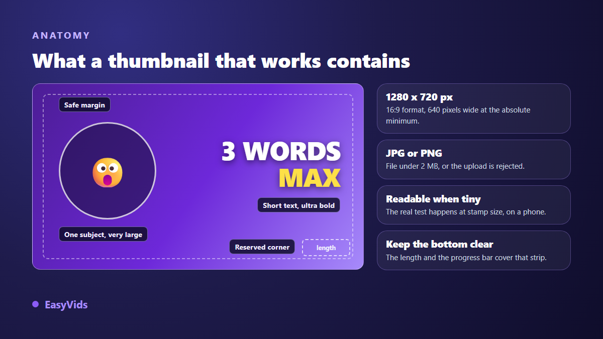
A YouTube thumbnail should be 1280 by 720 pixels, 16:9, JPG or PNG, under 2 MB. Visually, it shows one single subject, framed tight, on a high contrast background, with no more than three or four words of text, set large enough to stay readable at stamp size. It does not illustrate the title: it adds the information the title leaves out. Everything else follows from those four principles.
A thumbnail never works alone. It promises something the first seconds of the video must deliver. If you produce your videos with AI, our complete guide to AI video generation walks the whole chain, from idea to exported file. The thumbnail is the last piece of it, and almost always the most profitable one to improve.
Exact sizes and technical limits
Start with what is not negotiable, because a rejected upload wastes time for no reason. YouTube expects 1280 by 720 pixels, a 16:9 ratio, with a minimum width of 640 pixels. If your visuals come from a vertical or square source, the exact 16:9 sizes and how to avoid black bars will save you from simply stretching the image. Accepted formats are JPG, PNG and GIF, and the file must stay under 2 MB. Uploading a custom thumbnail requires a verified account: if the option is missing in your studio, verification is almost always the reason.
Two areas deserve attention because they get covered. The bottom right corner carries the duration label, so anything placed there disappears. The bottom edge, across the full width, carries the red progress bar once a viewer has started watching. Keep that strip clear, and leave a safety margin on all four sides, since thumbnails are cropped or rounded differently depending on the surface.
One more technical point changes a lot: compression. Your image is recompressed and served at several sizes. A composition full of soft gradients, fine detail and texture comes out dirty once scaled down. Flat areas, clean edges and few elements survive far better. The technical constraint and the readability constraint push in the same direction: simplify.
The squint test: your thumbnail will be tiny
The biggest production mistake comes from how creators look at their own work. You compose large, on a wide screen, admiring details nobody will ever see. Your viewer meets the image at a couple of centimetres wide, sometimes less, between two competing videos, while scrolling.
Build this habit before every upload. Export the image, scale it down to roughly 300 pixels wide, then step back a metre from the screen. If you cannot identify the subject and read the text within a second, rebuild it. Faster variant: squint until the image blurs. What survives is mass and contrast, which is exactly what a scrolling eye perceives.
What actually drives the click
Three levers do most of the work, and none of them makes up for the absence of the other two.
Contrast first. A bright subject on a dark background, or the reverse, separates from the feed. Flat mid greys and untouched desk photos blend into the page and disappear. The fastest fix for a dull thumbnail is to cut the subject out and place it on a deliberate background instead of keeping the original cluttered scene.
A face second. Eyes pull attention before anything else in an image, and a readable expression gives the video an emotion before it opens: surprise, doubt, focus, relief. Frame wide on the face, down to the shoulders, and drop neutral expressions that say nothing. If you do not show your face, replace it with one single subject treated like a character: an object, a product, a recurring illustration that becomes your signature.
Readability last. A working thumbnail decodes in one second because it carries one idea. Two subjects, three text blocks and four bright colours give the eye a reason to give up. Decide what viewers must see first, then remove everything that competes with it.
Three words, never a sentence
Thumbnail text is not a second title. It adds the missing word, the one that creates tension or sharpens the angle. A full sentence fills the frame with characters nobody can read at real size, and repeats information already printed right below the image.
A few typographic rules hold up whatever your channel style. They look rigid, and they are the difference between text that reads and text people have to guess.
- Three to five words maximum, in caps or heavy case.
- A thick weight, never a thin or decorative script font.
- Cap height around one fifth of the image height.
- An outline or drop shadow to lift the text off the background.
- Two colours at most, with a single accent colour on the key word.
- Placement over a calm area, never over busy detail.
Title and thumbnail are a pair
They are read together, never separately. Repeating the title inside the image wastes half your available space and tells viewers they already know everything. The split is simple: the title states the subject and the promise, the thumbnail states the stake, the result or the tension. For a video called « How I edit a video in ten minutes », the thumbnail should not say « fast editing ». It shows the before and the after, with a single word in the middle.
The mistakes that sink your click through rate
Most failing thumbnails are not ugly. They are unreadable at the size where they are actually seen, or redundant with the title. Here are the most common faults and their direct correction.
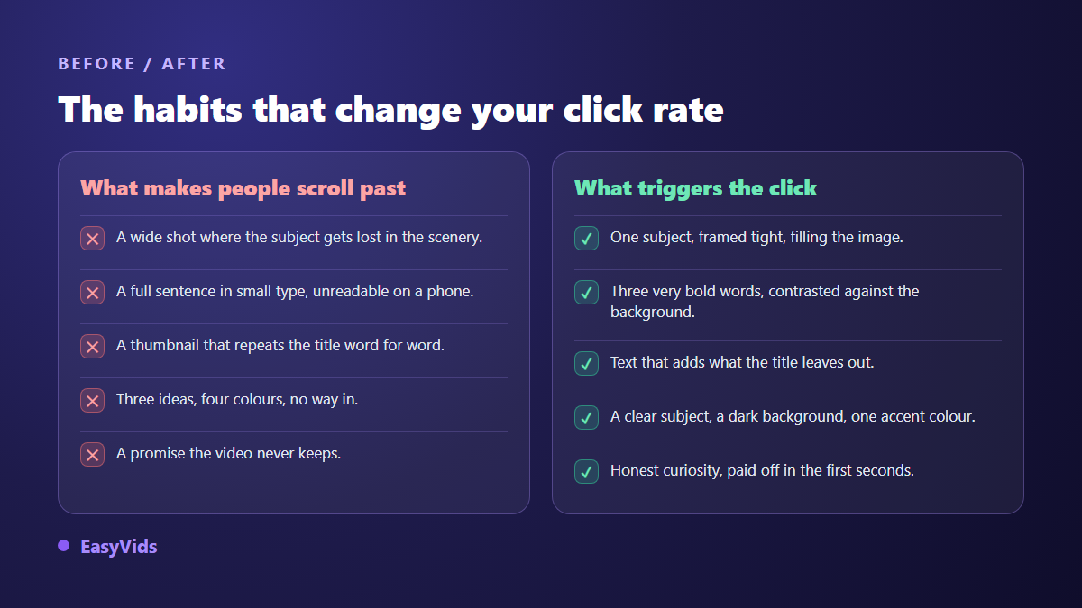
- A wide shot where the subject drowns in the scene: crop in tight.
- A full sentence in small type: keep three words, double the size.
- A thumbnail that copies the title: add the missing information instead.
- The original cluttered photo background: cut out and replace it.
- Bright colours everywhere: dark background, bright subject, one accent.
- A promise the video does not keep: click won, audience lost.
One word about clickbait, since the temptation always returns. An exaggerated thumbnail wins clicks for a few hours, then watch time collapses because viewers leave when they find something other than what was advertised. The recommendation system reads that signal and stops surfacing the video. Honest curiosity works for years, exaggeration bills you fast.
Channel wide visual consistency
A single thumbnail chases a click. A consistent set builds identity: after a handful of videos, your audience recognises you in a feed before reading your name. It is a compounding advantage most channels ignore, because it never shows up on any individual video. That identity is worth extending into motion, through an intro or animations built on the same colours and the same typeface: our guide to motion design shows how to produce them without complex software.
- A palette of two or three colours, always the same ones.
- One typeface, with its weight and slant locked.
- A constant position for the subject and another for the text.
- One background treatment: flat, gradient or blur, but chosen on purpose.
- A discreet series marker for recurring formats, such as an episode number.
Do not confuse consistency with repetition. If every thumbnail looks interchangeable, your audience can no longer tell new uploads from what they already watched. The style guide sets the frame, each video changes what sits inside it.
Covers for vertical formats
Vertical formats follow different rules. A Shorts cover is vertical, in 9:16, picked from a frame of the video or uploaded from the mobile app. More importantly, a large share of the screen belongs to the interface: title and description at the bottom left, the button column on the right, the navigation bar at the very bottom. Keep your subject in the central third and write nothing near the bottom edge. The horizontal format never moves by contrast: its dimensions, its weight limit and the accepted file types are gathered in our YouTube thumbnail size sheet, worth keeping open while you export.
Keep the role of that cover in perspective too. In the vertical feed playback starts on its own, so the first two seconds of the video do the retention work. The cover matters most on your channel tab, in search results and in shares, where it is seen as a still image.
Building a thumbnail with AI
There are two ways to use AI here, and the second one wins. The first asks a model for a finished thumbnail, text included. The second generates the background or the subject, then adds the text yourself in an editor. Image models still write words poorly, and more importantly you lose control over text size and contrast, which is precisely what decides readability.
An effective thumbnail prompt does not describe a movie scene, it describes a composition. Specify the framing, the scale of the subject in the frame, the gaze direction, the lighting, the background colour, and above all the empty space to preserve. Something like « close up portrait, surprised expression, plain dark background, subject on the left, right half empty » gives you a usable base. Generate several variants rather than one: choosing between five options beats defending a single image. These prompts follow the same principles as any generated picture, which our guide to AI image generators covers in detail, from framing to reworking a result that is almost right.
The rest happens in the editor: cutout, text, accent colour, export at 1280 by 720. For a channel, the real difficulty is keeping the subject consistent from video to video, and that is solved with reused visual references rather than by retyping the same description. EasyVids handles image, text and export in one place, and the plans are listed on the pricing page.
Test two thumbnails instead of guessing
Nobody guesses what will work, and creator intuition gets disproved regularly. YouTube now offers, in the studio and for eligible channels, a test tool that runs several thumbnails against each other on the same video and picks the one delivering the most watch time. When it is available, use it: it is the only clean comparison, because the versions are shown in parallel to the same audience.
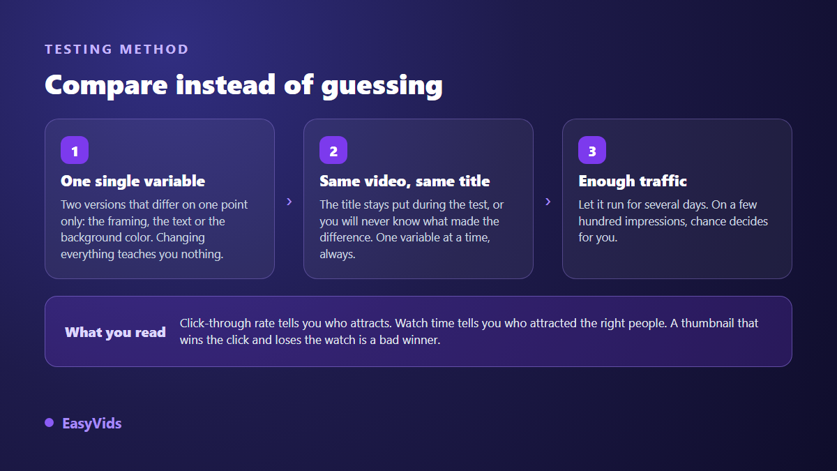
Without that tool, the manual method still helps if you accept its limits. Publish with a first thumbnail, wait several days, swap in a second version that changes exactly one element, and compare over equivalent windows. Since traffic is never stable over time, never conclude from a few hundred impressions: at that volume you are measuring luck.
A last word on reading results. Click through rate tells you who was attracted, watch time tells you whether they were the right people. A thumbnail that wins the click and loses the session is a bad winner, and the recommendation system notices faster than you do. Always read both together, over the same period.
Frequently asked questions
What size should a YouTube thumbnail be?
1280 by 720 pixels, 16:9, with a minimum width of 640 pixels, as JPG or PNG, under 2 MB. A larger image at the same ratio uploads fine. A smaller one gets stretched and looks soft on large screens.
Do I have to put text on a thumbnail?
No. Entire channels work with a strong image and not a single word, especially in cooking, travel and music. Text becomes useful when the image alone does not convey the angle, or when you want to add something the title does not carry. Three words are enough.
Can I change the thumbnail of a published video?
Yes, as often as you like, from the studio. The change takes a while to propagate across surfaces, and shares already posted may keep the old image cached. It is one of the fastest ways to revive an older video that retains well but gets few clicks.
Are AI generated thumbnails allowed?
In themselves, yes. What causes problems is a misleading image: an event that never happened, a real person's face used without permission, a dramatic scene absent from the video. Check commercial usage rights as well; the ones covering our studio are detailed in the FAQ.
What click through rate should I aim for?
There is no universal number: it depends on your traffic sources, your topic and the size of your audience. The only useful comparison is your own videos against each other, over comparable periods. Follow the trend rather than the absolute value, and always pair it with watch time.
The thumbnail is the fastest part of your channel to rebuild, and often the one that pays best. Pick a video whose subject deserves better numbers, remake its image with three rules only: one subject, hard contrast, three words readable at tiny size. Then measure over several days before drawing conclusions. To generate your visuals, set your text and hold one identity across every upload, creating an account opens the full studio right away.