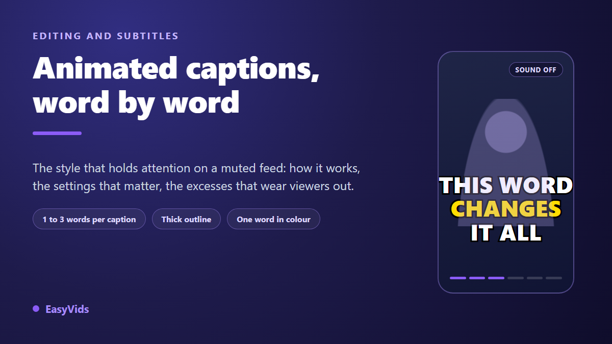
You post a short video. The idea is good, the delivery is clean, and people still leave after three seconds. The content is rarely the problem. Part of your audience scrolls with the sound off, on a train, in a meeting, in bed, and a small grey line of text stuck to the bottom of the screen gives them no reason to stay. That is the gap Hormozi style captions close: two or three word cards that land exactly when the words are spoken.
The format is named after the entrepreneur who made it famous, but nothing about it is magic and nobody owns it. It is a stack of settings, all copyable and all adjustable. This guide takes the stack apart: what really holds the eye, the six settings that decide legibility, the excesses that exhaust a viewer within ten seconds, and how to adapt the same look to every platform.
The short answer
Word by word captions are a run of very short cards, one to three words each, shown precisely while those words are spoken. The type is heavy, usually uppercase, wrapped in a thick black outline, sitting in the lower third of the frame, with a single word per card picked out in colour. Each card lands with one short entrance effect, always the same one. The rest is discipline: one accent colour, one style from first frame to last, and placement that clears the app interface. If you are starting from scratch, read our guide to automatic subtitles first, which covers transcription and proofreading before any styling.
Why the style works
The look took over vertical feeds in the early 2020s, carried by talks and interviews rechopped into one minute clips. Nobody invented it: word synchronised text already existed in karaoke and music games. What changed was scale and consistency. One heavily followed creator applied the same recipe to every single piece of content, and thousands copied it until the style became a visual code readable in a second.
Three plain mechanisms explain the results, and none of them is fashion. Movement comes first: the eye follows change, and a card refreshed twice a second creates a stream of micro movements. Involuntary reading comes second: a huge word in the middle of the screen is read before you decide to read it. Reduced load comes third: two words are taken in with one glance, a full sentence needs a scan. Stacked together they buy one more second of attention, then another. The same logic drives the rest of a short video, which our AI video generator guide covers end to end.
What word by word really means
The label misleads. True word by word would show one word at a time, and sometimes it does. In practice most videos carrying the name show groups of two or three words with one word highlighted inside the group. The distinction matters: a lone word forces the eye to hop between cards without ever forming meaning, while a short group carries a whole idea.
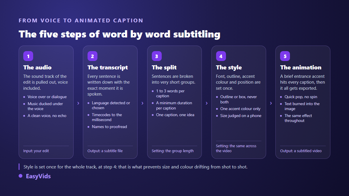
The chain has five steps and step two decides the rest. A useful transcript does not just return text, it returns the exact moment each segment starts and ends. Without those timestamps you place every card by hand, which is hours of work on a three minute edit. With them, splitting into short groups becomes arithmetic and the edit is free to focus on style.
The six settings that decide the result
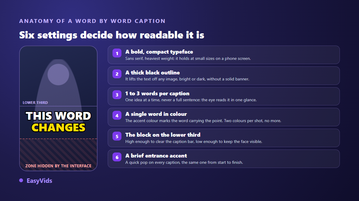
This is what separates captions that grab from captions that assault. Set these six once, at the top of the project, then apply them to the whole track instead of tweaking card by card.
- Typeface: a very heavy sans serif, on the narrow side. Medium weights vanish the moment the picture behind gets bright.
- Uppercase: it gives an even mass that reads from a distance, but it slows long text down. Keep it for short cards.
- Outline: a thick black rim around the letters. It beats an opaque bar, which hides part of the picture.
- Size: in vertical, the block runs about half the frame width. Judge it on a phone, never on a desktop monitor.
- Position: lower third, above the zone the app fills with its own elements.
- Accent colour: one only, bright, on one word per card. Two accent colours turn the video into a Christmas tree.
Contrast is the setting most people skip, and the only one with a serious published threshold. Web accessibility criteria set a minimum ratio of 4.5 to 1 between text and background, relaxed to 3 to 1 for large text, meaning at least 18 point, or 14 point bold. Your captions sit well inside that second bracket, but with a difficulty a web page never faces: the background changes on every shot. That is exactly why the black outline earns its place, since it guarantees separation whatever the image does.
Reading speed, the setting almost everyone gets wrong
A card that flashes past is not read; a card that lingers kills the rhythm. Professional subtitling settled this trade off long ago. Broadcast style guides cap reading speed at around 17 characters per second for adult programmes, with two lines maximum and 42 characters per line. Word by word captions deliberately run above those ceilings because the job is different: a film subtitle should be forgotten, a social caption is the content itself when the sound is off. Keep the underlying lesson anyway. Below half a second per card nobody reads, all that remains is flicker. Set a floor duration and let the split respect it, even if a word drifts slightly against the voice.
Highlight the right word, not every word
The accent colour is what separates a genuine word by word treatment from bold text. It does one job: telling the viewer where the information is. When everything is coloured, nothing is. On a selling video the highlighted word is nearly always the product benefit or its use, a hierarchy our guide to the product video breaks down argument by argument.
- One coloured word per card, and not in every card: two or three per sentence is plenty.
- Pick the word carrying the idea, a number, an action verb, a proper noun, never an article or a preposition.
- Keep the same colour across the video, then across videos. That is what builds a recognisable signature.
- Bright yellow and bright green hold on almost any footage; red drowns in warm scenes; blue disappears against a sky.
- If your brand owns a colour, use it, provided it stays legible once the black outline is on.
The excesses that exhaust viewers
This style ages badly when it is pushed too far. These are the mistakes that show up most often, each with its fix.
- A different effect on every card. Spin, bounce, shake: ten seconds in, the viewer is watching the animation instead of the message. Keep one short entrance, repeated identically.
- Text filling a third of the screen. It buries the face and the product. Shrink it until the picture breathes again.
- Three lines or more. Past two lines the format loses its point, and a classic subtitle serves you better.
- An emoji in every card. They break alignment, render differently across devices and add noise to a busy format.
- A block glued to the bottom edge. The app interface covers it, and you find out after publishing.
- An unproofread transcript. Mangled names, wrong numbers, missing punctuation: the text is displayed huge, so the error is too.
- The same treatment on a ten minute video. Word by word is built for short form. On long form it wears the viewer out.
One rule covers all of it: the animation should be felt, never noticed. If a viewer can describe your text effect afterwards, it was too strong. The same principle applies to the rest of the production, from shot pacing to voice level, which we cover in our advice on natural sounding AI voice over.
Placement changes with the platform
The style stays the same from one app to the next, the placement does not. Every platform stacks its own elements over your picture, and that zone differs in height and shape. TikTok creative guidance points the same way, asking for vertical 9:16, at least 720p, and important elements kept inside the safe zone, precisely because the interface covers the edges.
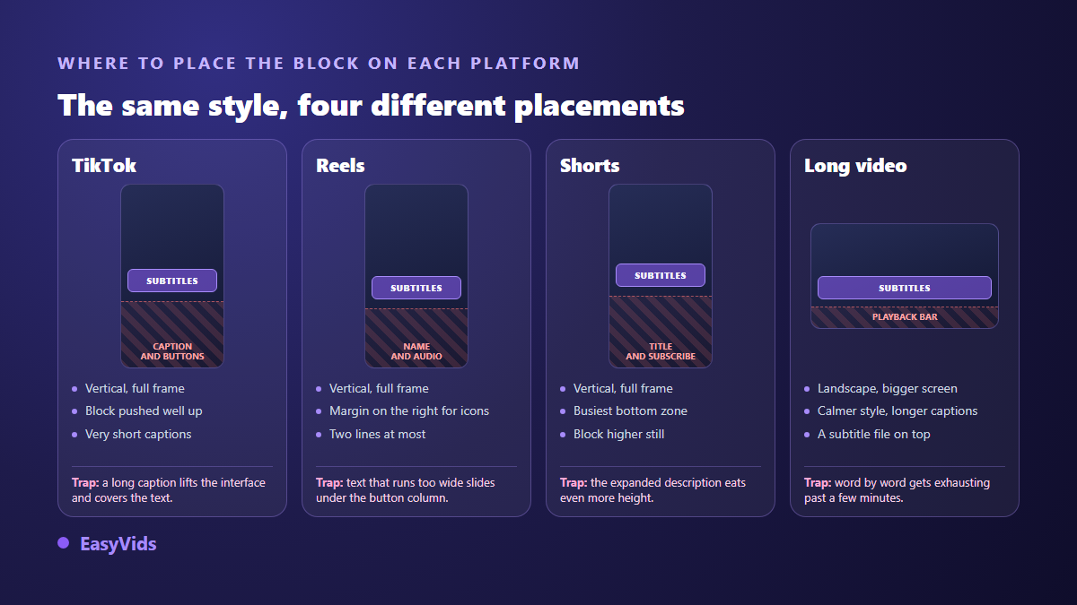
Three habits are enough. Push the block higher than feels natural, because the caption text and the buttons grow with whatever you type at publish time. Test on a real phone with a real account before the final upload, since an editor preview never shows the app interface. And on long form, switch logic entirely: longer cards, calmer animation, and a separate subtitle file attached at upload, because long form platforms accept those files and let the viewer switch them on.
Building them without installing anything
Technically none of this is hard. You need a timestamped transcript, a short split, a style, and a render that burns the text into the picture. A browser based editor does all four, with no install and no dedicated graphics card.
In our editor a dedicated captions panel pulls the audio track from the timeline, transcribes it, and drops the cards onto their own text track. You pick the language or let automatic detection handle it. If you already hold a subtitle file, you import it as SRT or ASS instead of transcribing again. Creating that file, correcting it or attaching it to a video is a separate craft, covered in our guide to the SRT file. Each card then becomes an independent text element with its own start and duration, which is what makes the word by word treatment practical: split a long card, nudge one that lingers, colour a word, without touching the rest of the track.
- Typeface, weight, italics, letter spacing and line height.
- Text colour, with an optional gradient for a stronger signature.
- Outline colour and thickness, the central setting of this style.
- Drop shadow with blur and offset, to lift the text off a busy background.
- A solid block behind the text, with opacity, corner radius and padding, when the outline is not enough.
- A gallery of ready made styles, from clean outline to yellow card, so you start from a base instead of building one.
Animations are picked by category, entrance, exit or accent, with a movement family and an intensity. For this look, a fast entrance at a measured intensity is enough, applied identically across the track. Export burns the text into the picture, which guarantees it shows everywhere, including where no subtitle file is accepted. Transcription is billed on the length of audio processed, and the detail sits on the pricing page.
Frequently asked questions
One word or three words per card?
Two to three in the vast majority of cases. A single word suits a fast passage, a hook or a list, but held for a full minute it becomes exhausting because the eye stops rebuilding meaning. The test never changes: each card must be readable in one glance, with no scanning.
Does this style work outside short form?
Poorly. It is designed for a phone held at arm's length, on fifteen to sixty second formats. On a long video watched on a television, the same treatment turns aggressive within two minutes. Use longer cards, quieter animation, and offer a switchable subtitle file alongside.
Do burned in captions replace a real subtitle file?
No, and they serve different audiences. Burned in text is an image: it cannot be switched off, machine translated, or read by assistive technology. On platforms that accept a file, add one on top of the burn in. On vertical short form, burning in remains the only way to guarantee the text appears.
How do I stop the interface covering my captions?
Lift the block into the lower third rather than against the bottom edge, and keep a margin on the side holding the button column. The zone the app occupies varies with the format and with the length of the caption you type at publish time. One test on a real phone settles it in seconds, where an editor preview never will.
Can I apply this to an AI generated video?
Yes, and it is now the common case: the video is produced scene by scene, then assembled and captioned in the editor before publishing. Our step by step guide to a published YouTube video walks the full sequence, from script to uploaded file.
Word by word captioning is not an editing trick, it is a reading constraint applied with method: very short groups, contrast guaranteed by the outline, one highlighted word, placement that clears the interface, and the same treatment from the first card to the last. Set those points once, keep them, and your videos become recognisable before the sound even starts. Common usage questions are answered in the FAQ, the full production toolkit lives in the EasyVids studio, and creating an account opens the editor so you can caption your first edit.