Your video is ready and one thing is missing: a title at the start, a name at the right moment, a call to action at the end. Add text to video and it looks like a formality, until the result plays on a phone. The line runs off the frame, hides behind the app buttons, or vanishes before anyone finishes reading it.
The tool is almost never the problem. Three decisions made too fast are: the style, the placement and the duration. This guide walks the full process, from the first click to the export, with the settings that separate a title people read from a title people endure. If browser based editing is new to you, our guide to editing video in the browser covers the ground this article builds on.
The short answer
Import your video into an editor, drop a text element on a track above the footage, type your line, apply a high contrast style, drag the block where you want it in the frame, then stretch the clip on the timeline to set how long it stays. A simple title takes under two minutes. In the EasyVids studio editor, text behaves exactly like an image: it moves with the mouse, resizes by its handles, and takes the same animations as everything else in the edit.
Title text and captions are two different objects
Mixing them up is the most common mistake. Captions transcribe speech, follow the rhythm of the voice, sit at the bottom of the frame and exist first for people watching with the sound off. Title text says something the soundtrack does not: a headline, a name, a figure, a promise, an instruction. It appears when you decide and leaves once the point has landed. If what you actually need is a transcript of the voice, automatic caption generation covers that from end to end and saves you typing dozens of blocks by hand.
The distinction has an immediate practical consequence. A caption keeps a neutral typeface, a moderate size and a stable position for the whole video. A title is allowed to be large, coloured, animated, off centre. Blending the two registers gives a confused frame where viewers no longer know which line to read first. That discipline of form says nothing about how accurate the words themselves are: what really decides the precision of a caption engine comes down to liaisons, proper nouns and where the lines are cut. Keep one level of emphasis per shot, never two.
The five kinds of on screen text that actually earn their place
Before you open the editor, know what your text has to do. Five uses cover nearly every need, and each one calls for a different size, position and duration.
- The opening title: the promise of the video, three to six words, shown in the first seconds.
- The lower third: a name, a role, a location, sitting at the bottom while someone speaks.
- The progress marker: step 2 of 5, which tells viewers where they are inside a tutorial.
- The highlight: a figure, a date, a keyword appearing exactly when the voice says it.
- The call to action: the closing line asking for a subscription, a visit or a comment.
How to add text to video, move by move
The procedure barely changes from one editor to another. It comes down to six moves, and the order matters: styling before placing wastes time, because a bigger line no longer fits where the small one did.
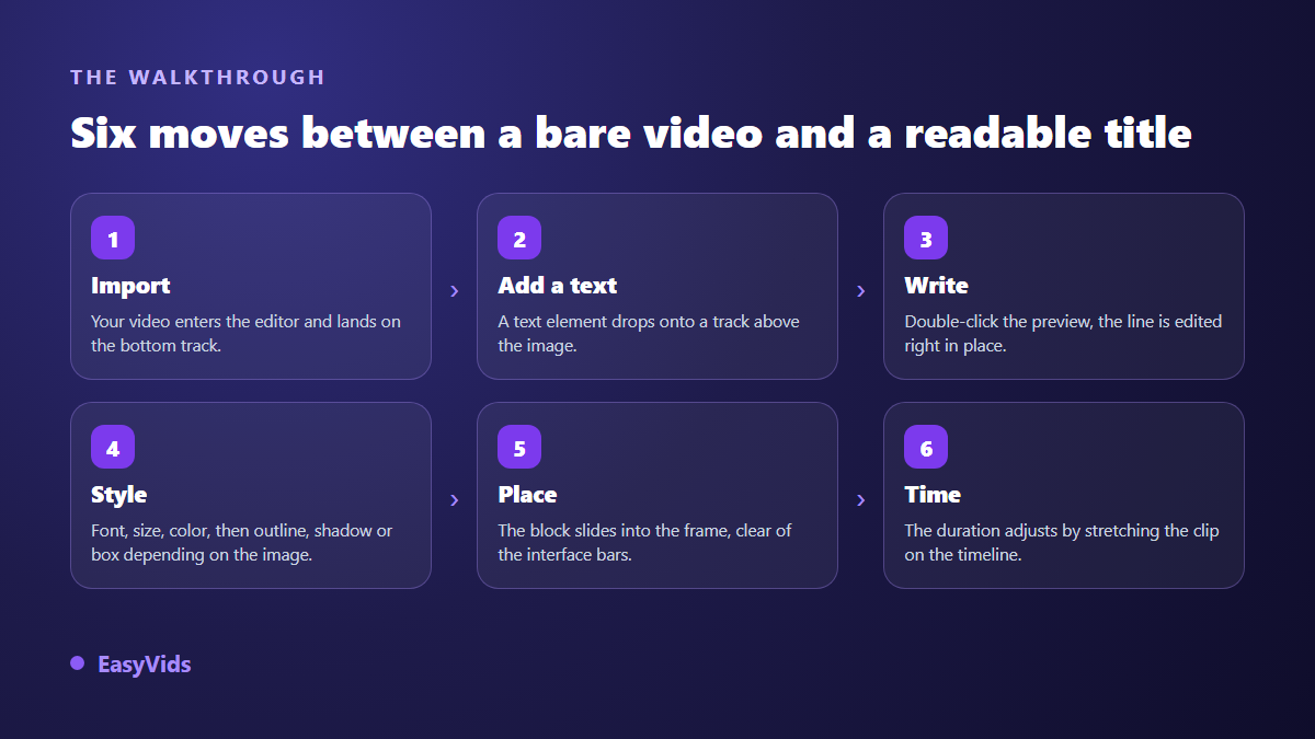
The first move is the import. Drag your video file into the editor library, then drop the clip on the bottom track. Add a text element next: it lands on a track above, which is the whole logic of layers in one sentence. What sits higher shows on top. A single video can carry several texts at once, each on its own track, each with its own duration.
Then comes typing. In the EasyVids editor, a double click on the block inside the preview opens editing straight on the image, at the exact spot where the text will appear. You see immediately whether the line fits, whether it overflows, whether it covers a face. Fixing it now costs seconds. Fixing it after the export costs another export.
Duration is the move everyone rushes. The text clip moves and stretches on the timeline like any other element. Where it starts decides when the line appears, how long it is decides how long people get to read. Text that starts too early repeats what the image already showed. Text that ends too early is never read at all.
Choosing a style that survives a small screen
Readable text is contrasted text. The WCAG 2.1 accessibility guidelines published by the W3C set a minimum contrast ratio of 4.5 to 1 between body text and its background, and 3 to 1 for large characters. Video makes this harder, because the background moves: white that reads perfectly over a dark shot disappears two seconds later when the sky enters the frame. Colour alone is never enough.
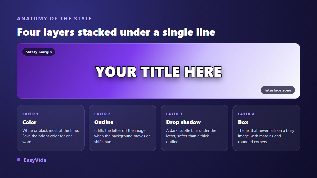
Four layers stack under a single line, and you never switch on all four at once: the text colour, an outline, a drop shadow, a background. The outline lifts the letters off a busy backdrop. The shadow does the same job more softly. The background never fails: a semi opaque band behind the words guarantees the line reads over any image. Pick one reinforcement layer, not three.
On typography the rule is dull and effective: one title face, one body face, held from start to finish. The editor opens on a library of more than 1,900 fonts, which makes switching every shot tempting. Resist it. Sizes, weights and colours are covered in our comparison of typefaces that stay readable on screen, and the findings apply to titles as much as to captions. To save time, eighteen ready made text styles are available, from a clean outline to a coloured card, applied in one click to a block you already wrote.
Where to put the text inside the frame
The centre is not always right, and the edges rarely are. On vertical formats, apps lay their own interface over your video: account handle, caption, action buttons, progress bar. TikTok publishing guidance and Meta guidance for Reels both ask creators to keep important elements clear of those bars, at the top as well as the bottom. A title perfectly centred at design time can end up half covered by a follow button.
Two aids prevent that. A guide grid splits the frame into thirds and gives a placement you can repeat shot after shot. A guide layer reproduces the real TikTok interface over your preview, so you see at a glance what will be hidden. And when you drag a block with the mouse, magnetic guides appear to align it on the centre or on another element, which removes the few pixel offsets you would only notice once the video is live.
How long to leave text on screen
This is the decision that carries the rest, and eyeballing it does not work. Our in house method fits in one sentence: read the line out loud at normal speed, then add one second. A six word title needs about three seconds, a two line lower third about four. Under two seconds nothing gets read, however short the line, because the eye has to find the text in the image before decoding it.
The opposite excess is just as real. A note left up for thirty seconds stops being information and becomes noise. Remove text as soon as its message has landed. Across our own edits, an opening title rarely runs past five seconds, and a highlight lives for the sentence it underlines, not a second longer.
Animating text without making it unreadable
A well placed animation draws the eye at the right moment. A bad one blocks reading. The three beat rule settles it: a short entrance, a still stretch during which the line is read, a short exit. The still stretch takes up most of the block. Text that keeps moving the whole time it is on screen will not be read, whatever its size.
In the editor, animations sit in a catalogue sorted by intent: entrances, exits and accent effects, each in three intensities, soft, normal or strong. A fade or a gentle rise suits most titles. Bolder effects such as bounce, spin or flip belong to a single word or to a shot meant to surprise. The nine text animation effects that cover real needs explain what each one tells the viewer. For finer control, keyframes let you animate position, size, opacity and even the colours of the block yourself.
The mistakes that make text unreadable
They repeat from project to project, and take seconds to fix once you spot them. Run through this list before every export and you will save yourself a republish.
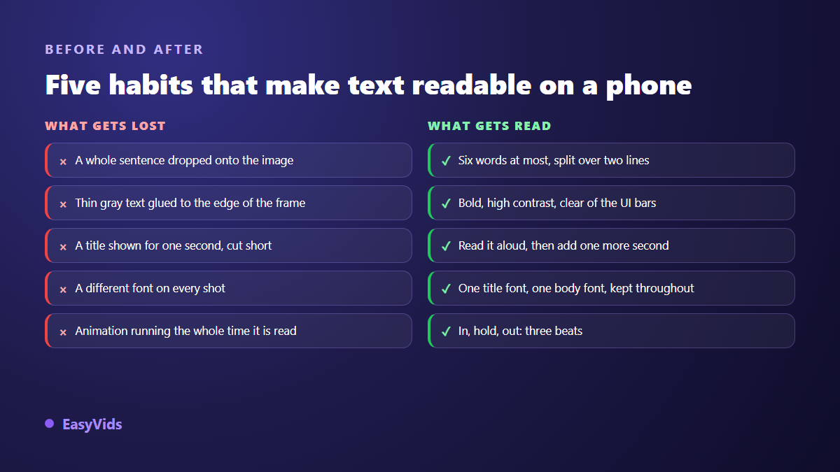
- A full sentence dropped on the image: cut to six words a line, two lines maximum.
- Thin light text on a light background: go bold, then add an outline or a background.
- A block glued to the edge of the frame: keep a margin, it survives cropping and interface bars.
- A different typeface every shot: visual identity is built by repetition.
- An animation running the whole block: entrance, stillness, exit, in that order.
Export: burned in text or a separate track
Text added in an editor is burned in: at export it becomes part of the image, like anything you filmed. That is exactly what you want for a title, because it will show identically everywhere, previews and reposts included. It is more debatable for captions, which platforms can display, translate and switch off when they arrive as a separate file. Our comparison of burned in captions and separate files gives the criterion to choose by destination.
One last habit before you render: check your title in the final format. Text designed on a horizontal frame and cropped to vertical loses its margins, and often half the sentence. The editor switches a project between the usual formats, horizontal, vertical and square, so you can reposition blocks before exporting to MP4.
Frequently asked questions
Can I add text to video from a phone?
Yes, as long as the editor runs in the browser. Typing and placement work by touch, and the preview shows the real result. A large screen stays more comfortable for fine tuning durations, but nothing stops you from adding a title and publishing from a mobile.
How do I add text to video without installing software?
An online editor is enough. You open a page, import your video, add your text and export the file, with nothing installed on your machine. That is how the EasyVids editor works from your account, and the pricing page sets out what each plan covers.
What text size works for a vertical video?
Think in proportion of the frame rather than in points. A readable title takes up roughly a tenth of the image height in vertical format. The decisive test takes one move: shrink the preview window to thumbnail size. If you can still read the line, the size is right.
Can I edit text after animating it?
Yes. Content, style and animation are three separate settings on the same element. You can rewrite the line, change typeface or swap the animation without losing the rest, as long as the project still exists. After export the text is part of the image, so you go back to the project to change it.
Should every shot carry text?
No, and doing so works against you. Text stands out because it is rare. A short video usually carries one title, one or two highlights and a closing call to action. Beyond that the screen turns into a page, and viewers stop watching the image to read.
Adding text to a video comes down to three decisions held to the end: a contrasted style, a placement clear of interface bars, a duration measured by reading out loud. The rest is handling, and one project teaches it. To try it on your own footage, creating an account opens the online editor, with nothing to install.