You have a clean, approved logo, exported in several file formats. In your videos it shows up as a still frame held for two or three seconds, and a still frame gets skipped. A logo animation answers that exact moment: bring the brand in, let it be read, then hand the screen back to the content. Done well, it lasts less time than it took you to read this paragraph.
The format still has a bad reputation, and it is deserved in two cases. Eight second intros that audiences learn to skip. And logos handed to a model that generates video from an image: they come back redrawn, with approximate letters and a colour that has drifted. The method below avoids both traps. Your original file stays untouched, it is moved by measured transformations, and the whole thing fits inside three seconds.
The short answer
Animating a logo means applying transformations to the file you already own: position, scale, rotation, opacity, plus a mask that reveals the artwork progressively. Nothing is redrawn, so nothing gets distorted. The structure that works everywhere has three beats: a fast entrance, a still hold long enough to be read, a discreet exit, with a short sound cued to the landing. Two to three seconds in total. It is a motion design exercise, and our complete motion design guide covers the movement principles this page simply applies to your brand.
What the animation has to achieve in three seconds
A brand animation works on three levels at once. It signs: viewers know whose content they are watching without reading a word. It connects: the same sequence at the head of every post turns a pile of videos into a recognisable series. It separates: between two parts of an edit, a logo crossing the frame replaces a soft transition with a clear marker. All three jobs are done in under three seconds.
Everything beyond that is decoration, and decoration is expensive. Every second of opening is taken from the attention your audience gives your subject. On a thirty second vertical video, a five second intro already eats a sixth of the running time. The right question is not how to make the logo spectacular, but what the shortest version is that still reads as yours. That version is almost always shorter than your first instinct.
The three beat rule
Every logo animation that works breaks down the same way. The entrance brings the elements into place. The hold leaves them still, and that dead time carries the memorisation even though it is the first thing people trim. The exit closes the sequence, with a short fade or a straight cut into the first shot of the video. That third beat can disappear entirely when the animation opens onto a scene: the logo then dissolves into the first image.
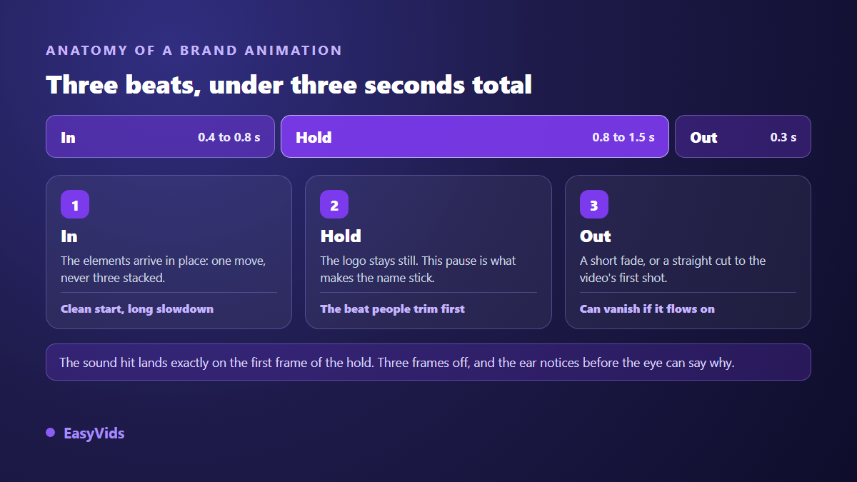
The durations that hold up in practice: the entrance runs four to eight tenths of a second, the hold eight tenths to a second and a half, the exit around three tenths. A full animation therefore lands between two and three seconds. Past four seconds you are no longer signing, you are telling a story, and that needs a reason: a tagline building word by word, a product appearing, a written promise. Without that reason, the extra time works for nobody.
Six moves are enough, and they combine two at a time
The list of useful moves is short. Effect libraries offer dozens, but the brand animations people remember rarely use more than two at once. These six cover almost every case, from the most restrained to the most demonstrative.
- Fade with a short rise of a few pixels: the quietest move, and the one that ages best.
- Directional slide: the logo enters from one edge and stops dead in position, with no stray bounce.
- Scale: the symbol arrives slightly oversized then settles at its final size, which gives it weight.
- Short rotation: a few degrees only, on a symbol that suits it, never a full turn.
- Mask wipe: a band reveals the logo from one edge to the other, like a curtain opening.
- Element stagger: symbol first, name second, tagline last, a tenth of a second apart.
Two settings transform these moves, and they matter more than the choice of effect itself. The first is the speed curve: a movement that starts decisively then brakes slowly reads as natural, while constant speed reads as mechanical. The second is that stagger, which turns a block landing all at once into a visual sentence that builds. Both apply to anything moving on screen, starting with type, as our nine animated text effects explain.
Do not hand your logo to a video generation model
It is the reflex of the moment: drop the logo into an image to video generator and ask for an animation. The result fools you for a second, then the flaws jump out. These models do not move your image, they build a new one for every frame of the sequence, using yours as a starting point. Letters warp, counters fill in, the colour drifts, and the symbol changes proportions from one instant to the next. It is the same mechanism that makes text unreadable in generated visuals, explained in detail here.
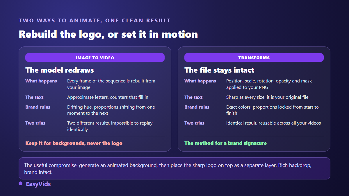
Generation still has a place, in one precise spot: the background. An animated set, a rippling texture, a light sweeping across the frame all generate well, and your crisp logo sits on top of them on a separate layer. You get the best of both, a rich backdrop and an untouched brand. The same reasoning applies to the graphic elements around the logo, produced once in a single style, as our AI image generator guide describes.
Sound carries half the effect
Mute a good brand animation and it loses its impact instantly. The audio signature has only two parts. A short whoosh under the entrance, then a brief hit at the exact moment the logo lands. The classic mistake is letting that hit slide by a few frames. The ear notices immediately, even when the eye cannot say what is wrong, and the whole thing feels sloppy.
Three precautions are enough after that. Leave a beat of silence before the whoosh, otherwise the effect drowns in whatever came before. Keep the level well under the voice over that follows. And reuse the same audio signature from video to video: repetition builds recognition, not richness of sound. A sound library built into the editor also saves you from hunting elsewhere for files whose usage rights are unclear.
Three placements, three different edits
The same animation is not edited the same way depending on where it lands. At the top, it should be as short as possible and cut straight into the first spoken line. At the end it becomes a signature and can breathe a little more, as long as it leaves room for the platform's clickable elements. As a standalone social post it becomes the content itself, which calls for a worked background, at least three seconds and a clean loop.
One platform rule is worth stating exactly. According to the YouTube help centre, an end screen requires a video of at least twenty five seconds, occupies between five and twenty seconds of the ending and accepts four elements at most, while the channel watermark is a fixed square image, never a video. Your animation does not replace those interactive layers, it supports them, and our animated end screen guide covers the composition to plan around them.
Formats, duration and export
A brand animation is rebuilt, not cropped. Moving from landscape to vertical pulls the logo toward the centre, enlarges the symbol and shortens the travel of every move, because a path that crosses a wide frame feels endless in a narrow one. Plan three versions from the start: landscape for long form video, square for feeds, vertical for full screen formats. The extra work takes minutes once the project exists.
A word on transparency, because the disappointment is common. The video format every platform reads carries no transparency layer, so your exported animation always arrives with a background. The practical answer is to export the background you actually want, white, black or your brand colour, and to place the animation on top of your footage inside the same project rather than expecting a cut out file.
The method, from source file to export
All of it happens in a video editor running in the browser, with no animation software to install. You need your logo as a PNG with a transparent background, exported large enough to survive scaling, and a clear target duration. Our online video editing guide describes that environment in detail, and the six steps below apply to it directly.
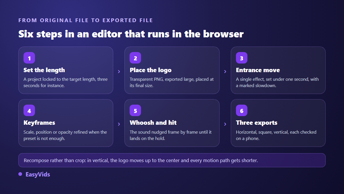
- Create a project at the exact target duration, three seconds for instance, instead of trimming at the end.
- Import the transparent PNG and place it centred, at its final size.
- Apply a single entrance move from the six, then set its duration under one second.
- Add keyframes on scale, position or opacity when the ready made effect is not quite right.
- Drop in the whoosh and the hit, then nudge the hit frame by frame until it lands on the hold.
- Export your three formats, then watch each one on a phone before reusing it everywhere.
None of this requires professional animation skills. It requires precision over very short durations. To weigh what you gain and lose by working without compositing software, our comparison of the available routes goes through it case by case, and our pricing page covers the plans, free trial included.
The mistakes that give away rushed work
- The logo doing a full spin: everyone's first instinct, and the most dated move there is.
- Stacked effects: a fade, a zoom, a rotation and a bounce inside one second cancel their own readability.
- No hold: the animation ends and the cut arrives immediately, with no time to read the name.
- A white background dropped onto dark footage, because the wrong background was exported.
- A tagline set far too small to survive on a phone screen.
- A different animation on every video, which cancels the only benefit you were after.
Frequently asked questions
How long should a logo animation be?
Two to three seconds in most cases, including roughly one second of still hold. Anything longer only makes sense if the animation says more than the name, a tagline building or a product appearing. At the top of a short video, go under two seconds without hesitation.
Can I animate a logo from a simple PNG file?
Yes, on two conditions: the background must be transparent, and the image must be exported large, at least twice its intended display size. Without transparency your logo arrives inside a white rectangle. Without resolution headroom, the slightest scaling shows the pixels. If you hold a vector file, export a large PNG from it before you start.
Can I get a logo animation with a transparent background?
The video format every platform reads carries no transparency, so a cut out animated logo is not a realistic deliverable. In practice you place the animation directly over the footage inside the same project: the visual result is identical and depends on no particular file format.
Do I need a different animation for each platform?
No, one animation is enough, reframed three ways. What changes from one platform to the next is the shape of the frame and the space around the logo, not the move itself. Keep the same entrance, the same audio signature and the same colours, because that consistency is exactly what builds recognition.
How long does the first version take to produce?
Around thirty minutes for a clean first animation once the logo is ready, and most of that time goes into cueing the sound and tuning durations rather than wrestling with the tool. Later versions take minutes, since you only swap the file and adjust the framing.
A good logo animation is never noticed as a technical feat. It settles in as a habit, until your audience knows whose video this is before the first sentence lands. Pick one move, hold it across twenty videos, and you have built a signature. To build yours today, creating an account opens the editor and the production tools, and the full EasyVids studio brings visuals, voice, sound and editing together in one place.