You export a video, post it as a story, and the result is not what you designed. The headline sits behind your account name. The bottom line is swallowed by the reply bar. The edges of the frame are gone. Instagram story dimensions are no secret, they come down to two numbers. The trouble is what those two numbers leave out: the visible surface is smaller than the frame.
A story is built at 1080 x 1920 pixels, a 9:16 ratio. That settles the export question, not the layout question, and layout decides what your audience actually reads. This sheet covers both: the exact values, and the margins you have to leave empty. If you post across several networks, our table of video formats by platform applies the same logic to the rest of your publishing.
The short answer
Build your story at 1080 x 1920 pixels, ratio 9:16, as MP4 or MOV for video. Keep roughly 250 pixels clear at the top and 250 pixels at the bottom, with no text and no logo: that is the space the app fills with its own interface. What is left is a safe zone of about 1080 x 1420 pixels, and everything that matters has to fit inside it.
Where 1080 x 1920 comes from
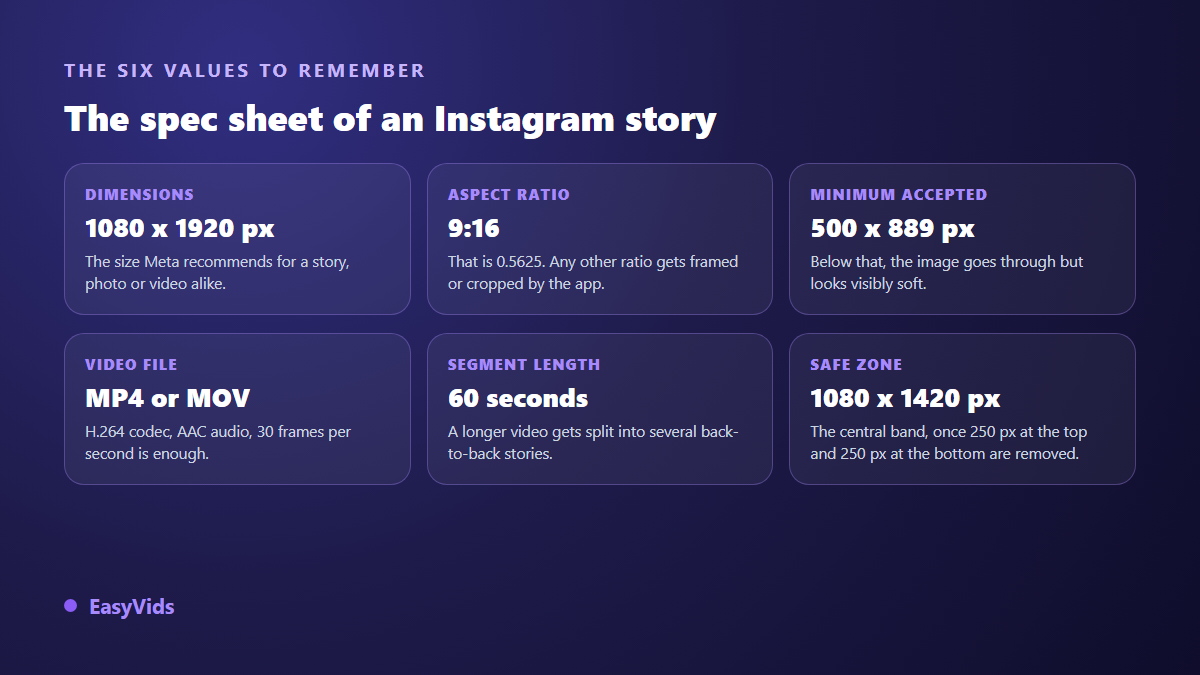
A 9:16 ratio equals 0.5625: the frame is nearly twice as tall as it is wide. That is the shape of a phone screen held upright, and a story fills it completely. According to Meta's advertising format guide, the recommended story size is 1080 x 1920 pixels, with a minimum resolution of 500 x 889 pixels. Below that floor your file still uploads, but the upscaling shows on edges and on type.
Should you export larger than 1080 pixels wide? No. Instagram re-encodes everything you send so it can serve the same story over very different connections. A 4K export does not survive that compression, it only makes the upload slower. The setting that pays off is different: export at exactly 1080 x 1920, in a single pass, without a second app recompressing the file.
The zones the interface covers
The frame is 1920 pixels tall, but the app lays its own interface on top. Progress bars, profile picture, account name and posting time sit at the top. The reply bar, the share button, the audio credit and any link sticker sit at the bottom. None of it moves, and the exact height shifts slightly with the phone model and the app version.
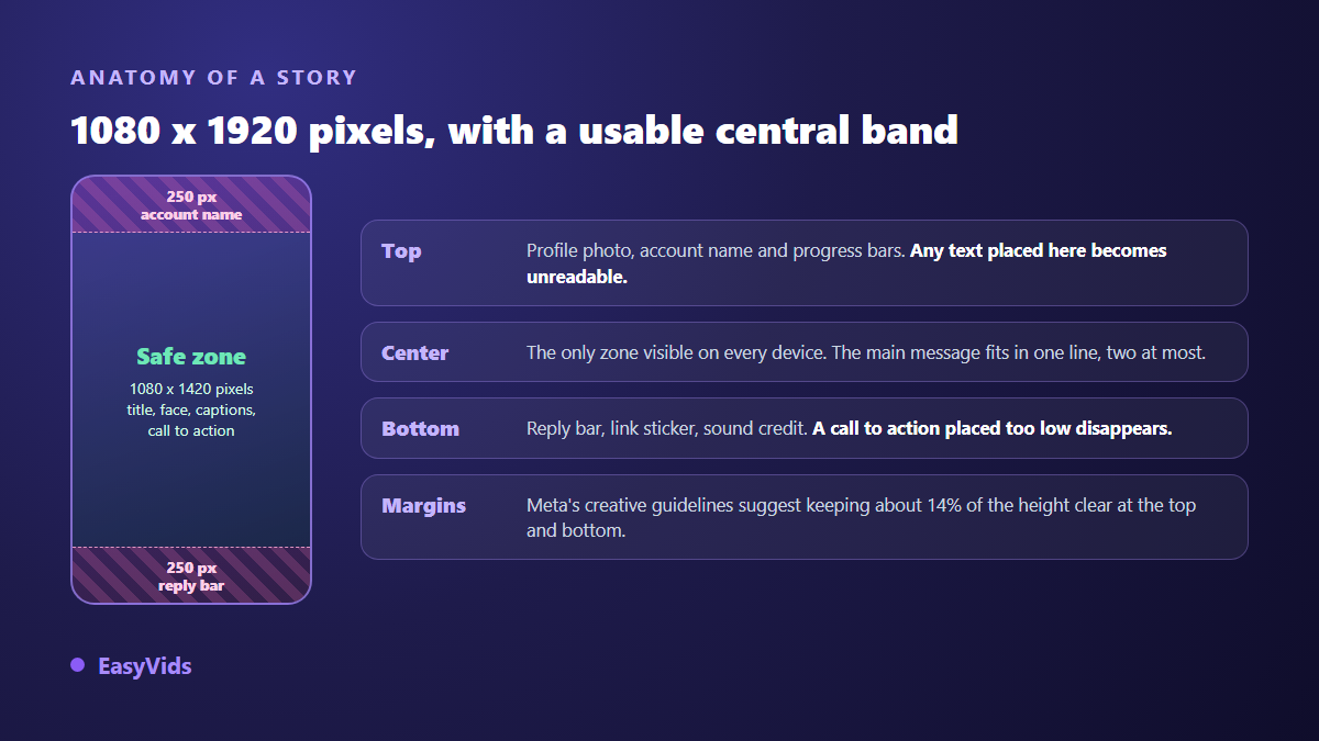
Meta gives a number in its creative guidance for stories: keep roughly 14 percent of the height free of text and logos at the top and at the bottom, which works out to about 250 pixels on each side of a 1920 pixel file. Our in house templates are slightly stricter, 250 pixels at the top and 320 at the bottom, because a link sticker or a poll reaches lower than the reply bar alone.
The central band is your real canvas
Take those margins out and you are left with a safe zone of about 1080 x 1420 pixels. That is your actual working format. Anything that has to be read, understood or tapped lives there, the rest is scenery. Five habits keep the template intact.
- Place the headline in the upper third of the safe zone, never flush against the top edge.
- Keep the call to action above the bottom margin, with an arrow pointing at the sticker instead of text sitting on it.
- Centre faces and products: that is the part of the image that survives every screen size.
- Give the sides a margin too, around 60 pixels, or the text looks like it is falling out of frame.
- Sit captions just above the bottom margin, never in the middle of the picture.
What happens to a video posted at the wrong ratio
Instagram accepts video that is not 9:16, but it will not crop it intelligently for you. A 16:9 clip ends up floating in the middle of the screen on a solid or blurred background, filling a fraction of the height. A 4:5 clip fares better, with thinner bands. Either way your message loses surface at the exact moment attention is shortest.
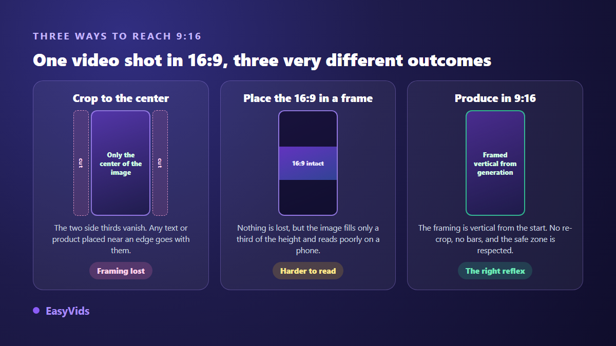
Three routes lead to 9:16 and they are not equal. A centre crop keeps full resolution but sacrifices the sides, which is fatal when your product or your text lives there. Letterboxing keeps everything at the cost of an image squeezed into a third of the screen. Producing vertical avoids both compromises, provided you decide before you generate or film, not at publishing time.
One size per surface, not one size for everything
Posting the same file everywhere is tempting, and that is where framing mistakes multiply. Stories fill the screen at 9:16. The feed takes vertical up to 4:5, taller than wide but less stretched. Reels return to 9:16 with their own overlays on the right side and under the caption. Each surface deserves its own sheet. The same logic applies to the still image attached to a YouTube video, with completely different values, as our sheet on YouTube thumbnail dimensions sets out.
Length, file type and image quality
Story video is published in segments. Instagram's help centre states that one segment runs up to 60 seconds, and that longer video is split into consecutive stories. That limit has moved more than once since the format launched, so check what the app displays before an important post. In practice, anything past fifteen seconds works better as a sequence of screens with one idea per segment.
On the file itself, Meta's format guide recommends MP4 or MOV, H.264 for picture and AAC for sound. Thirty frames per second is plenty. A single export, with no detour through a compression app, keeps type sharp: every extra re-encode attacks the edges of letters first, which is precisely what your viewer has to read in one second.
Story text: large, short, high contrast
Stories are watched at arm's length, often while walking, very often with the sound off. The type size that works is bigger than it looks on a desktop screen. On our templates we never go below 50 pixels of cap height for an important line on a 1080 pixel wide file. A semi opaque panel behind the text solves most legibility problems on bright or busy images.
Typeface matters as much as size, and the rules match those of subtitling: heavy weight, plain drawing, strong contrast. We covered them in our comparison of fonts that stay readable on screen. If your story carries a voice, add captions: the settings that work in vertical are the ones described for captions on Instagram Reels.
Produce in 9:16 rather than crop afterwards
The surest way to respect a safe zone is to work inside it, not to discover it at export. In the EasyVids online video editor, a format selector switches the scene to 9:16, that is 1080 x 1920 pixels, in one click. A grid overlay sits on the preview so you can check your margins. You add text and captions straight onto the vertical frame, then export to MP4 with no rescue crop.
For a story generated end to end, the ratio is chosen before the first image as well: picking 9:16 makes every visual come out vertical, with nothing cropped away. The principle holds whatever tool you use. Format is decided at the start of the chain, never at the end. Plans and the free trial are listed on the pricing page.
Seven mistakes that ruin a well framed story
These come up again and again on accounts that publish a lot, and each one takes under a minute to fix.
- Posting a desktop screenshot as it is: it arrives at 16:9 and drowns in the middle of the frame.
- Placing the logo top left, exactly where the app puts the profile picture.
- Writing your web address in the bottom 250 pixels, under the reply bar.
- Pasting long copy in small type: nobody reads more than two lines in one second.
- Centre cropping a horizontal video when the subject sits on one side.
- Skipping captions, when a large share of stories is watched with the sound off.
- Re-exporting the same file three times: compression eventually eats the edges of the text.
Frequently asked questions
What is the exact size of an Instagram story?
1080 x 1920 pixels, a 9:16 ratio. That is the size Meta recommends in its format guide, for photos as well as video. The accepted minimum drops to 500 x 889 pixels, but the difference in rendering is clearly visible.
How long can a story video be?
One segment runs up to 60 seconds according to Instagram's help centre, and longer footage is split into consecutive stories. That limit has changed before, so check what the app shows when you publish. In practice, one idea per segment remains the best rule.
What happens to a 16:9 video posted as a story?
It is not rejected. It appears centred on a solid or blurred background and fills only part of the height, which badly hurts the legibility of any burned in text. Crop it deliberately, or rebuild the video vertically.
Should I export wider than 1080 pixels?
There is no benefit. Instagram re-encodes every file it receives, and the extra detail disappears in compression. A clean single pass export at 1080 x 1920 beats a very heavy file that has been recompressed several times.
Where should text go to stay readable everywhere?
In the central band, roughly 1080 x 1420 pixels, leaving 250 pixels clear at the top and at least 250 at the bottom. Add a side margin of about sixty pixels, and a semi opaque panel behind the text when the image is bright.
A well framed story needs no special gear and no special talent: it needs two numbers and two margins. Try it on your next post by keeping the whole message inside the central band, then compare the replies you get. To prepare your stories at the right size from the first scene, create your account and start on a vertical canvas.