Open your channel and look at your last six videos side by side. If nothing says they come from the same place, the problem is neither your camera nor your editing. What you are missing is YouTube branding: the set of animated elements that come back from one video to the next, always identical. The opening titles, the name bar, the section cards, the subscribe reminder, the end screen, and the short sound motif that carries all of it.
Most creators go about it backwards. They chase one spectacular intro, drop it on a single video, then never use it again because it took too much work. Branding is not an effect, it is a system: a few pieces built once, reused for months, that let a viewer recognise your channel before reading the title. Our motion design guide covers the fundamentals of animation; this one describes the full kit, piece by piece, with durations, placements and a way to produce it without professional software.
The short answer
A branding kit holds six animated pieces: a short intro, a name and title bar, section cards, a subscribe reminder, an end screen and a sound signature. Recognition does not come from how beautiful each piece is. It comes from repeating three constants: a three colour palette, one type family, a sound motif of one to two seconds. Lock those three, build the six pieces once, and every new video becomes recognisable with no extra work.
Branding, style guide and editing are three different things
A style guide is a document. It fixes your colours, your typeface, how your logo is used, and it covers every surface, including the ones that never move. Video branding is that guide set in motion, inside the file itself. Editing is the assembly of your shots and your sound. The three overlap, they do not replace each other.
The confusion has a cost. A kit built with no written rules drifts in colour every couple of months, because nothing was ever fixed and each video is decided on the day. A style guide with no kit stays on paper: your colours exist, no video carries them. Write one page of rules first, then build the pieces that apply them.
The six pieces of a branding kit
A complete kit fits in six objects, and nothing forces you to produce them all on day one. Two are enough to change the overall impression: the intro and the end screen. The other four arrive over time, once you know what your formats actually need.
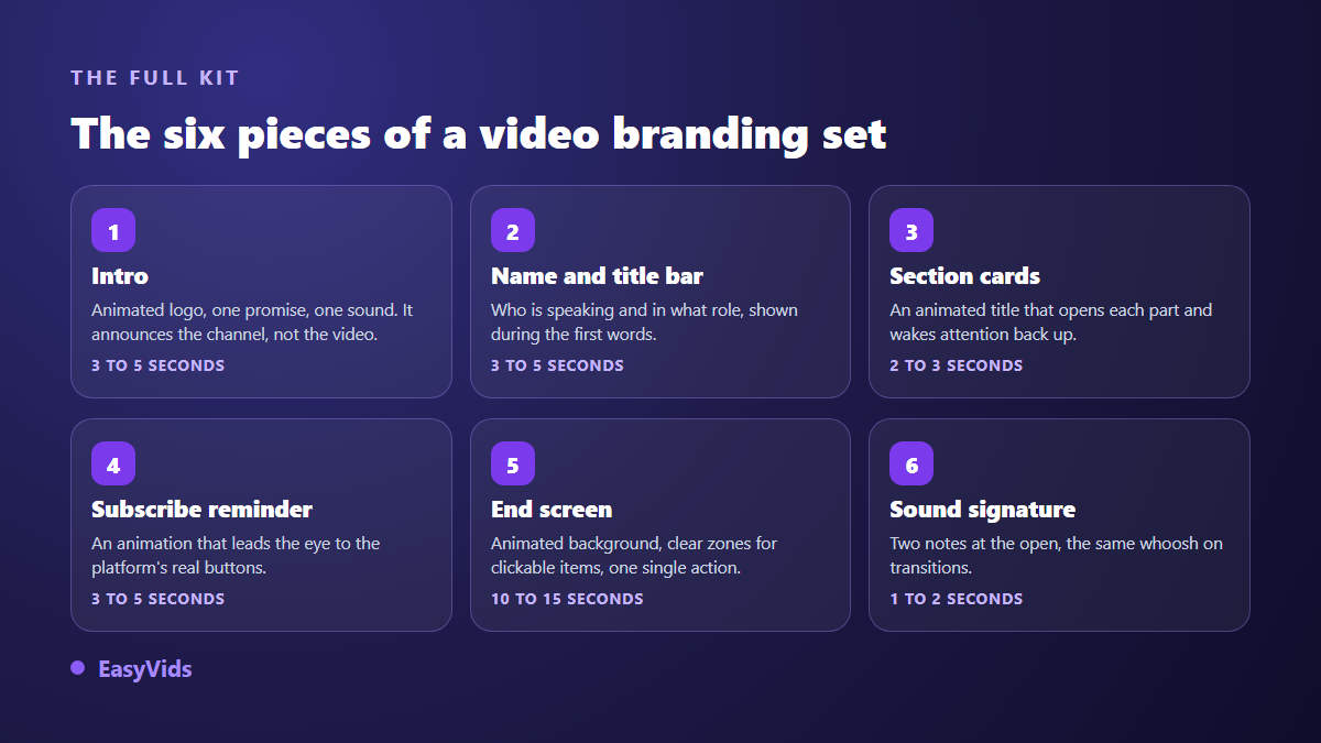
- The intro: your animated logo, a promise in a few words, a sound. It announces the channel, never the content of that particular video.
- The name and title bar: the discreet rectangle saying who is speaking, placed during the first lines of speech.
- Section cards: an animated title announcing each part and reviving attention inside a long format.
- The subscribe reminder: a short animation that walks the eye toward the platform buttons.
- The end screen: an animated background with empty zones left for the clickable elements, and one action pushed above the others.
- The sound signature: two notes on the way in, the same whoosh on transitions, the same chord on the way out.
One detail changes everything here: every piece must be able to live alone. An intro that only works glued to one specific shot is not a branding element, it is a sequence of that video. Build each brick on a background you own, and it will drop onto any edit without retouching.
The three constants that carry recognition
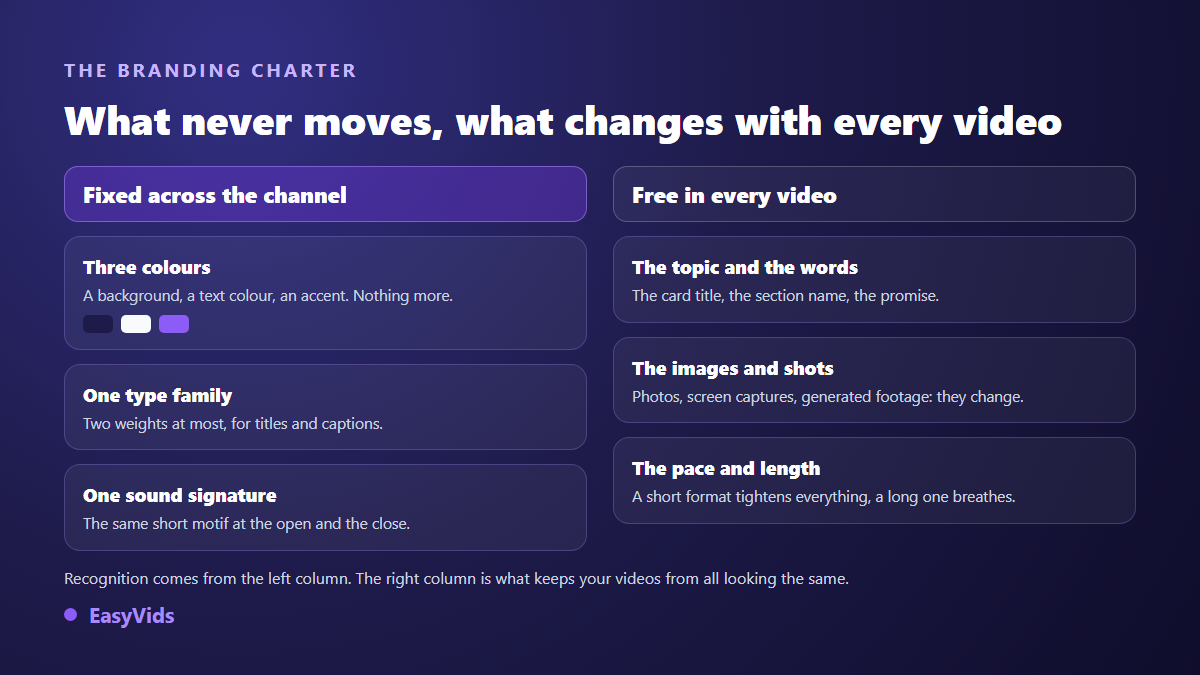
Three colours are enough, and the third does most of the work. A background colour, a text colour that reads on it, and an accent reserved for whatever must catch the eye. The accent has one job: an underline, a bar sweeping across the frame, the edge of a name bar. Used everywhere, it stops accenting anything.
Typography comes next, and one family is enough, with two weights at most: a bold one for titles, a regular one for captions. Then comes sound, the constant almost nobody writes down even though it is recognised with the eyes closed. A one to two second motif, played on the way in and echoed on the way out, anchors a channel faster than a logo does.
The intro: five seconds, not fifteen
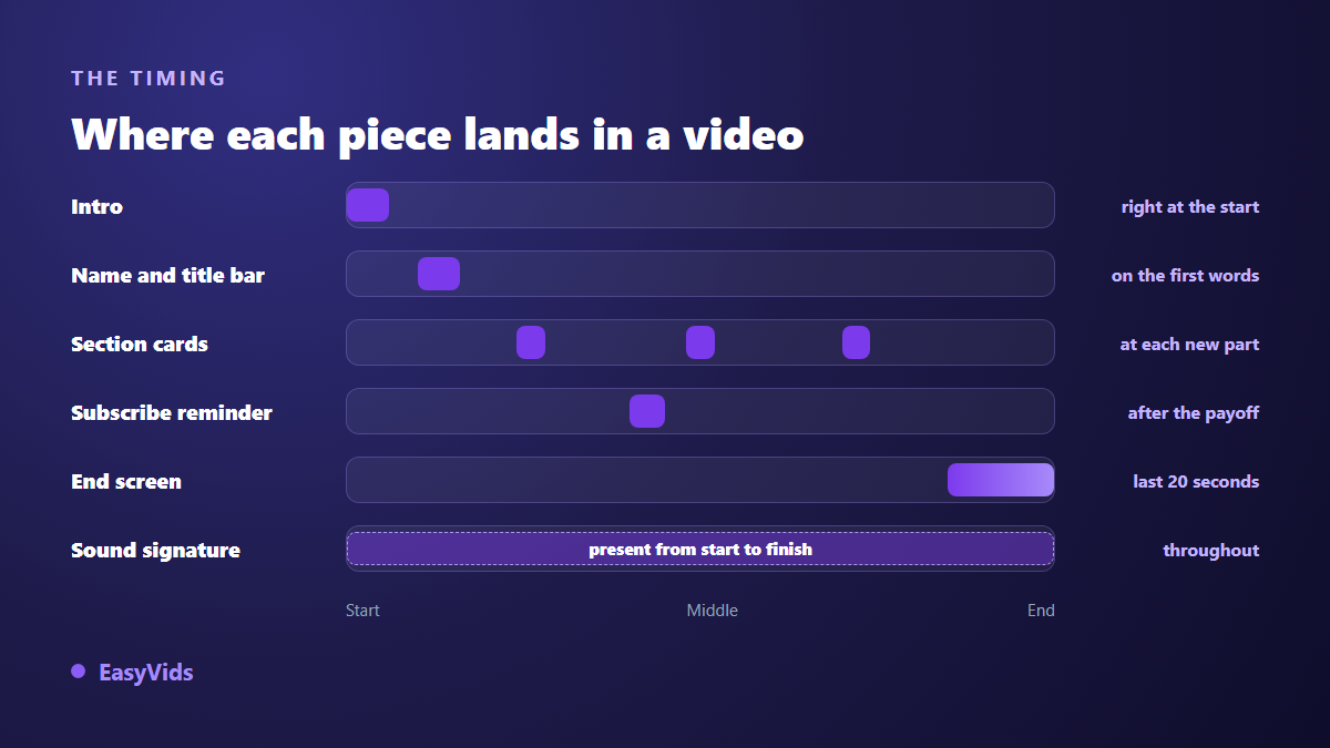
Every second of intro is a second in which the viewer learns nothing. A useful intro runs three to five seconds: the logo enters, the sound motif plays, the title clears, the video starts. Beyond that you are asking patience from someone you have given no reason to be patient. Narrative series are the exception, since the titles are part of the pleasure, but a tutorial does not get that privilege.
One editing trick is worth knowing: place the intro after the first few seconds of content, not before. A hook line, then the logo, then the rest. The viewer already has a reason to stay when your titles play, and the titles stop being a toll gate. It costs nothing and is decided at the edit, on the same intro you built once.
The name bar, the piece with the best return
This is the neglected piece that produces the most effect, because it turns a person talking into an identified speaker. A rectangle, your name, your role in three words, an accent bar, and the whole thing clears after three to five seconds. Its exact anatomy and seven reusable models are covered in our guide to the lower third, which also gives the safe zone where it will not fight the player interface.
Two settings make the difference. Height first: do not glue the bar to the bottom edge, because the progress bar, the duration and the captions already sit there. Repetition second: a shorter reminder, one or two seconds, when the same person speaks again after a long sequence, saves anyone who arrived mid video from wondering who is talking.
Section cards, the panels that revive attention
Past five minutes, attention drops at regular intervals. A section card works like a chapter: two to three seconds, a short title, an entrance and an exit, and the viewer understands a new part is starting. The same card doubles as a seam when you need to join two sequences shot at different moments.
The animation matters as much as the wording. An entrance sliding in the reading direction draws less attention than a sudden pop, and a word that grows slightly on arrival guides the eye without shouting. Nine animated text effects broken down give you enough to choose from without turning the video into an effects catalogue, the most common mistake on this piece.
The subscribe reminder: what is clickable and what is not
One clarification saves a lot of disappointment: the button you draw in your edit is not clickable. According to the YouTube Help Center, two subscription devices belong to the platform, the branding watermark, a small square image uploaded once in YouTube Studio and displayed over your videos, and the subscribe element of the end screen. Your animation exists to walk the eye toward them, which our method for an animated subscribe reminder sets out in detail.
Timing matters more than drawing. A reminder placed in the first ten seconds asks something from someone who has received nothing yet. Put it after the first useful moment, keep it three to five seconds, back it with a short sound, and never use more than two in a long video.
The end screen, the only piece with imposed rules
The other five pieces are free. This one is not, because the platform lays its own elements on top. According to the YouTube Help Center, a video must run at least 25 seconds to carry an end screen, that screen takes between 5 and 20 seconds of the ending, and it accepts four clickable elements at most. Your animated background must therefore leave empty zones exactly where those elements will land.
Also according to the YouTube Help Center, end screens do not apply to Shorts: on a short vertical video, the last spoken line and the on screen text carry the ask on their own. For duration, layout and the sound handover, our guide to the animated end screen has the detail.
The sound signature, the branding nobody has to look at
A large share of your audience watches while doing something else. Sound is therefore the only branding element that reaches someone who is not looking at the screen. Three elements are enough: a one to two second opening motif, a whoosh or light impact on transitions, a closing chord. Generate them once, export them as audio files, and drop them on every edit afterwards.
One nuance deserves care: background music and a sound signature do not do the same job. Music carries the mood of one specific video and can change with every upload. The signature never changes, otherwise it stops being a signature. On building that short theme and reusing it, our method for a recognisable intro track walks through the steps.
The same kit in 16:9, 9:16 and 1:1
Branding designed for landscape breaks in vertical: the name bar leaves the frame, the section card becomes unreadable, the end screen ends up half covered by the interface. Do not crop, redesign. The constants stay, the layout changes. In vertical, text moves up toward the central third, type size grows noticeably, and the name bar sits closer to the middle of the frame.
The habit that saves time is building each piece in the formats you actually publish, from the first build. Our motion design engine outputs the three common frames, 16:9 for landscape, 9:16 for vertical and 1:1 for square, from the same script and the same brand rules.
Building your kit without motion design software
Professional software is no longer the only route. Our motion design engine builds animated scenes from your text, with no template reused between projects: you paste your script, one line becomes one shot, you attach your logo, your colours and your typeface, and each shot is written for that project. Builds are counted in credits, and the details of our plans sit on the pricing page.
For the pieces that need no writing, an online editor is enough. Our studio places shapes, text, images and sound on a timeline, with a catalogue of entrance, exit and accent animations, and eighteen transition patterns in three intensities. That covers a name bar, a section card and a subscribe reminder, with nothing to install.
Reusing the kit instead of rebuilding it
This is where most branding kits die: they exist, but putting them back takes too many steps. Five habits make a kit genuinely reusable.
- Export each piece once as a standalone video file, then import that file into later edits.
- Name the files predictably, with the aspect ratio in the name, so landscape and vertical never get mixed up.
- Keep a template project with every piece already in place, and duplicate it instead of starting from an empty one.
- Write the one page of rules, with exact colour codes, the typeface name and where the sound files live.
- Date that page. Branding is revised once a year at most, and knowing how long it has been running prevents mood driven edits.
Frequently asked questions
What is the difference between branding and a style guide?
The style guide is the rulebook: colours, typeface, logo usage, across every surface. Video branding is those rules applied in motion, inside your videos. One is read, the other is watched. Either one alone leaves the job half done.
How long should a channel intro be?
Three to five seconds covers almost every case. A longer one is only justified on a narrative series, where the titles are part of the experience. On a tutorial, a demo or a short format, cut it further, or move the intro behind a hook line.
Do vertical videos need branding?
Yes, but a lighter version. On vertical, keep the sound signature, a very short name bar and a title card. The end screen does not apply the same way since, according to the YouTube Help Center, end screens do not show on Shorts: the last spoken line replaces the clickable screen.
Can I build branding without knowing how to animate?
Yes. These pieces rest on simple moves: a fade in, a slide, a slight scale up. An online editor with an animation catalogue covers that, and a motion design engine writes the scenes for you from your text and your brand rules.
How often should branding be changed?
As rarely as possible. Branding works by accumulation: it becomes recognisable after dozens of videos watched. One revision a year is plenty, and it usually touches details, the typeface or the accent colour, rather than a full rebuild that erases the visual memory already earned.
A branding kit asks for neither graphic talent nor expensive software. It asks for one page of rules and six pieces built once. Start with the two that show the most, the intro and the end screen, publish three videos with them, and look at your channel page again. To build your first piece today, creating an account opens the editor and the production studio, and the full EasyVids toolset brings writing, visuals, voice and editing together in one place.