A shot opens, someone speaks with authority, and the viewer still has no idea who they are. They wait a few seconds, look for a clue, then move on. Lower thirds exist to stop that loss: a small banner sitting in the bottom of the frame that gives a name, a role, a place or an idea, then disappears. It is the smallest piece of video branding there is, and one of the few whose absence is more noticeable than its presence.
The difficulty is almost never technical. Dropping a rectangle and two lines of text takes two minutes in any editor. What goes wrong is the content of the banner, its exact position and how long it stays on screen. This guide covers the definition, the six part anatomy, seven reusable templates, the placement rules inherited from broadcast, and the timing that makes a banner readable. For the wider discipline, our complete motion design guide sets out the principles; here the work happens at the level of the banner.
The short answer
A lower third is a block of text laid over the bottom third of the frame that identifies a person, a place or an idea for a few seconds. The standard form is two lines: a bold name line and a smaller role line underneath. It enters in less than half a second, sits still long enough to be read twice, roughly four seconds, then leaves faster than it arrived. Everything else, colours, accent bar, logo, animation, belongs to your brand rather than to the rule.
Where the name comes from, and why vertical did not kill it
The name describes the area literally: the lower third of the frame. It comes from television production, where control rooms identified guests and reporters with character generators. In American newsrooms the word chyron replaced the generic term altogether, after Chyron, the company whose machines equipped the studios. The technology has changed several times, the job never has: say who is talking without interrupting what is being said.
You might have expected vertical video to bury the idea. The opposite happened. On a social feed a video often starts without sound and plays for a few seconds: information that is not written on screen does not exist. The banner now names a person as often as it announces a chapter, a step or a figure. It simply moved, higher up the frame, for a very practical reason covered below.
The six parts of a lower third
A banner that works always breaks down the same way, whatever its graphic style. Six elements, of which only two are compulsory. Adding all of them by default is the most common mistake: every extra piece takes room on the image and reading time from your viewer.
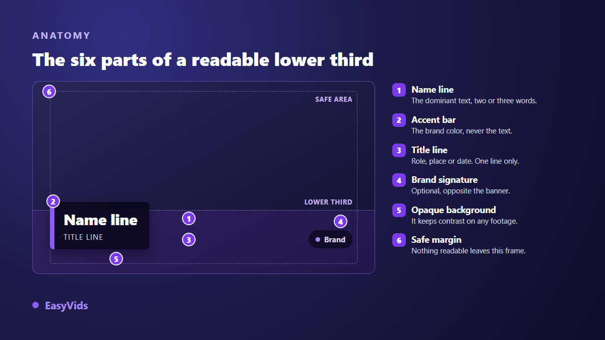
- The name line: the dominant text, two or three words. It is the only thing most of the audience will remember, so it comes first and largest.
- The role line: the job, the place or the date, on a single line. It explains why this person gets to speak about the subject.
- The background: a solid or heavily darkened panel behind the text. It is what keeps the words readable when the image changes brightness mid shot.
- The accent bar: a vertical or horizontal stripe in your brand colour. It carries the colour so the text does not have to.
- The brand signature: a logo or handle, optional, placed opposite the banner rather than pinned against it.
- The safe margin: the invisible frame nothing readable crosses. It is the part everyone forgets, and the one that costs most at publishing time.
Hierarchy between the two lines decides readability more reliably than the typeface does. Aim for a size ratio of at least 1.8 between the name line and the role line. Below that, the eye no longer knows where to start and reads both lines as one grey block.
Where it really goes, and why not at the very bottom
Lower third does not mean glued to the bottom edge. Video production has always worked with safe areas: SMPTE recommendation RP 218, the reference for safe areas in high definition production, keeps text inside roughly 90 % of the frame width and height. In practice that means a margin of about 5 % on every edge, below which nothing readable ever goes. The same marker governs the rest of your on screen furniture, and our breakdown of formats and ratios by platform gives the matching dimensions.
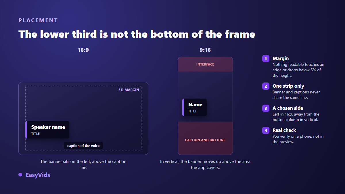
In vertical the constraint tightens, because the app stacks its own elements over your picture: handle, caption, share buttons. The usable band therefore sits well above the bottom edge. A second rule of the same kind applies: the banner and the captions never share a line. If your captions already occupy that zone, lift the banner one step or move the captions, as covered in our method for burning in captions that survive every platform.
Seven templates that cover almost every need
Catalogues offer hundreds of variants, but they reduce to seven intentions. Picking a template therefore means picking what the banner has to say, not picking a fashionable style. It is the same reasoning as the thumbnail layouts you fill with your own material, where you settle a composition rule before you go looking for an image. All seven use the same settings; only the content changes.
- The identity banner: name and role. The default for an interview, a testimonial or a piece to camera.
- The location banner: city, country or date. It anchors a report or a travel video, and often stands alone without a second line.
- The chapter banner: the title of the current section. It structures a long tutorial and stops viewers wondering where they are.
- The figure banner: one isolated number, very large, with its source small underneath. The bottom line carries the attribution, never a comment.
- The quote banner: a short sentence in quotation marks followed by its author. Two lines at most, otherwise you are building a text card, not a lower third.
- The recall banner: the same identity shown again later, shortened. The name alone is enough the second time.
- The action banner: a quiet prompt, a handle or an address. Save it for the final seconds, and never stack it on another banner.
Timing: three beats, and a shorter recall
A banner behaves like a spoken sentence: it starts, it lasts, it ends. The middle beat is the one everyone trims, and the only one that decides anything. The most reliable method is to read the content under your breath twice and keep that duration. A name with a role needs roughly four seconds of stillness. The entrance runs around four tenths of a second, the exit around three, because nobody watches a banner leave. The families of entrances and exits are exactly those of any animated text, and our inventory of text animation effects explains what each one says.
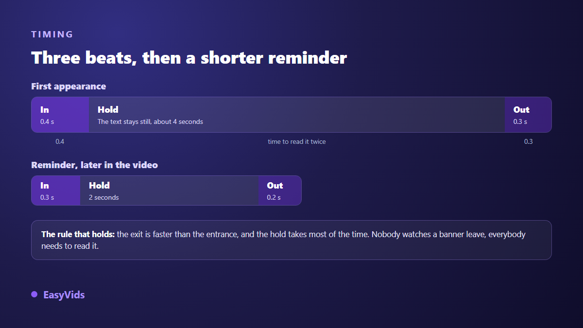
Two more markers complete the trio. The banner appears within three seconds of the person's first sentence, never before they start speaking, otherwise viewers attach the name to the previous shot. And on a long video, a second appearance of the same banner earns its place every two to three minutes, in shortened form: name only, two seconds, no role line.
Type, contrast and colour
An unreadable banner is a failed shot however elegant its animation. Three constraints come before any aesthetic choice. Size first: the name line never drops below 4 % of the image height, the role line never below 2.2 %. Contrast second: the WCAG accessibility guidelines set a ratio of at least 4.5 to 1 between text and its background, which calls for a solid or clearly darkened panel behind the letters, never a simple blur. Weight last: a medium or bold face holds up on a moving image, a thin one dissolves. The same trade offs govern captions, and our comparison of caption typefaces gives the values format by format.
Colour works the opposite way to instinct. The text stays white or near black, and the accent bar, the rule or the panel carries the brand colour. Coloured text over footage turns unreadable the moment the background changes hue, which happens at every cut. One accent colour per video is enough, and it pays to reuse it across your other on screen elements.
Building a lower third in an online editor
The EasyVids online editor runs in the browser and stays free with an account. The shortest route is a plain text element: add it, switch on its background in the style settings, then adjust the corner radius and the inner padding. You already have a clean banner without drawing a single shape. The style gallery even includes a broadcast caption preset, black panel at partial opacity with square corners, which makes an honest starting point for a restrained identity.
For the two line version, stack two text elements, then add a narrow rectangle as the accent bar: the basic shapes, rectangle, ellipse, polygon and star, are adjustable in colour, stroke and radius. The Animation tab then applies a separate entrance and exit to each element, one never replacing the other. Once the set is dialled in, the duplicate shortcut copies it as is for the next speaker: only the text changes. The thirds grid and the per platform safe area guides help you fix the height of the block. The wider workflow is covered in our guide to editing video online, and plan details live on the pricing page.
One point of honesty belongs here. We also build an engine that produces animated video straight from code, where a bottom banner is one of the compositions written shot by shot; that piece is not open to every account yet. And exporting a banner on its own over a transparent background, for reuse in another editing package, is not something the editor offers today. Better said than discovered.
The mistakes that give an amateur banner away
- A banner held for the whole shot: past six seconds it stops informing and becomes interface.
- Three lines instead of two: the third is almost never read, and it flattens the hierarchy of the first two.
- Text pinned to the bottom edge, which slides under the app interface the moment you publish.
- A thin typeface over a transparent panel: readable in preview, invisible on a bright shot.
- A different style for every speaker, when repeating the same banner is exactly what looks professional.
- A banner entering while the captions change: two simultaneous movements in one zone, and nothing gets read.
Frequently asked questions
How long should a lower third stay on screen?
Long enough to read its content twice, which lands around four seconds for a name with a role. Under three seconds part of the audience will not finish. Past six it clutters the frame without teaching anyone anything.
Do vertical videos need lower thirds?
Yes, provided you lift them. The bottom of the frame belongs to the app, not to your video. Plan a usable zone that starts clearly above the edge, and keep a margin on the side where the share button column sits.
Can I animate a lower third without professional software?
Yes. A text element with a background, plus an entrance and an exit chosen from an animation catalogue, cover almost every need. Animation software still earns its place on a complex brand package, not on identifying a speaker cleanly.
Where should the banner go when the video already has captions?
Above them, with a gap of at least one caption line. If space is tight, raise the captions for the duration of the banner rather than letting the two cross. Two text blocks stacked in the same place stay unreadable, even for half a second.
Should every speaker get the same banner design?
Yes. Consistency is the whole point: the same shape, the same colour, the same position, with only the words changing. Varying the design speaker by speaker reads as decoration rather than information, and viewers stop trusting it.
Open your last video and find the moment when someone starts talking without being introduced. Drop a two line banner there, four seconds, short entrance and a faster exit. It is the most visible change you can make in ten minutes, and it shows on the first phone playback. Creating an account opens the editor and its text style gallery, and the EasyVids studio gathers the writing, visuals, voice over and editing in one place.