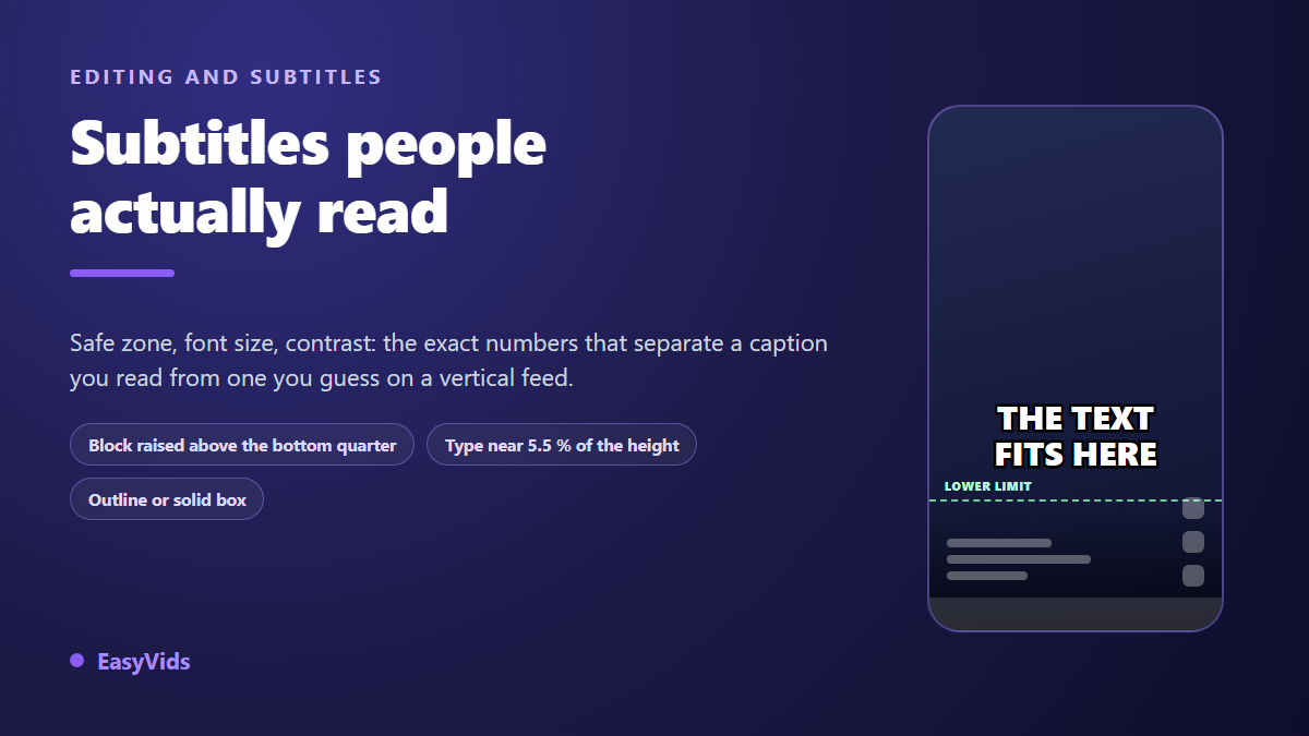
You post a reel, open it on your own phone to check, and the last line of text has vanished behind your username. Instagram Reels subtitles are rarely unreadable because the transcript was wrong. They are unreadable because they sit too low, run too small, or stay pure white over a bright shot. In the editor everything looked fine. On the viewer's screen, the app lays its own layer over your picture.
Three decisions fix this for good: position, size, contrast. All three happen while you edit, never after you publish, because none of them can be repaired from inside the app. This guide gives one concrete number for each, and names the platform rules where they exist. If the transcript itself is still the sticking point, our guide to automatic captions covers the step before this one.
The short answer
Keep the caption block between 55% and 75% of the frame height, horizontally centred: any higher and you cut across faces, any lower and you slide under the app interface. Set the type at roughly 5.5% of the frame height, about 105 pixels on a 1080 by 1920 video. Add a heavy black outline or a solid background, never bare white. Cap each card at seven words over two lines at most, and give every card at least one second on screen.
What the interface covers, and your editor never shows
A reel plays full screen, but it is never alone on that screen. Bottom left, the app stacks the account name, the caption and the audio title. Bottom right, the button column: like, comment, share, more. Below all of it, the app navigation bar, and on many devices the phone's own system bar on top of that. At the top, the clock and the notch. Your video fills the whole surface, but your text only gets a central band.
This is not a matter of taste. Meta publishes safe zones for its vertical placements in its ads format guide, asking creators to keep the top and bottom of the frame free of text and logos, precisely because the interface sits there. The guidance is written for ads, but the display surface is identical for an ordinary post.
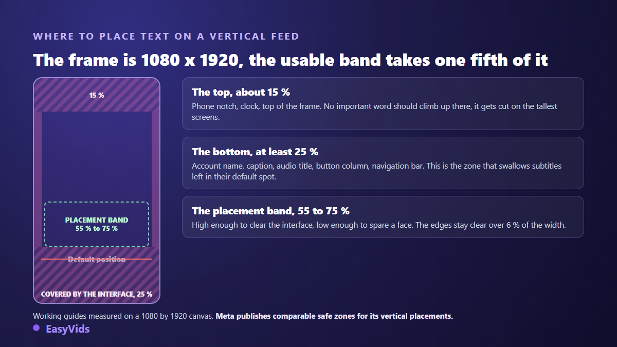
The trap is a tooling detail: your editor shows the bare frame. Nothing warns you that a line placed near the bottom will end up behind a button. That is why a framing guide drawn over the preview beats guesswork, and why watching the export on a real phone beats both.
The safe zone in numbers
A 1080 by 1920 canvas gives margins that are easy to remember. Treat the values below as working reference points, and widen them if your caption text runs long or you add stickers near the bottom.
- Top: reserve around 15% of the height, roughly 290 pixels. Nothing important climbs above that line.
- Bottom: reserve at least 25% of the height, roughly 480 pixels. By far the busiest area of the screen.
- Sides: leave 6% of the width clear on each edge, about 65 pixels, to absorb device differences.
- The caption band sits between 55% and 75% of the height measured from the top, centred.
- On a horizontal video reframed to vertical, apply these margins after the crop, never before.
Size: the setting almost everyone plays too safe on
A reel caption is not a film subtitle. It is read at arm's length, often while walking, often in the split second before a thumb flicks upward. The defaults in many tools come from television, where the screen is large and the viewer is seated. Carried over to a vertical feed, they produce text nobody reads.
The number that works: type sized between 5% and 6% of the frame height, which lands around 100 to 115 pixels on a 1080 by 1920 canvas. That is exactly what the EasyVids editor applies when it drops a caption track, with automatic line wrapping as soon as a line passes 80% of the frame width. Two lines maximum, never three. The relationship between text size and frame is also covered in our guide to formats and aspect ratios.
The most reliable check costs nothing. Shrink your editor preview to phone width, or export and watch the file on your own device. Text that takes effort at that size is too small, whatever the number in the settings panel says.
Contrast: making captions readable over any image
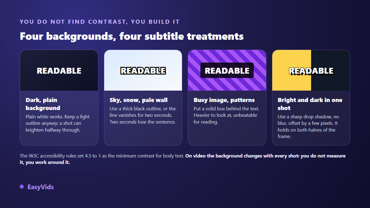
Pure white over a changing image is the worst possible choice, and it is the factory default nearly everywhere. A sky shot, a pale wall, an overexposed screen capture, and the line disappears for two seconds. Two seconds is enough to lose a sentence, and a lost sentence is enough to trigger a scroll.
The web accessibility rules published by the W3C as WCAG set a minimum contrast ratio of 4.5 to 1 between body text and its background, and 3 to 1 for large text. Video is not a web page: its background changes every frame, which makes that calculation impossible to hold shot by shot. Hence the approach used everywhere else, which is to stop depending on the background at all. You build the contrast instead of hoping for it.
Three techniques do the job, from subtle to heavy. A thick black outline separates the letter without hiding the image, and it is the default choice for vertical video. A hard drop shadow, no blur, offset by a few pixels, is softer but less reliable over busy footage. A solid background bar behind the text is unbeatable for legibility and costs you screen real estate. The EasyVids editor gathers all three in its text style gallery.
Words per card, and seconds on screen
A card that runs long does not get read, it gets skipped. The Netflix timed text style guide, used as a reference by many studios, caps lines at 42 characters and sets a reading speed of 17 characters per second for adult programming. Those figures assume a television and a seated viewer. On a vertical feed watched on the move, you go lower still.
In practice: seven words maximum per card, one or two lines, and a display time that never drops below one second even for a three word card. That is the constraint the EasyVids transcription applies when it splits audio, with timestamps tied to the moment the words are actually spoken. If you want to push the rhythm further, the mechanics of word by word animated captions are covered in our dedicated article.
Burned in captions or platform captions
Instagram generates its own automatic captions on reels, and its help centre documents the setting that turns them off, either for the whole account or for a single post. They have one real advantage: they arrive with no work from you. They have three drawbacks: you control neither their position, nor their style, nor their splitting, and they do not travel with your video when you repost it elsewhere.
A burned in caption is part of the picture. It cannot be switched off by accident, it looks identical everywhere, and it survives a re-encode. The price: it is not selectable, not machine translatable, and no help to screen readers. The sturdy habit is to burn in for the visual result and keep a clean SRT file beside it, ready to upload wherever the platform accepts one.
Cropping, or why the bottom of the frame disappears twice
A vertical video is not always shown in full. Instagram announced in early 2025 that the profile grid was moving from square to a taller 4:5 format, which means the preview of your reel inside your own grid is a crop of your 9:16 frame, losing both the top and the bottom.
The consequence for captions is immediate. A sentence sitting in the bottom 20% of the frame can be missing from the preview while being perfectly present in the video. If your first card carries the promise of the piece, put it near the centre rather than near the bottom, and always check the cover image separately.
Setting Instagram Reels subtitles in the editor, step by step
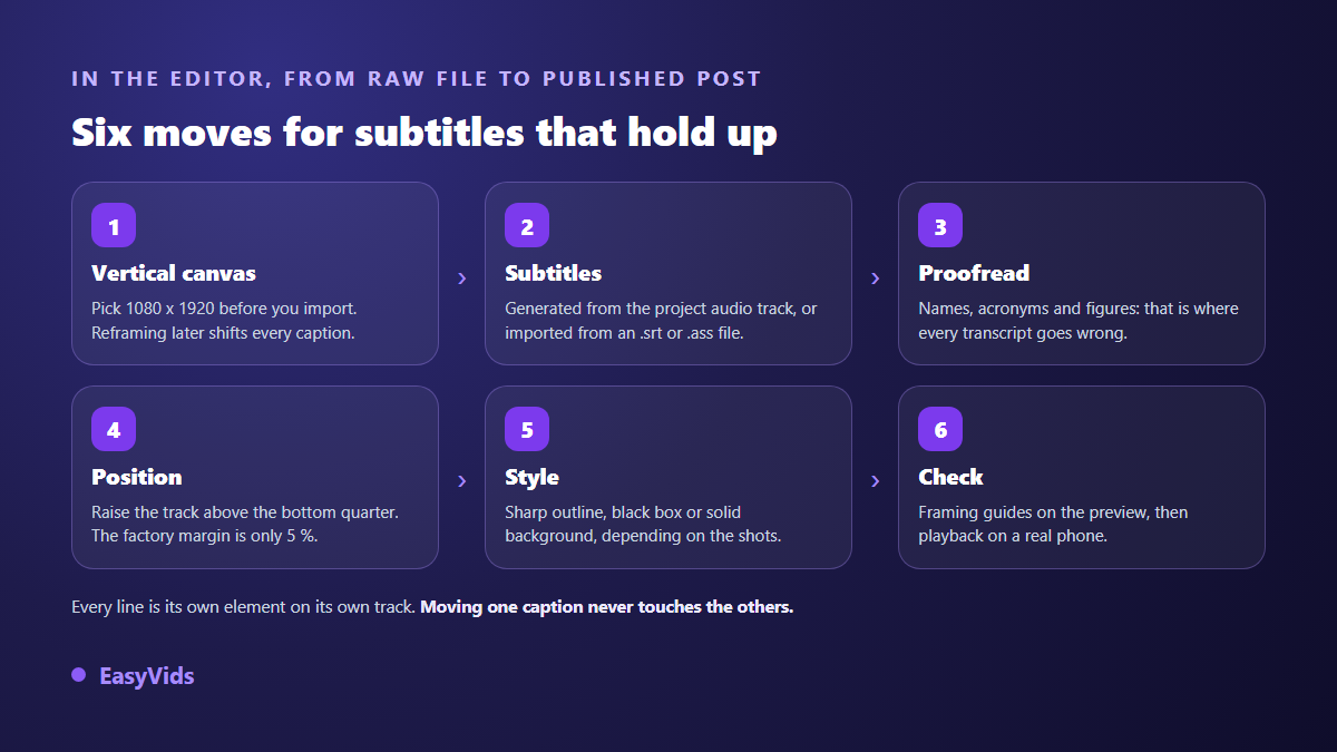
The EasyVids online editor runs in the browser with nothing to install, and treats captions as a track of their own: a text track above the video, one independent element per line. Every card can be moved, stretched and restyled without touching its neighbours, which matters the moment a single line misbehaves.
- Pick the 1080 by 1920 canvas before importing anything: reframing later shifts every text element.
- Generate captions from the project audio track, or import an existing .srt or .ass file.
- Let language detection do its job, or choose from the nine supported languages.
- Proofread before styling. Proper nouns, acronyms and figures are what every transcription gets wrong.
- Select the caption track and raise it: the default leaves a 5% bottom margin, fine for a plain video file, far too low for a reel.
- Apply a style from the gallery, an outline for varied footage, a solid box for busy shots.
- Turn on the framing grid over the preview and check that nothing drops into the bottom quarter.
- Export, then watch the file on a phone before publishing.
Transcription runs on our servers and is billed by the length of the audio processed, with the plans laid out on the pricing page. Importing a subtitle file costs nothing: if you already hold a proofread SRT, that is the fastest route to a clean track.
The mistakes that keep coming back
- The caption block left at its default position, glued to the bottom and covered on publication.
- Pure white with no outline or box, perfect on the test shot, invisible the moment an image turns bright.
- Twelve word cards over three lines, hiding a third of the frame and read by nobody.
- A thin typeface chosen on a large monitor, invisible on a phone held at arm's length.
- Cards replacing each other faster than the eye can follow, which reads as flicker.
- No proofreading, and a mangled proper noun in the first three seconds.
Frequently asked questions
Does Instagram add captions automatically?
Yes. According to the Instagram help centre, reels receive automatically generated captions, and a setting turns them off for the account or for a single post. They are a useful fallback, but you control neither their position nor their style, so burned in captions remain safer for a video you care about.
How high should captions sit on a reel?
Between 55% and 75% of the frame height measured from the top, horizontally centred. Higher, and you run into faces and the main framing. Lower, and you slide behind the caption text, the button column and the navigation bar.
What font size works for mobile captions?
Around 5% to 6% of the frame height, roughly one hundred pixels on a 1080 by 1920 canvas. The decisive test is not in the editor: export and read the video on a phone, at the distance you normally hold your own.
Outline or solid background?
A heavy black outline is enough in the vast majority of cases and hides far less of the image. Switch to a solid background when the footage is busy or very bright: a crowd, a sky, a screen capture, a filmed document.
Can I import an existing SRT file?
Yes. The EasyVids editor reads .srt and .ass files and lays every cue on a dedicated text track with its original timings. Position, size and style stay under your control afterwards, line by line if needed.
Readable captions take no special talent: a raised position, an unapologetic size, a manufactured contrast, short cards. Four decisions made once, then reused on everything you publish afterwards. To apply them without installing anything, create an account and open a video in the editor: the caption track lands in one action, the rest is adjustment. The EasyVids studio keeps writing, voice, editing and export in one place.