Your video starts, the sound is off, and the viewer decides within two seconds whether to stay. TikTok captions exist for exactly that moment. The catch is that the word covers two different things: the captions the app generates on its own at publishing time, and the ones you place in the frame yourself before uploading. Same name, completely different behaviour.
The gap shows up later. One creator switches auto captions on, never proofreads, and watches a mangled name sit across the screen for the life of the video. Another leaves the cards at their factory position, right at the bottom, where the expanded description and the navigation bar cover them. This guide walks both paths in order. For the fundamentals that apply to every platform, our guide to automatic captions sets the scene.
The short answer
On the TikTok posting screen, open the captions panel, run the automatic transcription, read the text, fix names and numbers, then publish. It is free and takes about a minute. As soon as styling matters, or the video will be reposted elsewhere, burn the text into the frame instead: it becomes part of the file, adjustable to the pixel, and identical everywhere. The EasyVids studio handles transcription, styling and export in one place.
Two paths, two very different outcomes
The first path is platform captions. TikTok listens to the audio, writes the text and displays it over the video, in its own font and size. According to the TikTok help centre, those captions are generated at posting time, the text stays editable before you upload, and the viewer keeps control: they can hide the captions on their side. That last point matters. Your text stops being a certainty and becomes an option.
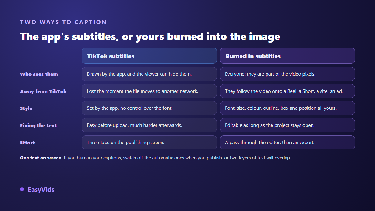
The second path is burning the text into the image before the file goes online. The words become pixels like any others: nobody can switch them off, and they survive a download, a repost on another network, a second life as an ad. That is the approach detailed in our method for burning captions into a video. The trade off is that they cannot be corrected after export, so proofreading happens first.
The two paths also collide. If your cards are already burned in, leaving automatic generation on displays two overlapping sets of text, usually out of sync. Pick one: rely on the platform, or place your own text and switch the automatic option off when you publish.
Turning captions on inside the app
The steps are short, and their order matters more than the taps themselves.
- Record or upload your video, then move on to the posting screen.
- Open the captions panel, usually grouped with the text and accessibility options.
- Run the automatic generation and let the text appear.
- Read it line by line: proper nouns, brands, acronyms and numbers are what speech recognition misses most.
- Fix the text in the caption editor, then confirm.
- Check the preview once more, with the description expanded, to see what the text actually covers.
Once the video is live, going back to a mistranscribed word gets awkward, and reposting starts the view count from zero again. Proofreading before upload is the only moment where a correction costs nothing.
Where the text belongs on a TikTok screen
The image fills the screen, but the interface sits on top of it. The tabs and search live at the top. The vertical button column and the sound disc take close to a fifth of the width on the right. The handle, the description, the music title and the phone navigation bar occupy the bottom.
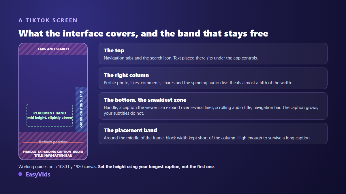
The description is the real trap. It shows collapsed, then grows by several lines when someone taps it. A card sitting just above the collapsed version vanishes the moment a viewer expands it. The position that survives every case sits around the middle of the frame, slightly above it, with a block narrow enough to clear the button column.
Set that height using your longest card, never the first one. A two line block reaches lower than a one line block. In our editor, a TikTok reference overlay sits on the preview and shows where those elements land, so nothing is left to guesswork.
Size, outline and case: what makes a card readable
The first useful instinct is to make it bigger. Text is judged on a phone held at arm's length, not on the wide screen you edit on. Most captions that go unnoticed are not badly written, they are simply too small.
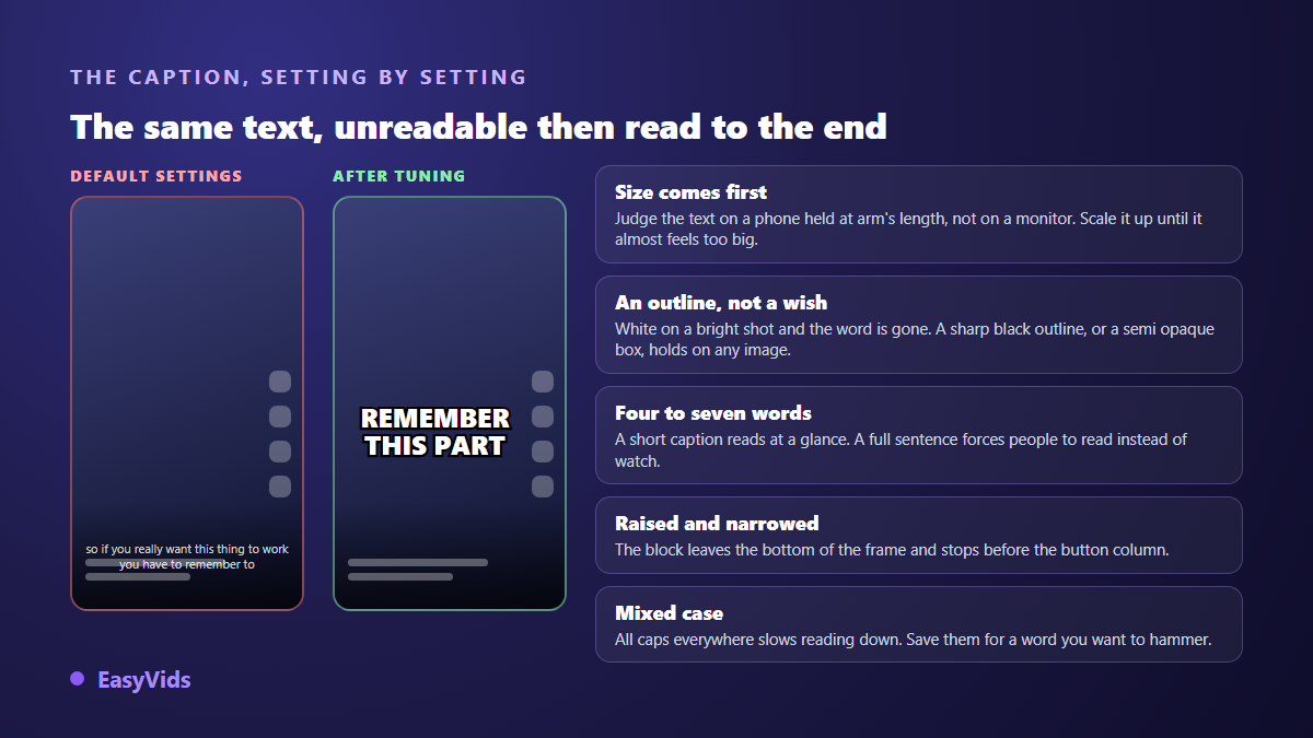
Contrast comes next. White on a bright shot disappears, and a vertical video changes background every couple of seconds. Two options hold on any shot: a firm black outline around the letters, or a semi opaque panel behind the block. Our editor offers both, plus a drop shadow and a gradient, along with a gallery of ready made styles that includes a classic caption look and a clean outline look.
Then the typeface. Heavy weights and wide shapes survive scaling down far better than a thin, elegant face. Setting everything in capitals slows reading because it removes word shapes, so save capitals for a word you want to hammer home. The topic has its own set of rules in our comparison of caption fonts.
Words per card, and time on screen
A card of four to seven words is read at a glance; a full sentence forces people to read instead of watch. Across our own generations, the editor's transcription splits speech into segments of seven words at most, which gives a natural rhythm on spoken content. Each card then stays up for at least a second, even when the phrase is short.
Word by word captions, used with restraint
Captions that pop one word at a time, often with a colour on the current word, have become a signature of vertical video. They hold attention, but they tire the eye on longer pieces and clash with calmer content. Keep them for fast, information dense videos. The build is covered in our guide to word by word animated captions.
Burning captions in before you publish
- Set the canvas to vertical, 1080 by 1920, before anything else: cropping later moves all your text.
- Drop the video on the timeline and trim the dead air at both ends.
- Open the captions panel, pick the spoken language or leave automatic detection, then run the transcription.
- Proofread, fix proper nouns, split any card that runs too long.
- Style the first card, then apply the same look to the rest for a single visual identity.
- Raise the block clear of the interface and narrow its width.
- Export the video, then publish without switching the platform's automatic captions back on.
In our studio that transcription runs on the server, across a handful of common languages plus automatic detection, and is counted in credits based on audio length; the pricing page carries the current plans. You can also arrive with your own file, since the import accepts SRT and ASS, a workflow covered in our SRT file guide.
The mistakes that keep coming back
- Publishing without reading the generated text, and leaving a misspelt name up for good.
- Leaving cards at their factory position, under the description and the navigation bar.
- Relying on platform captions for a video that will be reposted elsewhere.
- Stacking burned in text and automatic generation, which shows two versions at once.
- Setting long cards in full capitals, which slows reading instead of helping it.
- Setting the height on a short card, then finding two line cards sink too low.
- Editing in landscape and cropping to vertical, which shaves the text off at the sides.
Frequently asked questions
Does TikTok add captions automatically?
The app offers automatic generation at posting time, but it does not replace your proofreading, and viewers can hide those captions on their side, according to the TikTok help centre. If your message depends on the text, burn it into the frame rather than trusting that track.
Can captions be changed after the video is live?
The text is comfortable to fix before upload, inside the caption editor on the posting screen. Once the video is live, what you can do depends on the app version and stays limited. Treat the pre publication read through as a required step, not a bonus.
How high should TikTok captions sit?
Around the middle of the frame, slightly above it, and never in the bottom quarter. The lower area belongs to the handle, the expandable description, the sound title and the navigation bar. Set the height using your longest card, the one that wraps onto two lines.
Outline or background panel?
A clean black outline is enough in most cases and keeps the image visible. A panel becomes useful when your shots are bright, busy or constantly changing, screen recordings for instance. Either way the goal is the same: the word holds up whatever sits behind it.
Can I import an existing caption file?
Yes. Our editor takes SRT and ASS files and lays every cue on its own text track, timings included. That is the fastest route when you already have a proofread transcript, or when you are adapting an already captioned video into another language.
Captions that work on TikTok come down to three decisions: proofread text, a block raised clear of the interface, and contrast that survives any shot. The rest is habit, settled once in a project you duplicate afterwards. To transcribe, style and export in one place, create your account and try it on your next vertical video.