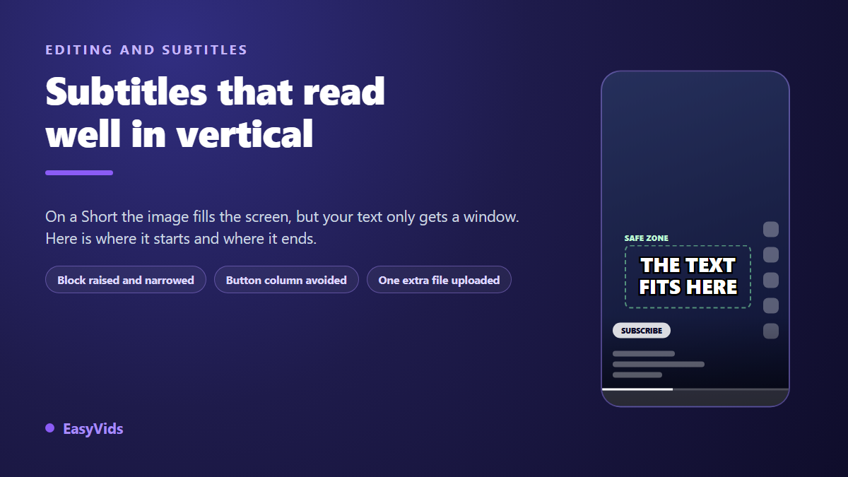
You publish a Short, open it on your own phone to check, and the last line of text has slipped behind the video title. YouTube Shorts captions face a problem horizontal video never has: the picture fills the whole screen, but the player lays its own layer on top, along the bottom and down the entire right column. In your editor the line sat neatly centred. On the viewer's screen it is half hidden.
Once the video is live there is no fix: burned in text is part of the picture and never moves again. Everything is decided while you edit, around three settings, position, width and contrast, plus a fourth one that YouTube rewards almost uniquely. This guide gives one concrete number for each. If the transcript itself is what slows you down, our guide to automatic captions covers the step before this one.
The short answer
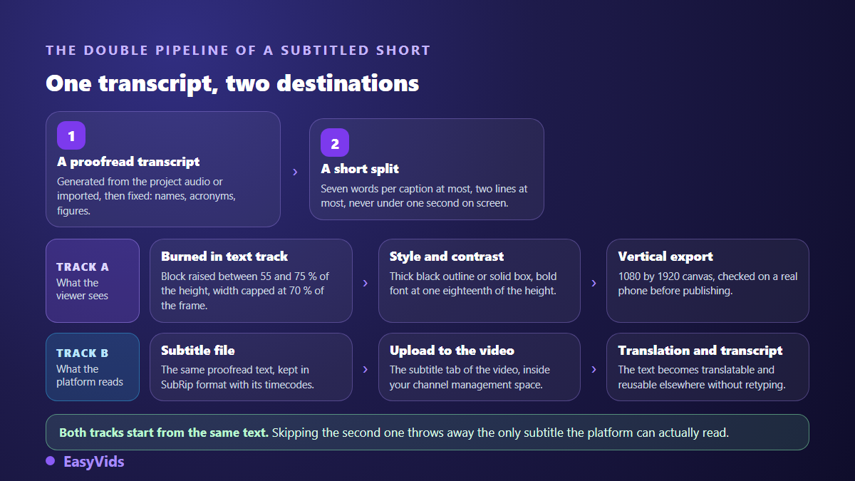
Keep the caption block between 55% and 75% of the frame height, centred, and give it no more than 70% of the width: the right hand button column climbs high on a Short. Set the type close to 5.5% of the frame height, roughly 105 pixels on a 1080 by 1920 canvas. Build the contrast with a heavy black outline or a solid background instead of relying on bare white. Cap each card at seven words over two lines at most. Then upload a real subtitle file on top of that, because the file does work that on screen text cannot.
What the player puts on top of your picture
A Short plays full screen, and that is exactly what fools you. Down the right side, a column stacks the like button, the dislike, comments, remix and share, with the channel picture above them. Bottom left sit the channel name, the subscribe button, the video title and the sound pill. Below all of it, the progress bar and the app navigation bar. Your video covers the entire surface. Your text only gets a window.
What sets Shorts apart from other vertical feeds is that right hand column. It carries more than elsewhere, because it holds two vote buttons instead of one, and it climbs to the middle of the frame. A caption centred across the full width slides under those icons long before it reaches the edge. The fix is to narrow the text block, not merely to raise it. Almost nobody does it, because no editor suggests it.
The trap is as much a tooling problem as a method problem: your editor shows the bare frame. Nothing warns you that a line placed there will end up behind a button. A guide drawn over the preview beats guesswork, and watching the export on a real phone beats both. Frame ratios and their consequences platform by platform are covered in our guide to video formats and aspect ratios.
The safe zone of a Short, in numbers
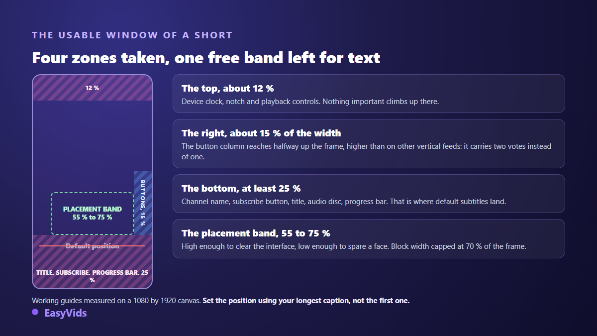
The values below are working reference points measured on the player interface, not figures published by the platform. They assume a 1080 by 1920 canvas. Widen them if your title runs long: it wraps onto two lines past roughly forty characters, and eats that much more of the lower frame.
- Top: keep around 12% of the height free of text, roughly 230 pixels, where the clock, the notch and the playback controls sit.
- Bottom: reserve at least 25% of the height, roughly 480 pixels. The busiest area of the screen, and exactly where default captions land.
- Right: the button column takes about 15% of the width and climbs to the middle of the frame.
- A centred block should therefore stay under 70% of the frame width, around 760 pixels, otherwise its ends slide under the icons.
- The comfortable caption band sits between 55% and 75% of the height measured from the top.
- On a Short cut out of a horizontal video, apply these margins after the crop, never before.
One last reference point, often forgotten: set the position against the longest card in your video, not the first one. A two line card reaches lower than a one line card, and it is always that extra line that ends up behind the video title.
Two sets of captions beat one, and that is specific to YouTube
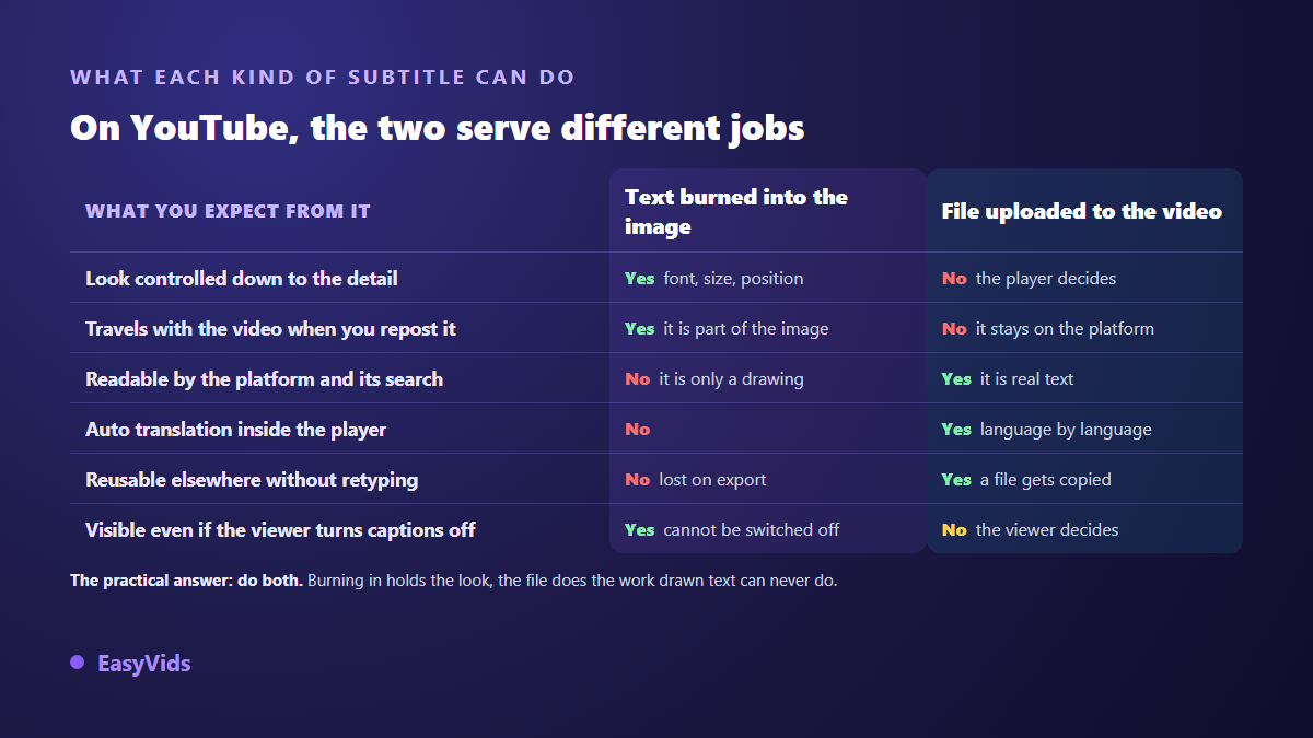
Here is what really separates a Short from other vertical formats. A Short is still an ordinary YouTube video: it has its own page, its own audio, and it is managed in the same place as the rest of your channel. According to the YouTube help centre, subtitles are handled video by video from a dedicated tab, and the platform accepts an uploaded file in several formats, including SubRip, the one with the .srt extension. On most other vertical feeds that option simply does not exist.
That file does more than display text. It feeds the video transcript, it can be machine translated inside the player, and it hands the platform clean text where it would otherwise have nothing but speech recognition. Burned in captions are only a drawing inside the picture: no engine reads them, no translation applies to them. The sturdy habit is to do both, burn in for the visual result and keep a proofread SRT file beside it.
The usual objection is time. It does not hold up. YouTube already produces automatic captions through speech recognition, and its help centre notes that this can fail when sound quality is poor, when several people speak at once, or when the video opens on a long stretch of silence. Starting from those automatic captions and correcting them takes a few minutes on a one minute Short. What each approach really costs is developed in our comparison of burned in captions and separate files.
Size, typeface and contrast on a vertical frame
A Short caption is not a film subtitle. It is read at arm's length, often while walking, in the split second before a thumb flicks upward. The defaults in many tools come from television, where the screen is large and the viewer is seated. Carried straight over to a vertical frame, they produce text nobody reads.
The number that works sits between 5% and 6% of the frame height, around 100 to 115 pixels on a 1080 by 1920 canvas. That is what the EasyVids editor applies when it drops a caption track: one eighteenth of the frame height, bold, centred, with automatic wrapping as soon as a line passes 80% of the width. On a Short, that 80% threshold is precisely the one to lower by hand, for the reason explained above.
For typeface and contrast, two rules are enough. A wide, heavy sans serif survives at small sizes, while a thin or condensed face loses its letters. And bare white with no treatment stays the worst possible setting, because it vanishes the moment a shot turns bright: a sky, a white wall, an overexposed screen capture. A thick black outline is the vertical default, a solid background wins on busy footage. The editor gathers those treatments in a gallery of eighteen text styles named in plain language.
Words per card, seconds on screen
A card that runs long does not get read, it gets skipped. The subtitle guidelines published by the BBC, used as a reference by many broadcasters, cap lines at 37 characters and ask that a subtitle be moved rather than allowed to cover something important in the picture. Those figures assume a television and a seated viewer. On a vertical feed watched on the move, you go lower still.
In practice: seven words maximum per card, one or two lines, never three. That is the constraint the EasyVids transcription applies when it splits audio, with timestamps tied to the moment the words are actually spoken. The editor's local splitter goes further and groups words in threes, with a floor of eight tenths of a second per card, so nothing flickers when the voice speeds up.
The rest is judged by eye. If you have to read fast to keep up, so will the viewer, and the viewer will not bother. Anyone chasing a sharper rhythm will find the full mechanics of word by word animated captions in our dedicated article, limits included.
The Short cut out of a horizontal video
Plenty of Shorts are not filmed vertically at all: they are cut from an existing horizontal video. According to the YouTube help centre, a Short is a vertical video of up to three minutes, the limit having been raised from one minute to three in October 2024. Three minutes means a lot of caption cards, and as many chances for one line to land in the wrong place.
The order of operations decides everything. Crop first, caption second. Text placed on a horizontal frame and then cropped to vertical ends up cut off at the sides, or shrunk to a ridiculous size. If your source is a long narration, the full production method is laid out in our guide to building a YouTube video with AI, and the vertical extracts always come last.
One more direct consequence: the preview of your Short in the channel grid and in search results is a crop of your vertical frame. A sentence sitting in the bottom 20% can be absent from that preview while being perfectly present in the video. If your first card carries the promise of the Short, place it near the centre rather than near the bottom.
The first three seconds carry the rest
On a vertical feed the viewer does not decide to watch, they decide not to scroll. The first caption card takes part in that decision as much as the first image and the first sentence. Write it as a promise rather than as the opening of a sentence: what the video is about to show, not the warm up of your narration.
One technical detail matters here. If your video opens on a second of silence, speech recognition has nothing to transcribe and your first card only arrives afterwards. Place a card by hand over that first second, in the same style as the rest, rather than leaving a gap at the exact moment everything is decided.
Setting Shorts captions in the editor, step by step
The EasyVids online editor runs in the browser with nothing to install. It treats captions as a track of their own: a text track above the video, one independent element per line. Every card moves, stretches and restyles without touching its neighbours, which matters the moment a single line misbehaves.
- Pick the 1080 by 1920 canvas before importing anything: the editor opens in 1920 by 1080, and changing frame later shifts every text element.
- Open the Captions panel, leave language detection on or pick from the nine supported languages, then generate from the project audio.
- You can also import a proofread .srt or .ass file: every cue arrives with its original timings.
- Proofread before styling. Proper nouns, acronyms and figures are what every transcription gets wrong.
- Select the caption track and raise it: the default leaves a 5% bottom margin, fine for a plain video file, far too low for a Short.
- Narrow the block so it stays under 70% of the width, otherwise its ends will sit behind the button column.
- Apply a style from the gallery: an outline for varied footage, a solid box for busy shots.
- Turn on the reference grid over the preview, adjustable in rows and columns, and check that nothing drops into the bottom quarter.
- Export to MP4, watch the file on a phone, publish, then upload the subtitle file to the video.
Caption generation runs on our servers and is billed by the length of the audio processed, with the plans laid out on the pricing page. Importing a subtitle file costs nothing: if you already hold a proofread SRT, that is the shortest route to a clean track.
The mistakes that keep coming back
- The caption block left at its default position, glued to the bottom and covered on publication.
- A block at the right height but too wide, whose last words disappear under the button column.
- Bare white with no outline or box, perfect on the test shot, invisible the moment an image turns bright.
- Twelve word cards over three lines, hiding a third of the frame and read by nobody.
- No subtitle file uploaded, when it is the only one of the two the platform can read.
- Burned in text repeating the title the interface already displays, stealing space for nothing.
- No proofreading, and a mangled proper noun in the first three seconds.
Frequently asked questions
Does YouTube add captions to Shorts automatically?
The platform generates captions through speech recognition on videos whose audio allows it. According to the YouTube help centre, that generation depends on the spoken language, the sound quality and how clearly people speak, and it may not happen at all. Those captions are a useful fallback, but you control neither their position, nor their style, nor their splitting.
Should I burn in Shorts captions or upload a file?
Both, for different reasons. Burning in guarantees the look and follows the video wherever you repost it. The file is the only one the platform can read, translate and show in a transcript. Doing both takes a few extra minutes and covers every case.
How high should captions sit on a Short?
Between 55% and 75% of the frame height measured from the top, horizontally centred, across no more than 70% of the width. Higher and you cut across faces. Lower and you slide behind the title and the subscribe button. Wider and you slide behind the button column.
Do captions help a Short get found?
A subtitle file gives the platform clean text attached to your video, where it would otherwise hold only an automatic transcript. Nobody outside the company can put a number on how much that weighs in ranking, and it is better not to pretend otherwise. What is certain is simpler: a video watched without sound is watched longer when it is captioned, and watch time sits at the centre of what YouTube describes in its own explanations of recommendations.
Can Shorts captions be reused elsewhere?
Yes, if you kept the file. A proofread SRT can be reimported into an editor, translated and uploaded to another platform untouched. Burned in text cannot be recovered: you would have to retype it line by line. That is the best argument for always keeping the file, even when you burn the captions in.
Readable Shorts captions take no special talent: a raised and narrowed block, an unapologetic size, manufactured contrast, short cards, and a file uploaded alongside the burned in text. Five decisions made once, then reused on everything you publish afterwards. To apply them without installing anything, create an account and open a video in the editor: the caption track lands in one action, the rest is adjustment. The EasyVids studio keeps writing, voice, editing and export in one place.