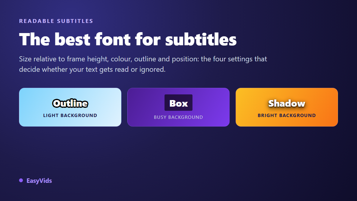
Your captions appear on cue, the wording is right, and nobody reads them. On a bright shot they vanish, on a phone they shrink to nothing, and every third line runs past the frame. Looking for the best font for captions almost always starts here: the problem is not what the text says, it is how it sits on screen.
The list of decisions is short. Typeface family, size relative to frame height, color, the way you lift the text off the background, and position in the frame. Five settings, plus one quick way to check them before you publish. If you do not have a caption track yet, our guide to automatic captions covers how to get one before you worry about styling it.
The short answer
Use a wide, bold sans serif such as Arial, Inter, Roboto or Archivo, set between 4 and 6 percent of the frame height. White text, a black outline at roughly 10 to 15 percent of the font size, two lines maximum, 32 to 42 characters per line, and a bottom margin of at least 5 percent. That setting holds on every platform, and everything else is fine tuning. Keep the order of priorities in mind: contrast decides readability, the typeface only refines it.
Contrast decides, the typeface refines
The W3C accessibility guidelines, in version 2.2, ask for a contrast ratio of at least 4.5 to 1 between text and background, dropping to 3 to 1 for large text. That benchmark was written for a page, where the background stays still. Video adds a problem the web never had: the backdrop changes with every frame, so a caption that is perfectly readable for two seconds can disappear on the third. Never tune captions on your friendliest shot. Tune them on the brightest, busiest one in the sequence.
The typeface matters elsewhere, on three measurable points. Letter distinction first: in many classic sans serifs, capital I, lowercase l and the digit 1 are the same vertical stroke. Character width next, because a generous set width survives shrinking to a phone screen far better. Weight behaviour last: hairline strokes vanish after compression, while very heavy strokes bleed into a bright background when nothing outlines them.
Two typefaces were drawn for exactly this problem. Atkinson Hyperlegible, published by the Braille Institute of America, deliberately pulls apart shapes that get confused. Tiresias Screenfont, designed at the Royal National Institute of Blind People, originally targeted digital television subtitles. The first one is available in our editor's font picker. You do not have to use either, but they set the right test: a caption font is judged on its most ambiguous letters, not on its overall look.
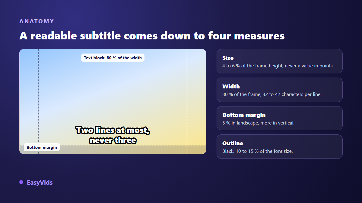
Six type families put to the caption test
Typefaces behave very differently once they sit on a moving image. Here is how the main families rank, from safest to riskiest.
- Neutral sans serif (Arial, Helvetica, Inter, Roboto, Source Sans): the default choice, distinct letterforms and no personality getting in the way.
- Wide sans serif (Verdana, Archivo, Nunito Sans): generous set width, the best behaviour when the video is watched small.
- Geometric sans (Montserrat, Poppins): very clean in bold and in vertical formats, slightly weaker at small sizes because the round letters look alike.
- Condensed (Oswald, Barlow Condensed): fits more words per line, best kept for titles and emphasised words rather than full sentences.
- Serif (Georgia, Playfair Display): for a documentary or cinema tone, with the risk of thin serifs fading away after compression.
- Script and monospace: rule them out. Joined letters get decoded rather than read, and fixed width breaks the silhouette of each word.
One industry marker is worth knowing: the Netflix subtitle style guide requires Arial for delivered subtitle files, with a normalised size and position. That is not an accident, it is the most neutral typeface available. Our editor offers more than 1900 Google Fonts families alongside the classic system fonts, which is plenty to give a channel a voice without losing readability, as long as you stay in the first two rows of that ranking.
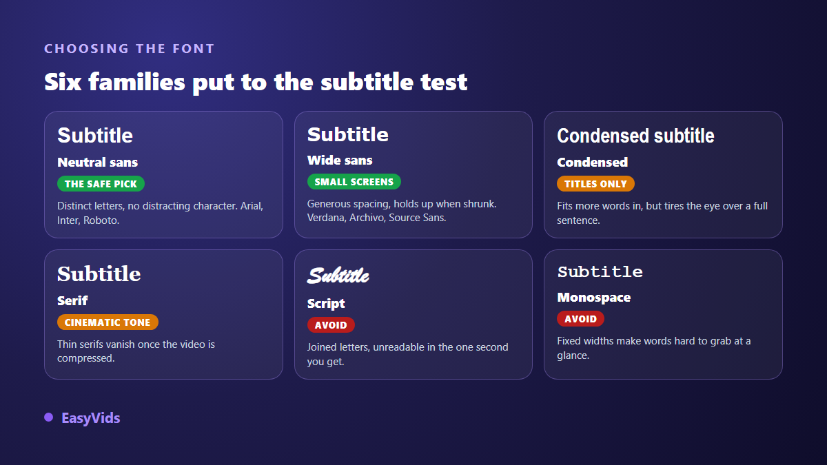
Sizing: think in percentage of frame height, never in points
Point sizes mean nothing in video. Twenty four points on a 720 pixel tall frame and on a 2160 pixel tall frame give two unrelated results. The only stable unit is a percentage of frame height, because that is how viewers actually perceive the picture, whatever the export resolution.
In our editor, text size is computed against a reference height of 90 units, and a caption lands at 5 by default, which is one eighteenth of the frame height, around 5.5 percent. On a 1080 pixel tall frame that is 60 pixels. On a vertical 1080 by 1920 frame, 106 pixels. The text block takes up 80 percent of the width at most, and sits 5 percent above the bottom edge.
The same principle applies to effects: outline thickness, shadow blur and shadow offsets are all percentages of the font size. A high resolution export therefore renders exactly like the preview, with no outline shrinking and no shadow swelling. Look for that behaviour in any tool you use. If effects are set in fixed pixels, the render will shift with the export resolution, and you will find out afterwards.
The check takes ten seconds. Shrink the preview window to thumbnail size, or watch the video on your phone at arm's length. If you squint, bump the size up one step and try again. That test beats any table of recommendations, because it reproduces the real viewing conditions.
Line length, word count and reading speed
A perfect typeface will not rescue badly cut text. The Netflix subtitle style guide sets benchmarks the wider industry follows: 42 characters per line for Latin script languages, two lines maximum, and a reading speed of 20 characters per second for adult audiences, dropping to 17 for children's programming.
Short, punchy content goes well below that. Our editor's transcription splits the audio into segments of seven words at most, which produces cards you take in at a glance. Cut on the joints of the sentence, never between an article and its noun, never after a stranded preposition. A bad cut forces a re-read, and a re-read costs more than a slightly long line. What travels in the file is the timing, not the look: our guide to the SRT format explains why an SRT carries no font and no color at all. A file that comes from elsewhere often runs ahead of or behind the voice, and no typeface repairs bad timing: our method for resyncing drifting subtitles covers that step, which comes before any styling.
Color: white wins almost every time
Pure white is our default, and it is the convention in nearly every professional captioning standard. It has only upsides: it stands out on dark backgrounds, it takes a black outline without any hue clash, and it carries no meaning of its own on top of the message. Yellow is the one serious alternative, because it separates better from mid greys and overexposed scenes. The BBC subtitle guidelines describe a codified use of four colors on a black box, white, yellow, cyan and green, to tell speakers apart in the same scene.
Two colors are worth avoiding for a technical reason. Almost every consumer video encoder stores color information at a lower resolution than brightness, a process known as chroma subsampling. The edges of bright red or saturated blue text start to smear, while white text, which rides on luminance, keeps clean edges. Save color for one emphasised word, never for the whole sentence.
Outline, shadow or box
A white caption placed bare on an image only survives dark shots. It needs a base, and there are exactly three techniques. The outline is the most versatile: our Sharp outline style pairs bold white text with a black outline at 14 percent of the font size, drawn before the fill so it pushes outward instead of eating into the letter. An outline drawn on top of the text thins the shapes and creates that muddy look you see on so many videos.
A drop shadow is gentler and suits light weights and serifs, where a thick outline would overload the drawing. A box is the guaranteed option: a semi opaque black rectangle behind the text makes readability independent of the picture, at the cost of part of the frame. That is the television and e-learning choice, and our TV caption style reproduces it with black at 60 percent opacity. On a social feed, prefer the outline, which is visually lighter.
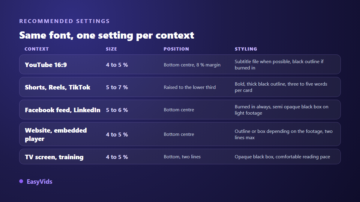
Settings by platform
A consistent channel keeps the same typeface everywhere. What changes between surfaces is size, position and treatment, because each platform's interface covers a different part of the picture.
- YouTube in 16:9: around 4 to 5 percent of the height, with a bottom margin near 8 percent to clear the progress bar. The YouTube help centre notes that viewers can change the font, size, color and background of player captions themselves, which argues for an uploaded file rather than burned in text.
- Vertical formats: 5 to 7 percent, raised into the lower third, since the account name, description and buttons take the bottom area. Three to five words per card.
- Facebook and LinkedIn feeds: autoplay without sound, so captions must be burned in, with a semi opaque background when the footage is bright.
- Embedded player on a site: close to YouTube settings, always checked at phone width.
- Television screens and training: black box, two lines, comfortable reading speed, no typographic flourish.
Both vertical cases deserve their own reference points, since the reserved zones differ. We covered them for YouTube Shorts captions and for the Instagram Reels format. Choosing between an uploaded file and text baked into the picture is a separate decision, handled in our comparison of burned in captions.
Common mistakes
- Setting size in points instead of a percentage of height, so the render shifts with every export resolution.
- Picking the typeface on a dark shot, then discovering the problem on the bright scene at the end.
- Three lines of text: the viewer reads the first one and loses the picture.
- An outline drawn over the text, thinning the letters instead of framing them.
- A decorative typeface chosen for brand identity and unreadable below a certain size.
- Captions glued to the bottom edge, covered by the progress bar or the platform interface.
- Reusing a horizontal video's settings unchanged on a vertical format.
Setting it up in an online editor
In our editor, the captions panel transcribes the timeline audio in nine languages with automatic detection and drops the cards onto a text track. You can also import an existing SRT or ASS file, recovering font, color, alignment and margins when the file carries them. Styling is then set per card or for the whole track: typeface from more than 1900 families, weight, color, outline, shadow, gradient, background, letter spacing, line height, alignment and margins, with eighteen ready made styles covering the usual cases. Editing video in the browser works like installed software, and the rest of the EasyVids studio works on the same project.
Frequently asked questions
What is the best caption font for mobile?
A wide sans serif in a heavy weight, such as Verdana, Archivo or Inter. On a phone screen, set width and weight decide, not the finer points of letterform design. Always add a black outline, because the video will often be watched in daylight, where perceived contrast collapses.
Should captions be written in all capitals?
No, except for one or two emphasised words. Capitals remove the ascenders and descenders that give each word its silhouette, so the reader decodes letter by letter. On a two word card in a vertical video the effect is negligible. On a full sentence it costs reading time on every shot.
What font size should I use for a vertical video?
Between 5 and 7 percent of the frame height, roughly 100 to 135 pixels on a 1080 by 1920 frame. That is noticeably larger than in a horizontal video, because vertical content is almost always watched on a phone held at a distance, with no way to enlarge the text.
Is a black outline better than a black box?
The outline in most cases: it keeps the picture visible and follows the shape of the letters. A box becomes preferable when the background is bright, highly detailed or unpredictable, screen recordings and archive footage for instance. Never stack both, the result is heavier without being more readable.
Can I keep the same font across every platform?
Yes, and it is the better choice for channel identity. Size, position and treatment should adapt, not the typeface family. Just confirm that your chosen font stays readable at the smallest size you use, usually a horizontal video watched on a phone.
A readable caption is built in this order: a wide sans serif, a size expressed as a percentage of frame height, an outline that survives the brightest shot in the sequence, and a position that dodges the platform interface. Test your settings on the worst frame in your video, never on the prettiest one. To apply them to your own files, creating an account opens the online editor and its captions panel, with nothing to install.